Improve
Updates for Rock 18.1
Below is a summary of the updates for this version.
- Migrate HTML Content Channels to Structured Content Editing with ease.
- Short Links can now be pinned, categorized or copied.
- Rock now supports a new icon pack, Tabler
Updates for Rock 1.0
No updates made.Updates for Rock 2.0
Below is a summary of the updates for this version.
- Added tip to not change the Stark Theme
- Add Less tip to reference the Stark theme's CSS if you will not be compiling your own CSS.
Updates for Rock 3.0
Below is a summary of the updates for this version.
- Added information on the new Universal Channel Type.
- Documented how to add item attributes to a Content Channel
(before the documentation only showed how to add item attributes
to the channel types.)
- Noted the location change of the content channel admin pages
from 'Admin Tools > Communications' to 'Admin Tools > CMS Configuration'
- Added information on the new theme CSS edit classes. These classes help
you alter your theme's layout when Rock's in-page edit features are enabled.
Updates for Rock 4.0
Below is a summary of the updates for this version.
- Added email form block description.
- Added tips for creating an email form.
- Documented Rock's new mobile redirect settings on the site configuration.
- Added information on the new site page view tracking options.
- New chapter on SEO topics.
Updates for Rock 5.0
Below is a summary of the updates for this version.
- Documented new feature to disable indexing of a site by web crawlers.
- Added information on new feature that allows a site to be placed into an iFrame.
- New information on using Rock's Theme Styler.
- Provided new information on how to design a theme that uses the Theme Styler's tools.
- Documented Rock's tools that help compile Less files
Updates for Rock 6.0
Below is a summary of the updates for this version.
- Added tip regarding site scoped routes.
- Documented the new 'Require Encryption' feature on sites.
- Described the new page copy features.
- Renamed the chapter 'Custom Content' to 'Content Channels'.
- Documented the new parent/child content channel capabilities.
- Outlined how podcasting is implemented.
- New chapter on making your Rock pages social sharable.
- Moved Managing Dynamic Content chapter from the Communications manual to this one.
- Fixed incorrect screen location name in Dynamic Content chapter.
Updates for Rock 7.0
Below is a summary of the updates for this version.
- Updated Page Properties Advanced Settings screenshot and added Body CSS Class description.
- Updated Content Channel Type screenshot and added Disable Content Field and Disable Status descriptions.
- Updated Content Channel Configuration screenshot and callout information.
- Updated Admin Toolbar screenshot.
- Added Short Links documentation to Managing Content and Pages chapter.
- Added Page Attributes information and code sample to Creating a New Site chapter.
- Updated Add Site screenshot and callouts to include Site Icon info
- Added Lava Shortcodes section in Standing on the Shoulders of Giants chapter.
- Updated Add Block documentation in Adding Content to Rock chapter to include how to add a block to every page in a site.
- Added Content Channel Tags section to Content Channels chapter.
- Updated the Add Content Channel screenshot.
- Moved Managing Dynamic Content chapter from Communications manual to this one.
- Added Cookies chapter.
- Added chapter on Font Awesome 5.
Updates for Rock 8.0
Below is a summary of the updates for this version.
- Documented the new Content Channel View Detail block
- Documented the new Landing Pages feature
- Updated screen shots for version 8
Updates for Rock 9.0
Below is a summary of the updates for this version.
- Added Content Component Template to v9 for web developers and designers
- Added "URL slug" section
- Added Working With Images section
- Added Asset Manager System section
Updates for Rock 10.0
Below is a summary of the updates for this version.
- Persisted Datasets
- Caching for Rock Websites
- Google Cloud Asset Storage Provider
- Added additional details to Content Component chapter
- Added new chapter on Cache Tags
Updates for Rock 11.0
Below is a summary of the updates for this version.
- Added Categories to Content Channels
- Added new Content Channel Item Editor - Structured Content
- Routes can be designated as Global
- Added Azure Cloud Storage as a supported Asset Storage Type
- Added ability to view and set values for Site attributes from the Site Detail block
- The Content Channel View block supports multiple values in query string parameters for
Defined Value attributes that have 'Allow Multiple' enabled
Updates for Rock 12.0
Below is a summary of the updates for this version.
- A new Admin Toolbar button gives Rock admins the ability to temporarily disable caching for certain blocks via a cookie
- Added cache control settings to Page Properties for selecting the Cacheability Type and the maximum age for cached pages
- A new "Enable Archive Summary" setting on the Content Channel View block lets you use Lava to create a summarized list of older Content Channel Items
- Attribute values for Content Channel Items can be updated automatically using the Content Channel Item Self Update job
Updates for Rock 13.0
No updates made.Updates for Rock 14.0
Below is a summary of the updates for this version.
- Rock's personalization features help ensure the right content is getting to the right people
- Content Collections let you group content channels together to search for content across all channels in the collection
Updates for Rock 15.0
Below is a summary of the updates for this version.
-
The rate limiting feature lets you throttle pages,
to reject requests when they exceed the provided limits
-
New settings were added to the Campus Context Setter block
-
Urchin Tracking Module (UTM) filters can be added to
Personalization segments
Updates for Rock 16.0
Below is a summary of the updates for this version.
- The Content Library feature enables churches to share and download content
- Enhance worship with real-time Interactive Experiences through Rock Mobile
- Display relevant Content Channel Items by filtering using context
Updates for Rock 17.0
Below is a summary of the updates for this version.
- Adaptive Messaging tailors pre-defined messages based on an individual's data, view counts and date ranges
- Personalization Segments can be assigned to categories.
- New Request Filter for Geolocations such as: country, region and postal codes
- Short Link Advanced Settings
- Scheduled Short Links
Welcome
Rock RMS was conceived and built by web designers and programmers just like you.
We understand that you might be a little hesitant about using Rock as your
Content Management System (CMS). In fact, many of you are probably thinking
that you won't use Rock as a CMS at all. Instead, you're considering
integrating it to your current CMS using our REST API. We don't blame you.
We thought the same thing years ago when we developed our first relationship
management system. But we were wrong. Hopefully, you'll read this entire guide.
If you do, we think you'll see the light too. But let's be honest right up
front and address some of your top concerns.
Your Top Five Concerns with Using Rock as a CMS
-
Rock will never have all the features of my current CMS.
Yep, you're right. We'll never be able to have every feature that
your current CMS has. Although, they probably don't have every
feature we have either. Rock makes creating powerful websites easy.
We’ve stolen borrowed the best ideas from the top CMS
out there. We've leveraged our years of experience building sites to
create tools we’ve always wanted.
-
We'll never be able to find someone who knows Rock; everyone knows xxxxx.
We're working hard to establish an ecosystem full of vendors and
freelancers who can help you. Not only that, but documentation like this
manual makes it simple to quickly bring any web designer vendor up to
speed. You should probably hesitate to use any vendor who resists using
the tool the customer wants and instead uses their favorite tool.
Remember, you're the one who needs to live with the site.
-
Rock is built on Microsoft .Net. Come on, no serious CMS uses that.
While there are several popular .Net CMS systems (Umbraco, DotNetNuke,
Orchard) that really isn't the point. When looking for a CMS, you need
powerful features with blazingly fast performance that can scale. Rock
excels at each of these. Think about it this way: Should the builder be
judged by the tools he brings to the worksite or the building that
stands when he's finished? That's not to say we're not proud of our
tools. We LOVE .Net and we think you will too once you try it on.
-
There are a limited number of .Net webhosts to run Rock on and the
ones that do exist are more expensive.
True, there are fewer than our PHP/MySql cousins, but there are
numerous vendors to pick from. As far as price, .Net hosting on average
costs about 20% more than Linux hosting. On the lower end this translates
into $2-$3 dollars a month. The return on investment with using Rock as
your CMS will far outweigh this small difference.
-
But I’m a PHP developer; I don’t know .Net.
That's just a part of the job. Constant change
is the career you’ve chosen. Technologies like LESS, jQuery
and Bootstrap didn't exist just a few years ago. To not change is to
become extinct. Don't see yourself as a .Net Developer, instead
look at yourself as just a developer who today uses .Net. If
you're a developer, you'll have no trouble with .Net. It's an
elegant and well-designed language.
But What Are the Benefits?
Hopefully you're starting to see that some of the barriers aren't as
large as they may appear. But there's no reason to change for change's
sake; the benefits must outweigh the cost. Reading through this
manual will show you numerous ways to exploit the power of Rock's
CMS features. But let’s touch on one simple example. The biggest
"killer app" of Rock is personalization. Just picture adding the
markup below into your baptism page using Rock's on-page HTML editor
(You’re going to love the editor!):
{% if Person %}
    {% if Person.BaptismDate != '' %}
        {{ Person.NickName }}, remember the joy of your baptism? Share that joy
        with a friend who hasn't yet taken the plunge at one of our upcoming
        baptism events!
    {% else %}
        {{ Person.NickName }}, now is the time! Don't put off baptism any longer,
        take the plunge at one of our upcoming events!
    {% endif %}
{% else %}
    Take the plunge at one of our upcoming baptism events!
{% endif %}
Rock uses an upcoming templating engine called
Lava.
Paired with Rock data, Lava is very powerful. The markup above does this:
-
If the person is logged in and has been baptized it shows the message:
"Alisha, remember the joy of your baptism? Share that joy with a friend
who hasn't yet taken the plunge at one of our upcoming baptism events!"
-
If the person hasn't been baptized yet they'll see: "Alisha, now is the
time! Don't put off baptism any longer, take the plunge at one of our
upcoming events!"
-
Otherwise, if the person isn't logged in, the greeting reads:
"Take the plunge at one of our upcoming baptism events!"
Armed with just a little knowledge of Lava, we've created a very personal
experience on our site; one that is much more likely to draw people in and
promote action. Are you starting to see the power of Rock? And we're just
getting started.
Anatomy of Rock CMS
Grab your lab partner and let's dig in to what makes the Rock CMS tick. There's
no better place than to start at the top with sites and work our way down to the
components that make up a page. Pass the scalpel and let's start cutting.
Sites
The top of the CMS hierarchy is the site. Each website you create should be
created as a unique site. Think of sites as a collection of related pages that
share a consistent look and feel. Sites aren't limited to external websites
though. You can use them to contain your check-in pages or a set of pages for
a metrics dashboard.
Sites are created and managed under
Admin Tools > Websites.
Be sure to use the chapter Creating a New Site
before setting out on your own.
Site Themes
Themes are a set of resources that add styling to the pages of a site. The
theme is defined at the site level. This makes it very easy to change the
look of an entire site with a single configuration change. You can read more
about themes in the
Themes chapter.
Pages
The concept of pages is pretty obvious; they represent a single web page.
Unlike many CMS however, the page doesn't exist as a file on the website.
Instead, a page is dynamically assembled by Rock with each request. This
allows each page to be personalized by the person requesting it and allows
you to secure portions of the page based on the person's security rights.
Pages are arranged in a parent-child hierarchy. This hierarchy allows us
to build dynamic menus.
Layouts
Each page is configured to have a specific layout. This determines the
content areas (or zones) that the page has. Available layouts are defined by
the theme that the site is configured to use. While you can create as many
new layouts as you'd like, we strongly recommend that you use the standard
names for reasons that will be made obvious in future chapters.
Zones
Zones are content areas that are defined by the layout. They represent things
like the header, navigation menu, footer and content areas.
Blocks
Blocks make up the actual content of the page. They come in all shapes and
sizes. Each has a specific purpose. The most common block is the
HTML Content
block. This block allows you to display and edit HTML content to a specific
zone. Other blocks are used to generate navigation menus, list groups, show
maps, etc. Think of blocks as your Legos® that you can use to build a world
of new inventions.
Blocks can be placed on either a page, a layout or a site. When tied to a
layout they're displayed on every page that uses the layout. When tied to
a site they're displayed on every page within the site. This is very
helpful when adding content like navigation in the header or footer text
that should be the same across all pages.
The Anatomy of a Page
Now that we've covered all of the components of the Rock CMS system let's
look at a visual representation of a page. Remember that each page has a
layout, and the layout defines what zones are available to place blocks
into.
Anatomy of a Page
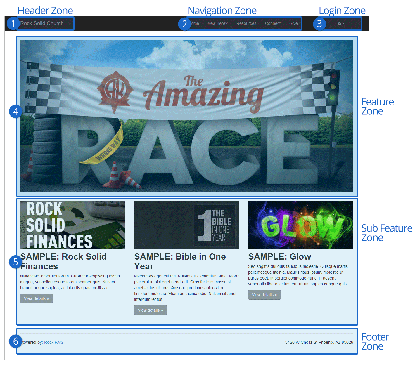
- 1 Header Zone
- The header zone is used for the organization's logo and tagline.
- 2 Navigation Zone
- The navigation zone holds the site's main menu.
- 3 Login Zone
- The login zone allows people with accounts to access protected portions of the site.
- 4 Feature Zone
- The feature zone holds the main content of a homepage which in many cases will be an ad rotator.
- 5 Sub Feature Zone
- The sub feature zone contains secondary ads or content on the homepage.
- 6 Footer Zone
- The footer zone wraps links and content in the footer.
Adding Content to Rock
As you work on your site, you’ll want to add new pages. There are two ways to do this: through your external
organization site, or through your internal Rock site. Both methods end in the same result (new pages with blocks
and content), you just take different paths to get there. Each approach has its pros and cons. Creating pages from your
external site allows you to view the pages as you’re creating them. Creating pages
from your internal site allows you to create and configure pages faster as well as to easily see how the new pages
fit into the overall site structure.
Let’s start by looking at how to add a page from your external site.
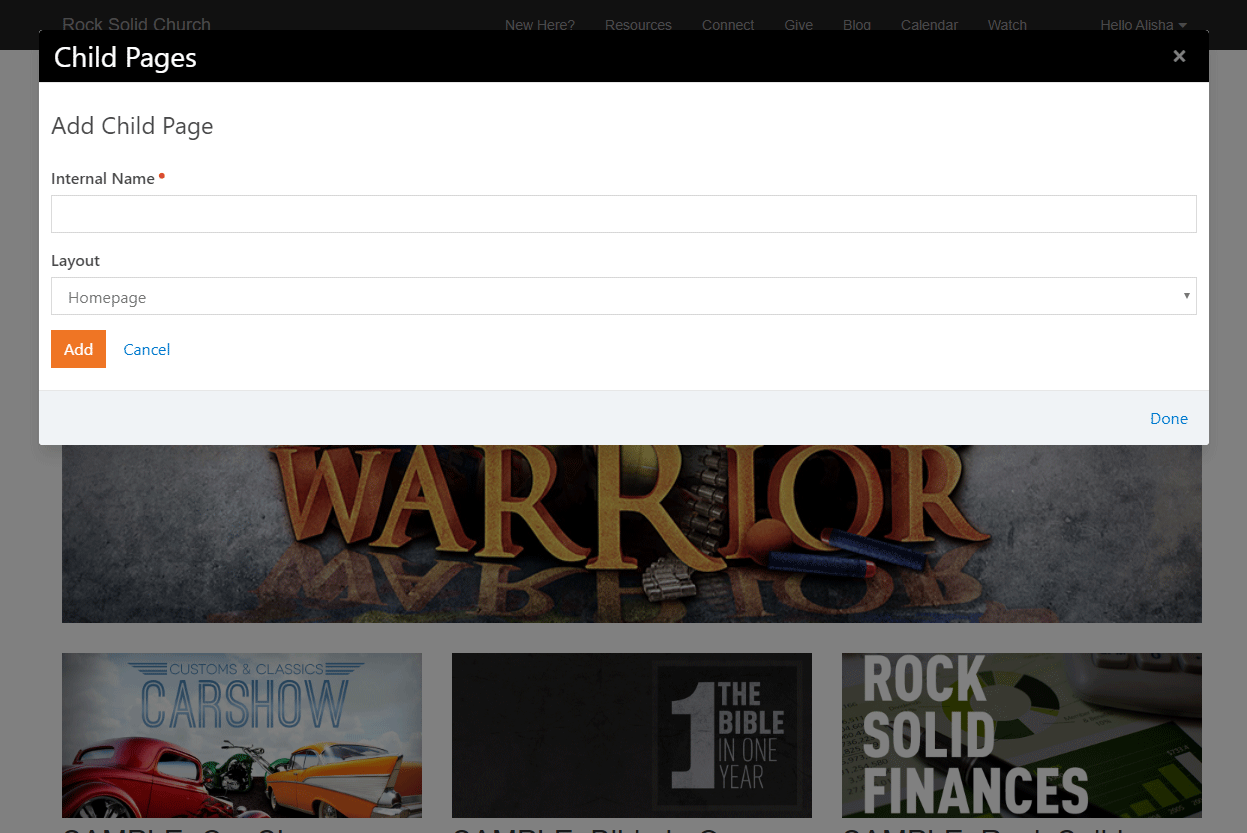
Adding a Page (External Site)
To add a page from your external organization site, follow these steps:
-
Navigate to the parent page that you want the new page to be under.
-
Click the
(Child Page) button from the Admin Toolbar.
-
From the Child Page
dialog, click the
button to add a new page to the list.
-
The Add
screen will allow you to provide a name for your page and choose a layout.
To configure the page fully you'll need to click on it from the child page list
and then click its
(Page Properties) button on its Admin Toolbar.
Child Pages Dialog
 Add Page Dialog
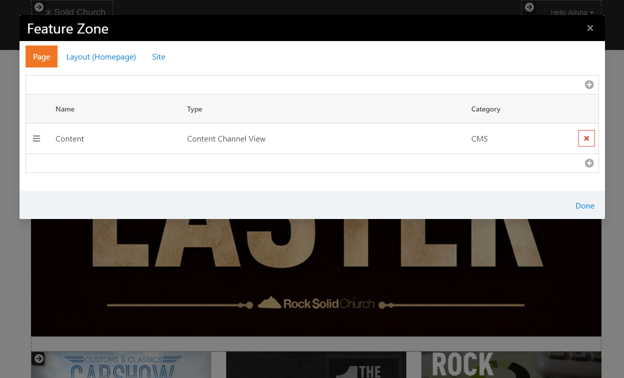
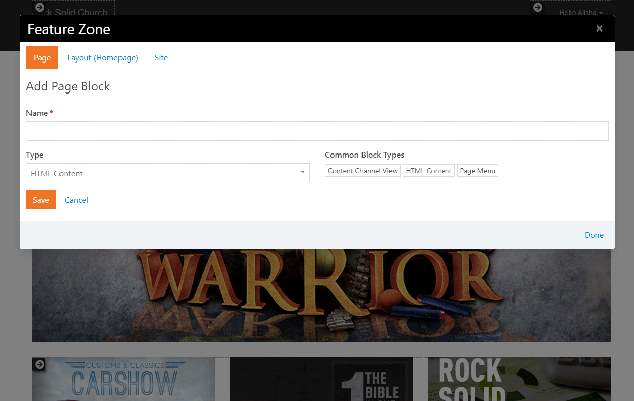
Adding a Block to a Page (External Site)
A small part of your content management duties will be to add and configure
blocks on a page. To add a block to an existing page, follow these simple steps.
-
Navigate to the page you’d like to add the block to.
-
Select the (Page Zone Editor)
button in the page’s Admin Toolbar.
-
This will highlight all of the zones on the page for you.
-
Select the fly-out toolbar for the zone you wish to add the block to and
click its (Zone Blocks) button.
This will bring up the zone's block list.
-
From here you have a decision to make. Do you want the block to live on
just this page, on every page that uses this layout, or across your entire site? Decide by picking
the appropriate tab at the top of the dialog: Page, Layout or Site. Keep in mind, choosing any
option other than Page carries some risk. The Layout and Site options are best used for blocks
you're certain belong on multiple pages, such as headers and footers.
-
Next, click the (Add Block)
button to add the block to the layout. Like adding a page you'll just
provide a name for your block and the type of block you wish to add. You'll
add more configuration later.
-
Next, determine in what order you want your block to appear within the zone.
You can move it up or down by dragging and dropping the order on the list.
-
Now that you've added your block to the list, click the Done
link and reload your page. Your new block will now be on the page.
-
In most cases, you'll now need to configure your block. To do so click
the (Block Configuration)
button in the Admin Toolbar.
This will highlight each block on the page.
-
To edit the settings, click the (Block Properties)
button from the block's fly-out menu. This will bring up the block
properties dialog with all of the settings for the selected block.
Zone Block List Dialog
 Add Block
Now that your page is created and your block structure is set up, it’s
time to configure your page properties and add content. To learn how to
do this, see the Managing Content and Pages
section below.
Adding a Page (Internal Site)
Adding a page from your internal site allows you to both create a page
and configure its properties in the same place.
Begin by going to Admin Tools > CMS Configuration > Pages.
You’ll see a tree navigation of the pages of your site, as well as a icon.
Click the icon
and select either "Add Top-Level" or "Add Child To Selected". Rock will
then display the Add Page screen.
The Add Page
screen has three tabs: Basic Settings, Display Settings, and Advanced Settings.
This is where you set up the new page’s properties.
Add Page - Basic Settings
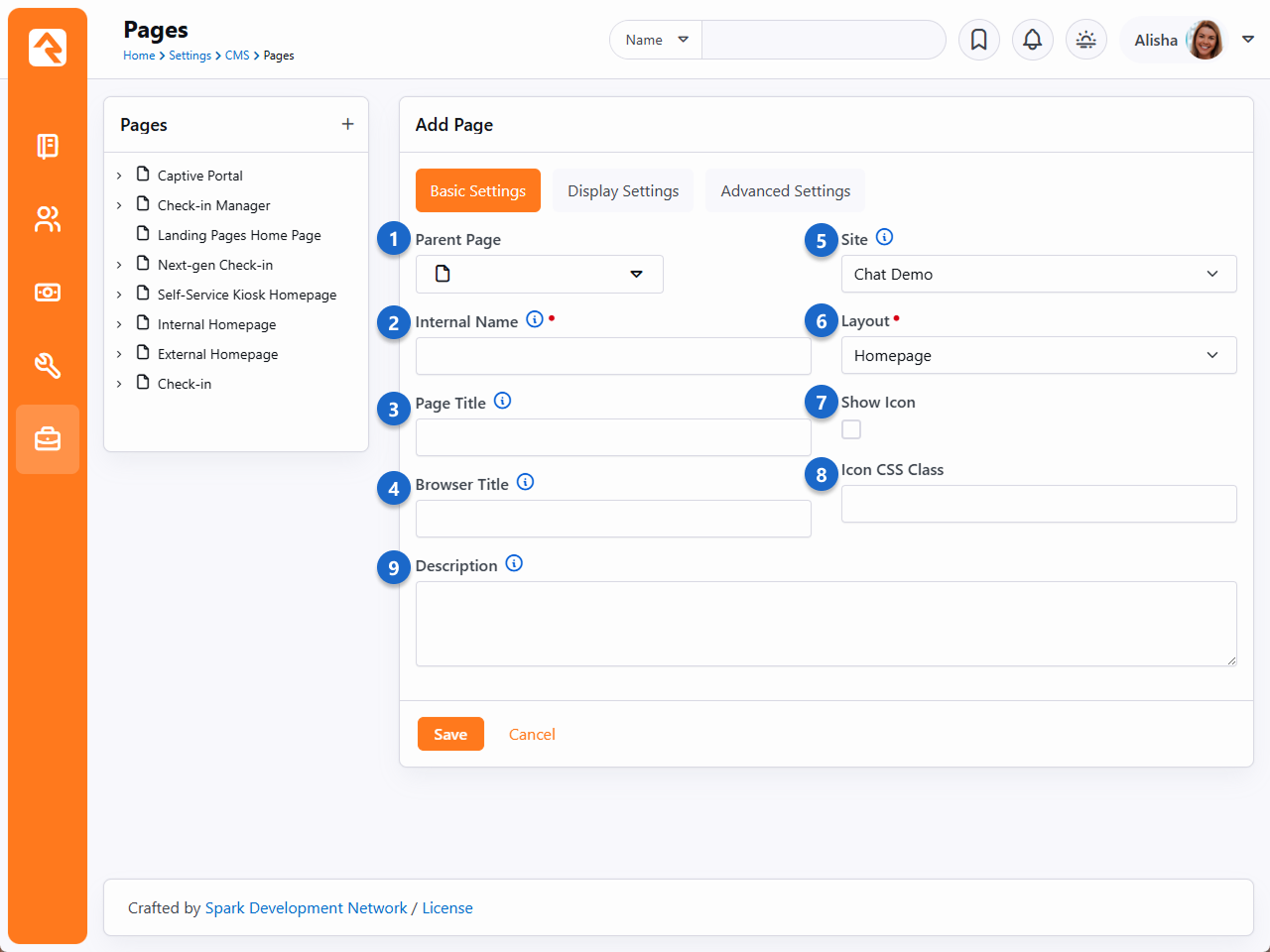
- 1 Parent Page
-
You can easily change the parent page for your selected page.
This will alter where that page is displayed in the navigation.
- 2 Internal Name
-
This is the name of the page that is used in the admin menus and
page pickers. Often, in these situations, you want the page to have
a more descriptive name than you might want to be displayed in a
menu on the site. For instance, you might want the homepage of a
site to have the internal name of "Youth Sports Homepage" but when
you're on the site the title should be simply "Home" on the menu.
- 3 Page Title
-
This is the name that will be used for the page title element
on the page. It will also be used in the navigation menus and
breadcrumbs.
- 4 Browser Title
-
For Search Engine Optimization it's often
important to have a different name in the browser's title. This
setting allows you to edit this.
- 5 Site
-
Each page belongs to a site. You can change the site for a
page with this setting. Keep in mind that the page gets its
theme from the site, so changing this setting could change how the
page is displayed.
- 6 Layout
-
This selects the layout that the page should use.
Further discussion of layouts can be found in the
chapter Looking Deeper at Layouts.
- 7 Show Icon
-
An icon can be used in the page title and breadcrumbs if it
is enabled with this setting.
- 8 Icon CSS Class
-
This setting allows you to enter the CSS class for the font
icon you wish to use. While Font Awesome
is installed, there's no reason you can't add your own alternate font icon
collection and enter your custom class here. When using Font
Awesome, you should use the syntax
fa fa-[icon name].
- 9 Description
-
The description gives a short summary of the page and its
intent. You can use this as "internal documentation" or,
using Lava, you can use it in your menus and page listings.
Add Page - Display Settings
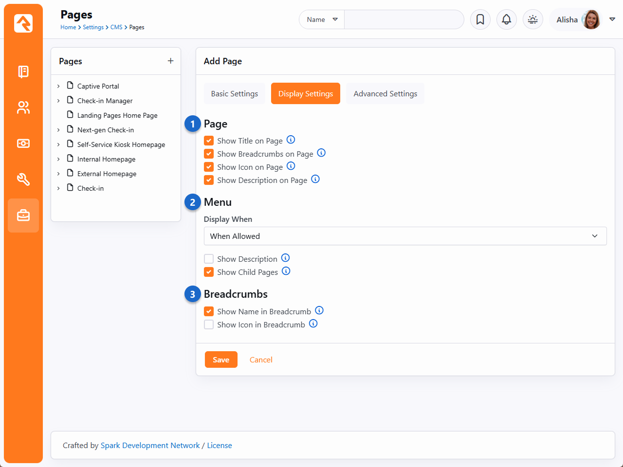
- 1 Page Display Settings
-
These settings control the view state of various components
of the page (title, breadcrumbs, description, etc.) How
these actually render on the page is somewhat dependent on
the theme you are using.
- 2 Menu Display When
-
How and when a page is displayed in a menu has several different options.
-
When Allowed: With this default option a page will only be
displayed in the menu when the person has view permissions to the page.
-
Always: You may want some pages that require a login to be
displayed in the menu even when the person isn't logged in. When
the person clicks the link, they will be asked to log in before
proceeding to the page. This is helpful for things like group
toolboxes where you want the person to see the option and then log
in before they can view the contents.
-
Never: Some support pages aren't meant to ever be navigated
to directly. Setting them to Never
ensures that nobody accidentally views them in a menu.
- 3 Breadcrumb Settings
-
These settings determine whether a page should be displayed in the breadcrumbs
and, if so, whether an icon should be included. Some designers set the name to
not display but will show an icon for homepages.
Add Page - Advanced Settings
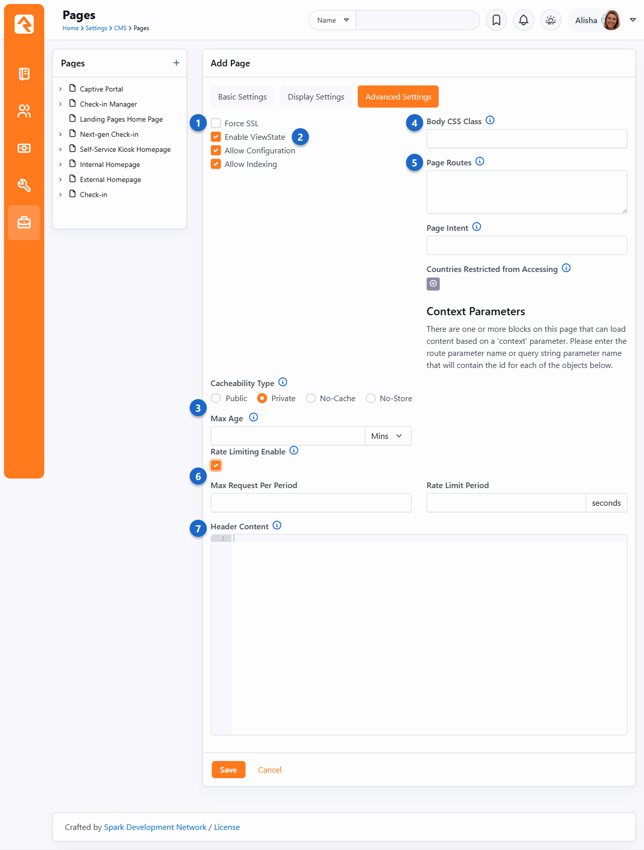
- 1 Force SSL
-
This ensures that the page will always load using SSL. This is
important for pages like giving or online registration where
credit card information will be used on the page. This does
require that your webserver is configured to support SSL.
- 2 Enable ViewState
-
ViewState is a .Net technology that allows a page to remember its
state across postbacks. If this doesn’t make complete sense to you,
you probably shouldn't uncheck the box. In most cases bad things
will happen if you do.
- 3 Cache Settings
-
Here you'll select the Cacheability Type
(see the icon in Rock for descriptions of each option) as well as the
Max Age and
Max Shared Age
for how long the page should be cached.
- 4 Body CSS Class
-
You can enter a specific CSS class for a specific page in this field. For
example, if you want to change the look and feel of a particular registration landing
page, you can create a unique CSS class for that page and designate the
class here.
- 5 Page Routes
-
You can enter page routes for the page here. Several routes can be
configured by delimiting them with commas. For more information see the
Routes
chapter below.
- 6 Page Intent
-
Classify the purpose of this page. For more see the
Interaction Intents documentation.
- 7 Countries Restricted from Accessing
-
Block users attempting to access your site from the selected countries.
For more info see IP Address Geocoding.
- 8 Rate Limiting Enable
-
If you check this box, the two fields below (Max Requests Per Period,
Rate Limit Period) can be used to control how many times a specific
IP address is allowed to access the page within the specified period
of time. This helps prevent malicious attackers from overloading the
system with excessive requests, potentially causing Rock to become
inaccessible.
- 9 Header Content
-
As a web designer we know you'll have custom scripts, meta tags, styling
and more that you'll want to add to the page's header. Whatever text you
add to this setting will be placed into the page's header.
Click Save when you’re done.
Now it’s time to add content to your page. To learn how to do this, see the
Managing Content and Pages
chapter below.
Saving Your New Page Configurations
While the Save button appears on each
of the Add Page tabs, you only have to click it once to save the configuration settings for all three tabs.
Editing a Page (Internal Site)
You can also edit a page’s block configuration and properties from the internal site. From the
Pages screen
(Admin Tools > CMS Configuration > Pages),
click the page you want to edit from the tree navigation.
Edit Page
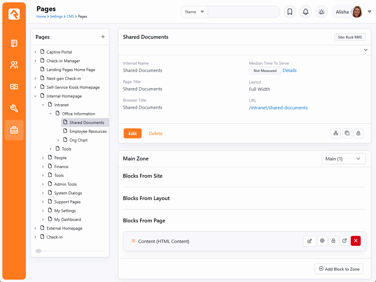
From here, you can edit an existing block by clicking the
button. You can also add a new block by selecting the zone where you want the block to go from the dropdown menu on the right,
then clicking Add Block to Zone to display the Add Block window.
Add Block
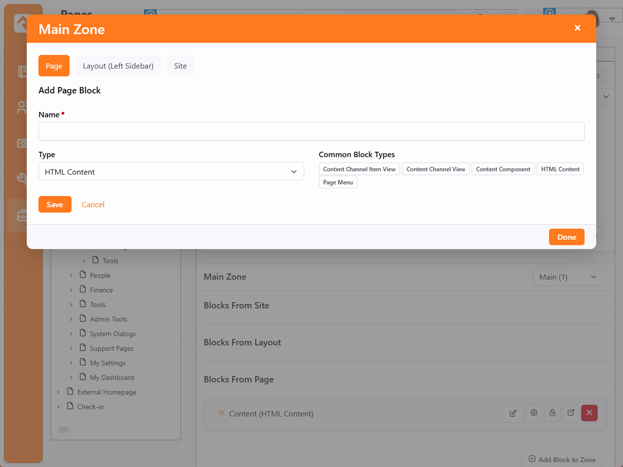
Note here the option to add this block to the Page, Layout or Site. Just like
adding a block to your external site, you need
to decide if you want this block to only appear on the current page, on any page using this layout or across your entire internal site.
The Layout and Site options are best used when adding a block you know for sure belongs on every page, such as a header or footer. Otherwise,
it's best to use the Page option.
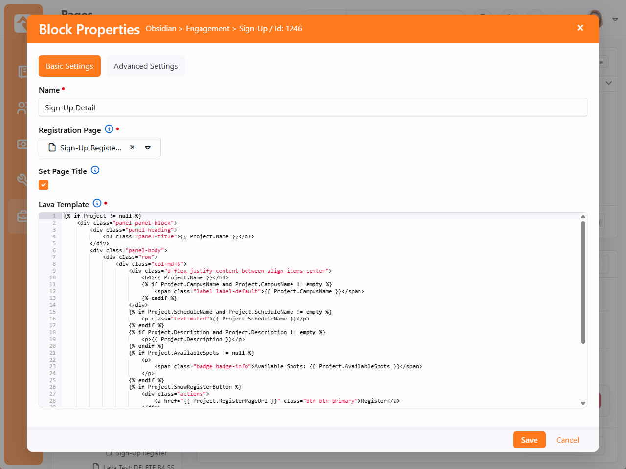
To edit an existing block’s properties, click the
button. Rock will display the Block Properties screen.
The options displayed will depend on the kind of block you're editing.
Block Properties
Managing Content and Pages
The Admin Toolbar
is the gateway to a majority of Rock's content management features. This bar is
displayed at the bottom of each page that the logged in person has rights to manage.
It's always available at the bottom of the page, but it's hidden until you hover
over it with your mouse.
Admin Toolbar

You can find the following buttons/links on the toolbar:
-
- Block Configuration
-
- Page Properties
-
- Child Pages
-
- Page Zones
-
- Page Security
-
- Short Links
-
- Rock Information
Page Load Time
When we started to plan for Rock, we listed out our high-level goals for the
project. One of these was "Speed as a Feature." For us that was more than
just words, we wanted it to be real and measurable. One of the first features
we added was the page load time in the admin bar. From that moment on speed
was put in front of us on every page we loaded. We kept it there, not only as
our contract with you, but also so you could measure your custom modifications.
Block Configuration
Clicking the block configuration button ()
in the admin toolbar will bring up
a fly-out menu over each block on the page. Rolling over these menus will
allow you to:
-
Edit Content: This opens the content for the block to be edited and managed.
-
Block Settings: This brings up a dialog that allows you to manage the block settings for the block.
-
Block Security: This item allows you to edit the security of the
block. This not only allows you to control who can view a block, but
also who can edit and administrate blocks.
-
Move Block: Selecting this item allows you to move the block to a
different zone on a page. You can also move the block from the pages
zone to the layouts zone. This will make the block available to each
page that uses the layout.
-
Delete Block: For everything there is a season; a time to add and
a time to delete. When it’s time to delete, use this option.
Block Flyout
Page Properties
The page properties ()
dialog allows you to edit all of a page's settings. This uses the same screens, with the same options, as we
saw on the internal site in the prior chapter.
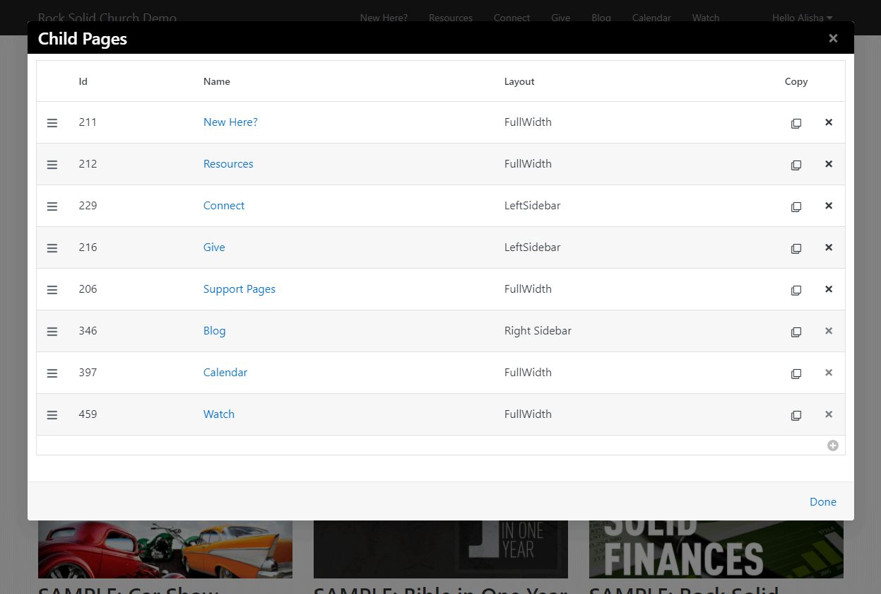
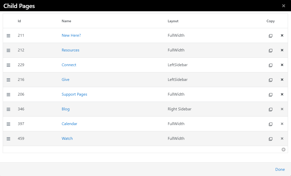
Child Pages
The child pages ()
dialog allows you to see a list of child pages of the current page.
From this list you can reorder the pages, delete a page,
copy an existing page or add a new page.
You can also use this list to navigate to a page that might not be available in
the menu.
When copying an existing page, not only is the page copied, but also the page blocks, child pages,
and child page blocks. What a time saver! Even though Rock will re-wire up any references between the new
blocks and new pages, it is wise to double check your block settings to verify everything is what
you expect.
Child Pages Dialog
Page Zone
Clicking the Page Zones button ()
will enable the zone fly-out menu for each zone
defined on the page. From this menu you can bring up the zone dialog below.
Page Zone Dialog
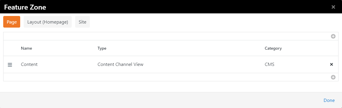
From the zone dialog you can add or delete blocks in a zone. The tabs at the top
of the page determine if the blocks will be added to the current page, the layout or the site.
Adding the block to the layout will enable it to be shown on all pages that use that layout.
Adding the block to the site will place the block on every page in the site.
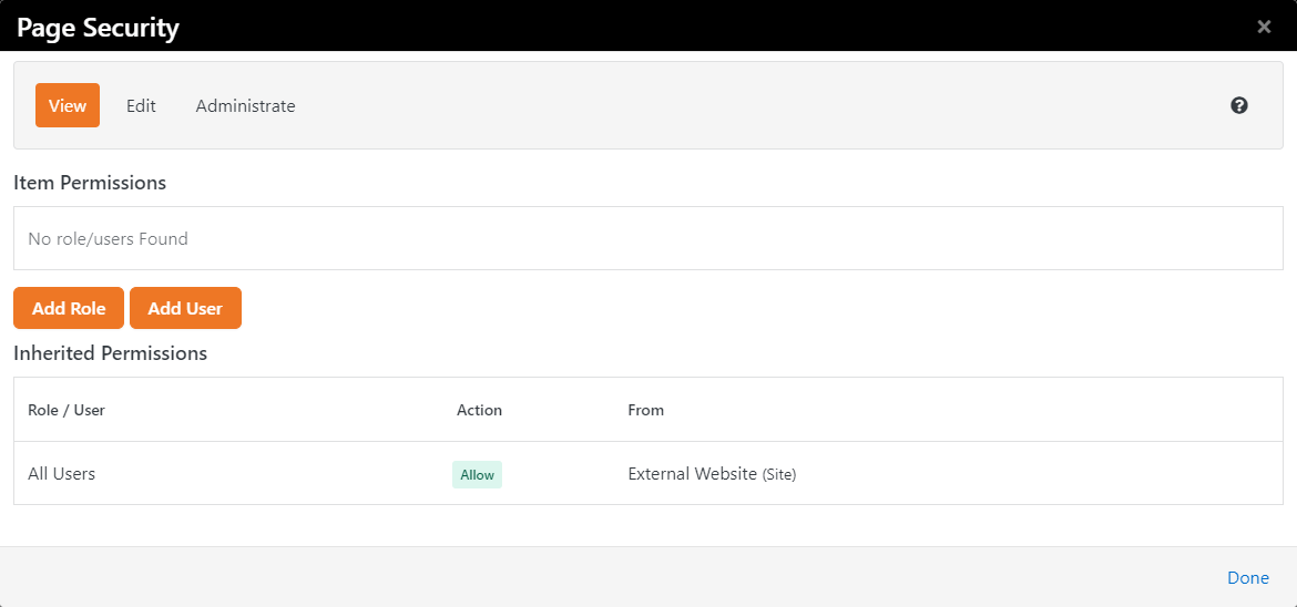
Page Security
The Page Security ()
dialog allows you to set security for the page. This allows you to determine who
can view and administrate the current page. Note that page security is hierarchical.
If no specific security rights are defined by a page, it will use the security settings
of its parent and its parent's parent. If no page above it defines any specific
rights it will use the rights defined for the site. This allows for a robust and
flexible security implementation with minimal configuration.
Page Security Dialog
Short Links
Short links
()
are exactly what they sound like: simple, user‑friendly links that replace long, messy URLs. But don’t let their size fool you. These links handle a lot behind the scenes, from tracking engagement with analytics and capturing helpful marketing data. You can even schedule these links to redirect automatically when you need to update or change their destination.
To start, click the
button in the Admin Toolbar to display the Shortened Link window.
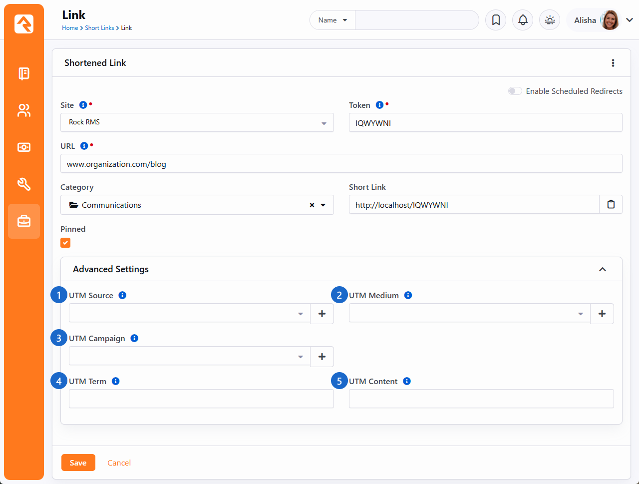
Shortened Link
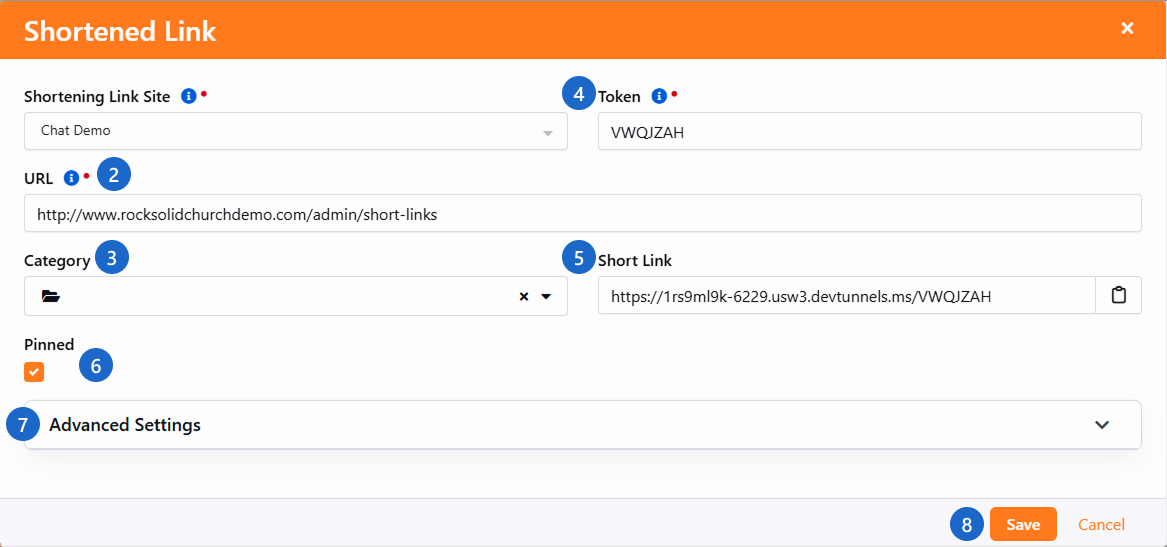
- 1 Site
- This is where you choose which site you want to use for the short link. Only sites that have the Enabled for Shortening option checked will appear in the options. The Enabled for Shortening option is located in the site's Site Detail screen. See Creating A New Site for more information.
- 2 URL
- This is the URL to which the short link will redirect individuals. The default is the URL of the current page, but you can change it to any valid URL.
- 3 Category
- Pick the category that best fits your Short Link to organize it by use. For details on creating categories, see below.
- 4 Token
- The token is a unique, random value at least seven characters long that is used to identify the page in a short link. Rock generates a default token for you, but you can also provide your own. Remember, the token must be unique and at least seven characters long.
- 5 Short Link Preview
- This is the generated Short Link, based on the Site, URL and Token fields. It updates automatically as those values change. Use the button to copy it.
- 6 Pinned
- Select this for your most important Short Links, those you will use often. Links you pin will be displayed at the top of your Short Links list.
- 7 Advanced Settings
- Advanced configuration such as setting an Urchin Tracking Module (UTM) for your link. More on this below.
- 8 Save
- The short link will not work until you click Save. Clicking Save will also automatically copy the short link to your clipboard.
Managing Your Short Links:
It's wise to start organizing your links early by pinning or categorizing them. Someday you may have thousands of Short Links, especially if they're automatically created through workflows or integrations. Good organization makes it much easier to quickly check analytics and maintain clarity as your list grows.
Domain Order
Be sure the domain you want to use for your Short Link appears first in your site's Domains list. Rock uses the first domain to build the Short Link.
Go to Admin Tools > Websites, edit your site and reorder the domains so your desired domain appears first.
To add a new category, make sure it uses the EntityType of
PageShortLink. Only categories with this type are eligible
for use with Short Links. You can set this in the
Admin Tools > Settings > Category Manager.
For example, you might create a Children's Ministry category
to keep all related Short Links organized. You can also configure security so only Children's Ministry staff can access or
manage those links.
Managing Short Links
As you create short links, they can be viewed and managed in the Short Links page found at
Admin Tools > CMS Configuration > Short Links.
Short Links
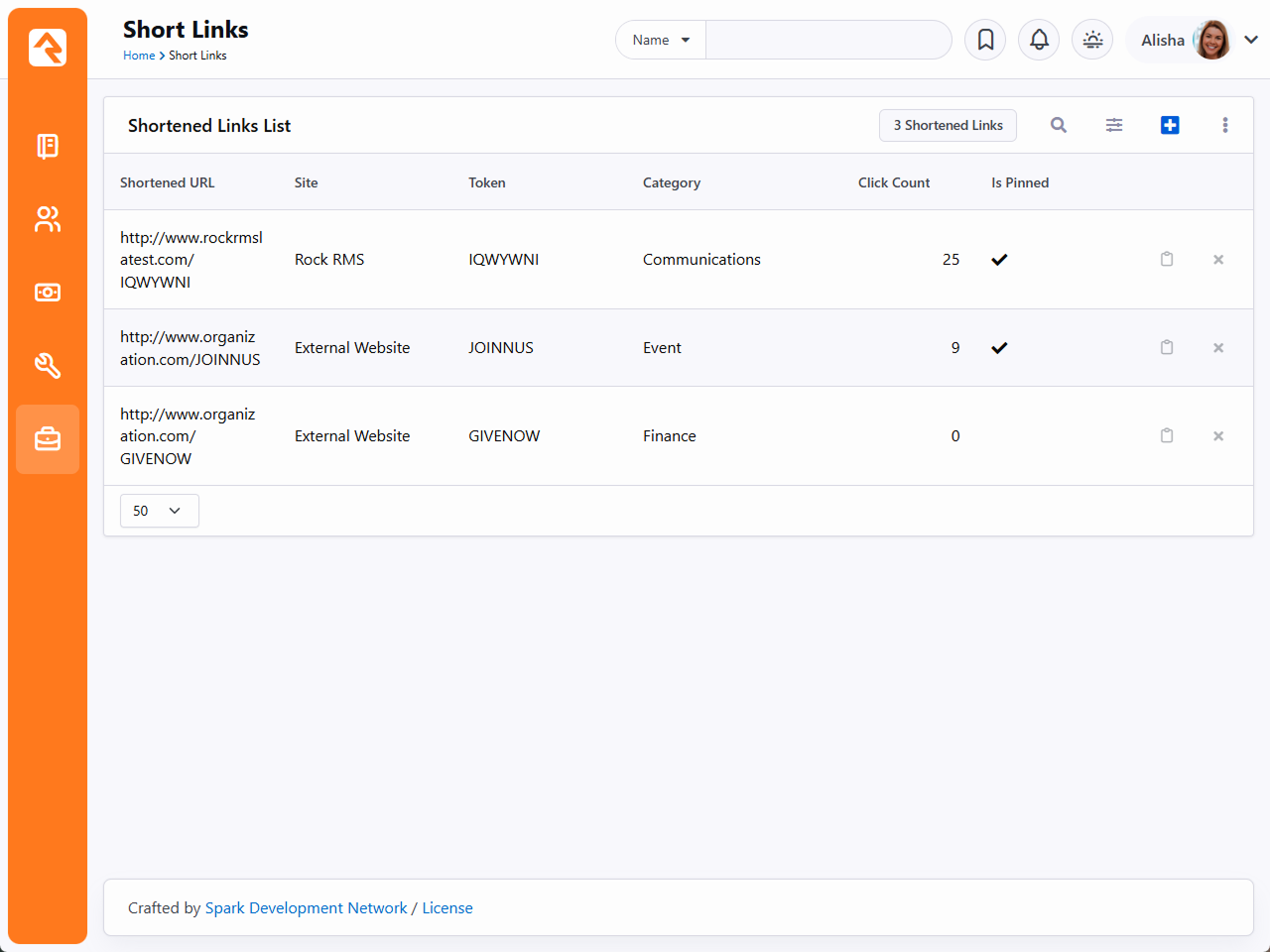
As your list of Short Links grows, you can keep things manageable with built-in filtering and sorting. Press
for global options, or hover over a column
and select to narrow the results.
Click any Short Link in the list to view or edit its details and see where it has been used. To copy a link, click the button. To filter by creator, select the icon.
Create Short Link Workflow Action
You can also create short links as part of a workflow. For more information see Create Short Link, located in the Utility section of the Workflow Action Documentation.
Advanced Short Links
When it comes to short links, there's more than meets the eye. With Advanced Settings, you can tack on UTM codes to track where your traffic’s coming from—perfect for tracking marketing campaigns and collecting valuable data.
When editing or adding a new Short Link
from the Short Links List block, you will notice that the
detail screen looks a little different, and has some new features.
Short Link Advanced Settings
- 1 UTM Source
-
Who sent the traffic. (e.g., Facebook, Newsletter)
- 2 UTM Medium
-
How the link was shared. (e.g., email, SMS, social)
- 3 UTM Campaign
-
Under what campaign was the link shared. (e.g., SpringGroups, Launch2025)
- 4 UTM Term
-
What keyword triggered the link (mainly for ads).
- 5 UTM Content
-
Which version of the link was clicked (great for A/B testing).
Once you have started collecting data with UTM parameters, you can track performance similar to other analytics platforms like Google Analytics.
Streamlining UTM Parameters
The UTM Source, UTM Medium and UTM Campaign fields use a list that preserves the values you use. This process ensures consistency and easy retrieval of UTM values you have used before. Under the hood, these values are being saved as Defined Values.
Using UTM Parameters Manually
You don’t have to use the UTM fields in the interface. You can manually add them to the end of a URL when sharing a link. The Advanced Settings are simply provided for convenience.
Short Link Scheduled Redirects
By utilizing Scheduled Redirects, links can dynamically re-route
clicks during a specified time period.
Here is an example of the power Scheduled Redirects brings:
You might place this URL in a QR code or an NFC token located in your auditorium. The link could change depending on the event. On weekends, it might direct to a giving page, while during weekday events, it could point to your event schedule.
If you toggle Enable Scheduled Redirects on when editing a Short Link, then click the
,
you can create a new Scheduled Redirect.
Scheduled Redirect
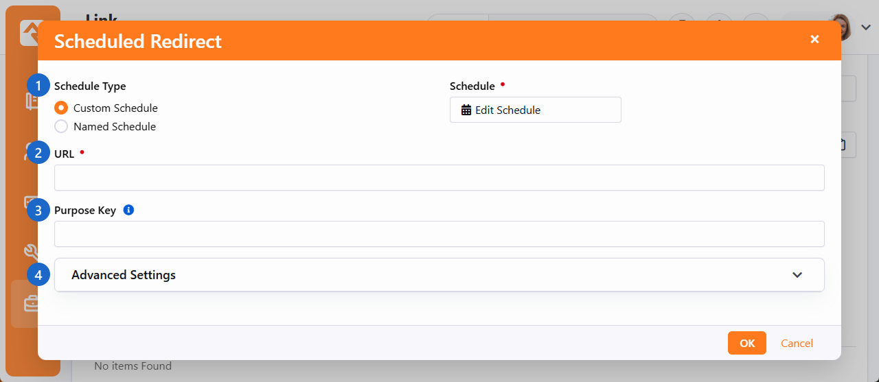
- 1 Schedule Type
-
- Custom Schedule
When using a Custom Schedule
you can determine a one-time or recurring schedule for when this link will redirect those who click.
- Named Schedule
When using a Named Schedule
you can select a pre-configured schedule. Create a new one under Admin Tools > Settings > General > Schedules.
- 2 URL
-
This is the URL to which the short link will redirect individuals.
- 3 Purpose Key
-
Optional parameter used to describe what the specified URL represents. (e.g.: event_registration)
- 4 Advanced Settings
-
UTM settings can be individually configured for each redirect link. See Advanced Short Links for more information.
Make sure to click OK when you are done.
Using UTM Campaigns With Scheduled Redirects
Imagine your 'Church Information' link is scheduled to redirect to a Small Groups page during weekdays. Setting up a new campaign for that link will allow you to collect more targeted data on who is searching for your church throughout the week versus searching on the weekends.
HTML Content Block
The HTML Content block is one of the most powerful blocks provided by Rock. As
someone who creates and maintains websites, you're going to love it. Let's
walk through each of its features in detail.
Basic Usage
To edit an HTML block, click the
icon in the Admin Toolbar
at the bottom of the page where the block has been placed. Next, move your cursor over the
(Block Fly-out) toolbar and select the
(Edit) button. This will bring up the edit modal (shown below). This modal allows you to edit
the contents of the HTML.
HTML Editor
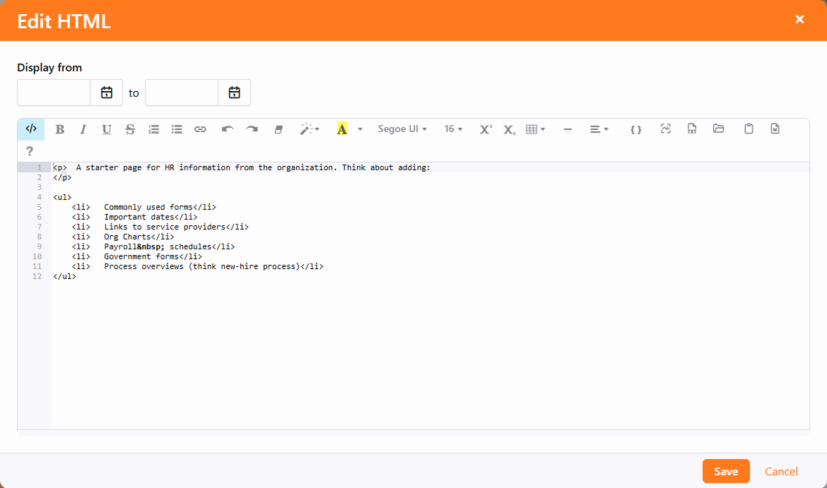
Near the top-right of the block, you can also set a date range for which the content
is valid. This is great for adding date-sensitive messages. Just keep in mind that the
dates are based on midnight. So, if you want to see content from January 1 to January 7,
you would set the first date to January 1, and the second date to January 8. In other
words, the content will be displayed until, but not on, the second date.
HTML Content Block Settings
While the default HTML block settings are great for typical usage, you have a
ton of extra options that you can use to do some really cool things. Like
any block, to get to the settings click the
icon in the Admin Toolbar
at the bottom of the page and then select the
button from the block fly-out menu. This will bring up the block settings dialog.
Let’s look at each setting in detail.
Editor Mode
The HTML editor has two different edit modes: code and WYSIWYG
(What You See Is What You Get). The code editor mode (default) gives
you a very powerful and rich code editor that allows you to modify
your HTML in a highly controlled manner. If you're comfortable writing
HTML, you'll love this mode as it will feel like your favorite code
editor. Really, there are so many features. Check out the
keyboard shortcuts
#mindblown
If you are more comfortable using a rich text editor that creates the
HTML for you, change Use Code Editor to No.
This will change the edit to a WYSIWYG editor. This editor includes a very nice
image and
file uploader that makes it simple to move your files to the server.
And of course, the
asset manager to upload a file already stored in your cloud.
There is also a merge field {}
button that lists all of the personalized merge fields you can add to your content.
WYSIWYG Has Its Limitations
While the WYSIWYG editor is very powerful it does have its limits.
The HTML markup it produces may frustrate the advanced web designer.
We recommend using it to allow non-technical staff the ability to
edit small portions of content. It works great for limited non-technical
use. As you start to edit large portions of the page you may want
to have more control of the HTML markup. This is where the code
editor mode excels.
Document and Image Root Folders
The next two settings set the root folder for the image and document
uploaders. This allows you to customize the location per block. This
is helpful when you give a specific department access to edit a
portion of their website. Instead of giving them access to the
default contents folders, you can give them their own sub-directory.
This helps keep things nice and tidy (OCD'ers unite!)
What’s Up With the Tilde?
You may notice that many file paths in Rock start with the ~ character.
This is a shortcut character that represents the application's
home directory.
User Specific Folders
In some rare cases, you may want each person using the HTML editor
to have access to their own directory when editing. We do this on
the Rock website for the Q&A. Each person can upload images to
include in their posts. However, we don't want individuals to
see/edit/delete each other's photos on the server. By enabling the
User Specific Folders
option, each person will be given their own folder under the document
and image root folder for placing their images.
Cache Duration
Caching is your friend, but to understand it you have to know what's
going on behind the scenes. Whenever a person visits a page, Rock has to
dynamically create the page by querying the database for all kinds
of content. Rock must ask for and receive the most recent content
from the database for each HTML block on the page. While this is
relatively quick, it does take time. Caching speeds this up by
keeping a copy of the content in memory so a trip to the database isn't
needed. This can dramatically decrease the load time of a page.
You may notice that the first time a page loads it's not as fast as
subsequent visits. That’s caching in action.
The Cache Duration
setting tells Rock how long to store this copy, in seconds, before
going back to the database for a new copy. This value is set to one
hour by default. It's safe to increase this number because when the
content is updated the cache is automatically expired. Setting it
too high, though, could increase the size of the cache.
When to Avoid Caching
If the cache contains a Lava Command (like {% stylesheet %} or {% javascript %}), the command will not run. Split this code into a separate block that has caching disabled.
Also, don’t cache Personalized Content. If you have used merge fields in your content (similar to the baptism
example in the introduction) it's important that you disable
caching by placing "0" in this setting. Otherwise, individuals
will see the personalized message from the first person who
visits the page. That’s embarrassing...
For more information on caching in general, check out the
Caching for Rock Websites
chapter of this guide.
Context Parameter
Context parameters can be tricky. For each Context Parameter, you must enter unique content (Edit HTML).
The content is not shared between parameters. Adding content for each parameter allows you to use features like
Display from dates, versioning, and approval. Before we discuss how they can be used in the HTML editor be sure
to first read about them in the Using Context chapter below.
The HTML Editor can dynamically merge in the contents of the context parameter. Say for instance
your page allows the guest to switch the Campus
context. You may wish to have the campus name appear in the content of your page. This is also useful when
you have a page set with a group context.
The merge field format is Context.[ObjectTypeName].[ObjectField]. For example, to display the current campus context name,
you'd use a merge field of {{ Context.Campus.Name }}. Make sure that the HTML Content block is not
caching, otherwise the content will not be dynamic.
Note
It's not required to set the "Entity Type" setting under the Context section of the HTML Content block settings for
this to work. However, you may need to do that in some cases so that the page knows to load a particular object type
into context.
Context Name
In many cases you might have content that you would like to be the
same across a wide number of pages. A good example of this might be
a copyright statement in the footer of each page. Adding this to each
and every page would be a painful task, not to mention having to
update it every year. Remember that while blocks live in a specific
zone they can be applied to a page or a layout. When assigned to a
layout, the content will appear on every page that uses that layout.
That gets us closer to our desired state, but we still need to update
the content on every layout. Enter Context Names.
When you provide a context name, you are able to link HTML content
across HTML editor blocks. All blocks that use the same name in the Context Name
setting will share the same content. Edit in one place and it will
change in all blocks.
So, for our footer example we could put the name "website-footer"
into the Context Name
of each HTML block in every layout. After setting this up we can
easily update it on every page with a single edit. Pow!
Require Approval
There is a leadership principle that says, "Trust, but verify."
That's especially true when you give a non-technical staff member
access to edit your external site. There are times when you'll want
to see their changes before those changes go live.
By enabling the Require Approval
box, all edits made by individuals without Approve
rights to the block will not be shown until someone who does have rights
approves them. This approval can be done under Tools > HTML Content Approval.
Keep Your Eye On This Page
There are currently no notifications that content needs approval,
so keep your eye on the HTML Content Approvals page. Notifications are coming soon.
When you enable approvals, versioning is automatically enabled too.
Otherwise, the content would disappear from the page until the
approval takes place. With versioning enabled, the previous content
will show until the new content is approved.
Versioning
When you make an edit, sometimes you may want to keep a
copy of the previous content. Enabling versioning will keep all
previous copies of the content. While this is nice to have for use
as a backup, it's even more powerful when used with date ranges.
When versioning is enabled, Rock will pull the most recently approved
content that meets the date range. This is very powerful when adding
seasonal or temporary messages to a page.
Say for instance you want to add a highlighted message about an
upcoming event. You could add a new version of the content with the
highlighted message and provide a date range of when it should be
shown. Working ahead (with Rock you'll actually have time to), you
might add the content two weeks before it should be shown. Rock will
keep the current content visible until the start date. Then the new
event-specific content will be shown. After the end date, the
previous content will again be what your visitors see. No need to
remember to take it down. See all the time you're going to save?
Validate Markup
This option determines whether or not Rock will check your work and validate that you have
accurate markup. If something's wrong, you'll get a warning message indicating the problem.
But sometimes, especially if you're using Lava or SQL, what you wrote may be valid but
is viewed as incorrect HTML during validation. In those cases, you can turn validation
off, to avoid misleading error messages.
Pre/Post HTML
You might be thinking, "That’s a lot of features." But wait, there's
more. Switching over to the Advanced Settings
tab you'll find a couple more options. Sometimes you might want to give
your staff access to edit portions of the page, but you don't want
them to mess up parts of the content. For instance, there may be a
start and end paragraph you don’t want them to change or some special
markup that's needed for styling. While you could add a secured HTML
block before and after to hold this content, there's a much simpler
solution. Content you add to the Pre/Post settings will be placed -
you guessed it - before and after the content they can modify. This
saves you from having to add additional blocks.
Merge Fields
It's time to change the paradigm of how you write content. With Rock,
content doesn't have to be impersonal any longer. Using merge fields,
you can customize the content for the logged-in person. Not only can you
add their name, but you can look at all of the person attributes and make
the content relevant to their relationship with your organization. Let's
revisit the example from the introduction.
Adding the following on a baptism page allows for personal and actionable content:
{% if Person %}
    {% if Person.BaptismDate != '' %}
        {{ Person.NickName }}, remember the joy of your baptism? Share that joy
        with a friend who hasn't yet taken the plunge at one of our upcoming
        baptism events!
    {% else %}
        {{ Person.NickName }}, now is the time! Don't put off baptism any longer,
        take the plunge at one of our upcoming events!
    {% endif %}
{% else %}
    Take the plunge at one of our upcoming baptism events!
{% endif %}
Note the use of Lava syntax to add logic to the page. Here's
how the markup above would look:
-
If the person is logged in and has been baptized it shows the message:
"Alisha, remember the joy of your baptism? Share that joy with a
friend who hasn't yet taken the plunge at one of our upcoming baptism events!"
-
If the person hasn't been baptized yet they will see: "Alisha, now is
the time! Don't put off baptism any longer, take the plunge at one
of our upcoming events!"
-
Otherwise, if the person is not logged in, they are greeted with:
"Take the plunge at one of our upcoming baptism events!"
Besides information on the current person, you also have access to all organization attributes and items in the context of the page.
For more information on Lava syntax see the Lava Basics.
Pages vs Layouts
While it's already been noted before, remember that blocks can be
assigned to either a page or a layout. When a block is assigned to a
layout, it will be displayed on all pages that use that layout. This
is especially useful with the HTML editor block as you'll often want
bits of content to be consistently applied to several pages.
You can also apply the HTML editor block to the site level, though
this is done only rarely. Adding the block at the site level will
cause the block to appear on every page in the site. This could be
useful for header or footer content you want applied to all pages
site-wide.
Content Component
In Rock there are lots of ways to put content onto a page. For example, in this manual we have
sections covering HTML content blocks and Content Channel blocks. Another option is content components.
Content components can be thought of as a marriage between HTML blocks and Content Channel blocks. They're
a blend of content and style. Website designers can create great looking templates and define which
elements of information an editor needs to provide, while editors get a simple and clean tool for inputting
their content without having to worry about breaking the website.
Each content component has a custom Lava template, so you can do amazing things with their
values. Maybe you want to resize an image or add a clickable link to each heading. With
Lava the sky is the limit.
Content components exist because your site editors shouldn’t have to learn HTML to update your site. Without content
components, an editor needs to memorize specific steps in the text editor to get a certain result or, worse yet, copy
precise HTML markup. That approach is dangerous and prone to error. With content components you can template small blocks
of content so that even complex markup requirements are easily implemented.
Content Channels and Content Components
To help understand a little about what's going on behind the scenes, it's important to note that there's a hidden content
channel for each component.
Content Component Templates
With content components you’ll use a set of templates to manage content. Each template provides a set of fields and a
matching Lava template, which gives designers control over the output. Rock comes with a few example templates out of
the box.
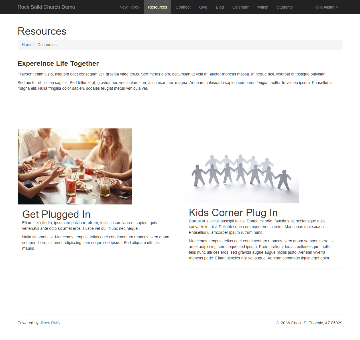
In the example below, the content component is set up with the
Side By Side template. There are actually two items
here, one with text on the left and another with text on the right. You’ll see below how this kind of arrangement can be
set up and changed.
Side By Side Template
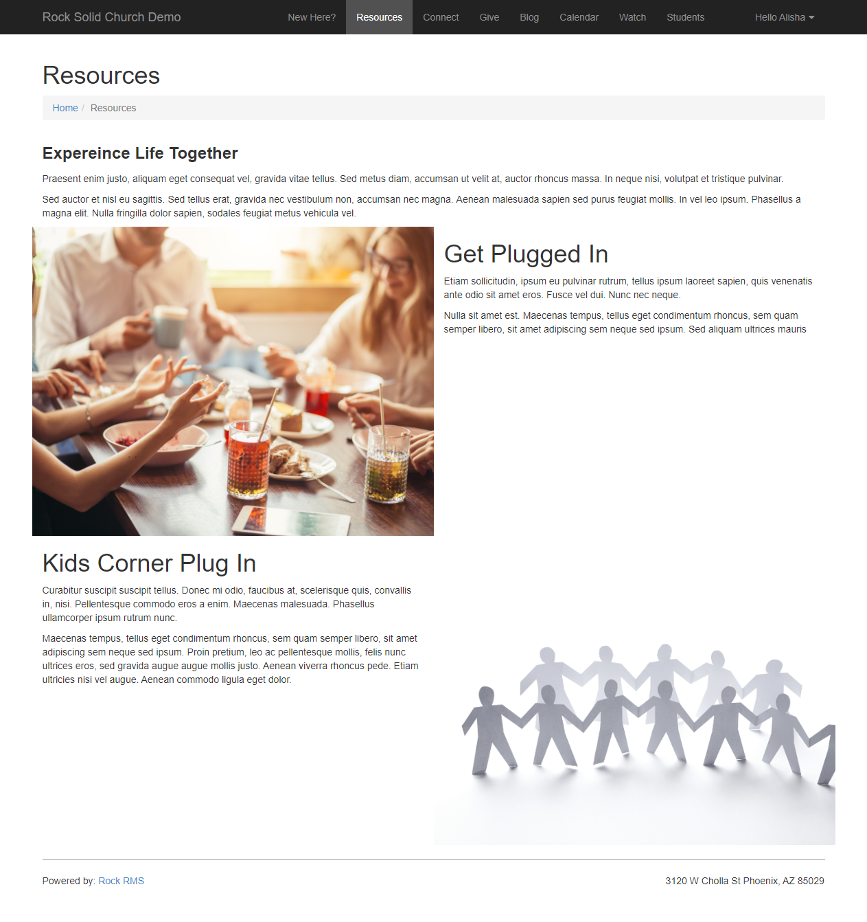
To achieve this consistent look the editors didn't need to learn HTML, they just entered
text into a few fields! Let’s take a peek at how this is set up behind the scenes.
Configuring Content Components
First, you'll need to set up the page and block settings. Check out the Page Zone
and Page Properties sections for more details on doing that. When adjusting
the Page Zone settings, be sure “Content Component”
is selected as the page block Type.
Then, click the icon for the block to open the content component configuration page.
Configuration Page
- 1 Component Name
- Provide a name for the content component. This is only visible internally.
- 2 Allow Multiple Content Items
- If you enable this, content creators can add several content items to a single section. The remaining
block settings described here apply to all of the content items, so this option is great for ensuring
consistency on the page.
- 3 Item Cache Duration
- Rock can cache the items returned from the database to help improve performance. Here you can provide
the item cache duration, in seconds.
- 4 Output Cache Duration
- Rock can cache the page output as well. This improves speed but is best used for non-personalized
information. After all, you don't want to display a wrong name because the page is displaying cached output!
- 5 Content Component Template
- Pick the content component template you want to use from the dropdown list of available options. There
are three available out of the box, but you can add as many as you want. The templates that ship with Rock
are:
- 6 Title Size
- The font size of the title can be adjusted by selecting one of the available options. This follows standard
heading (H) increments, so H1 will be larger than H2.
- 7 Content Alignment
- Pick where your content should appear within the block. The impact this has will vary depending on the layout
being used, so feel free to try different layout/alignment combinations to find what works best for your content.
- 8 Foreground Color
- Select the color of the font for your content. This applies to both the title and the actual content.
- 9 Background Color
- Select the color of the background for your content. The font/foreground color chosen will appear on top of the
background color, depending on the layout and whether or not you’re using a photo.
- 10 Filters
- You can selectively filter what content to show based on one or more of the content channel item fields or
attributes.
- 11 Advanced
- As with most blocks, you can add custom HTML that renders before or after the block.
After the content component block has been set up, the configuration bar will have the icon
available to add content.
Content Edit Page
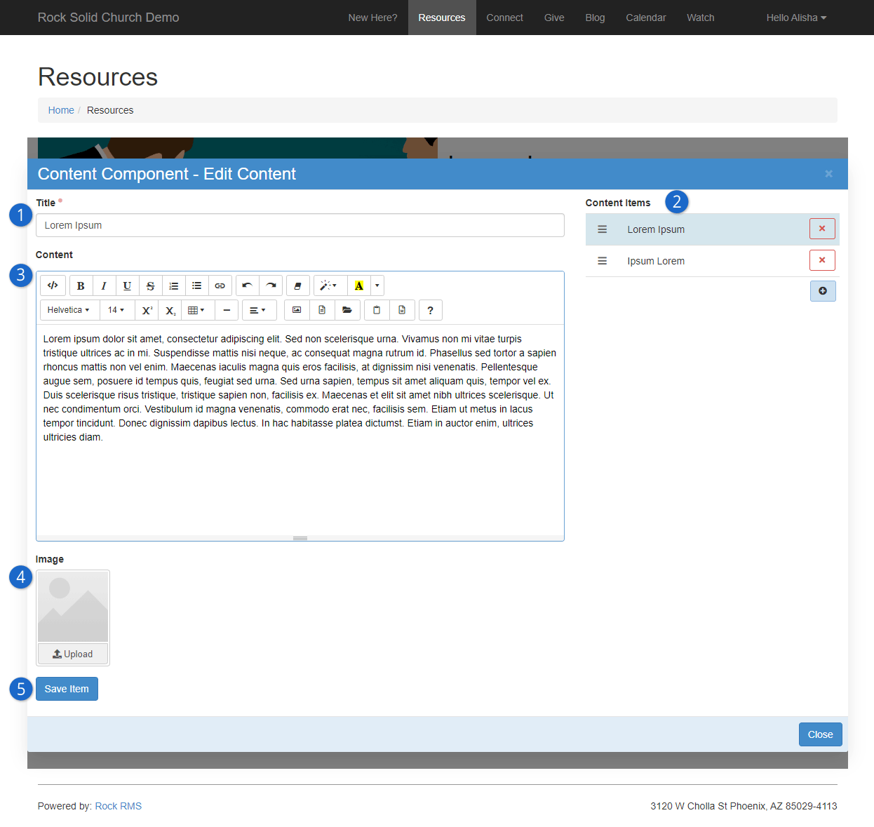
- 1 Title
- The title will appear on the website above the content you provide. The font size of the title can be changed using the block
settings discussed above.
- 2 Content Items
- This pane will only appear if Allow Multiple Content Items
is enabled in the block settings. Here you can add, remove or change the display order of the block’s content items.
- 3 Content
- This is where the actual content is added and edited. This is designed with common word processing features that editors are
generally familiar with, so they can be creative without getting technical.
- 4 Image
- An image can optionally be added. Try using images with different layout and alignment options (in the block settings) to see
what works best.
- 5 Save / Save Item
- If Allow Multiple Content Items is enabled, then you’ll
have a Save Item button below the image upload area. If
Allow Multiple Content Items is not enabled, then you’ll see a
Save button in the bottom right corner of the window, next to a
Cancel button.
Save Item
As noted above, the Save button moves around and changes its name
depending on your block settings. Whatever it looks like, don’t forget to find it and save!
Add/Modify Content Component
Now let’s say we want to change our content component from the Side By Side view to the Card view.
Those who have full admin rights can do that on the fly by going back to the content component
configuration page and changing the
Content Component Template.
Changing The Template
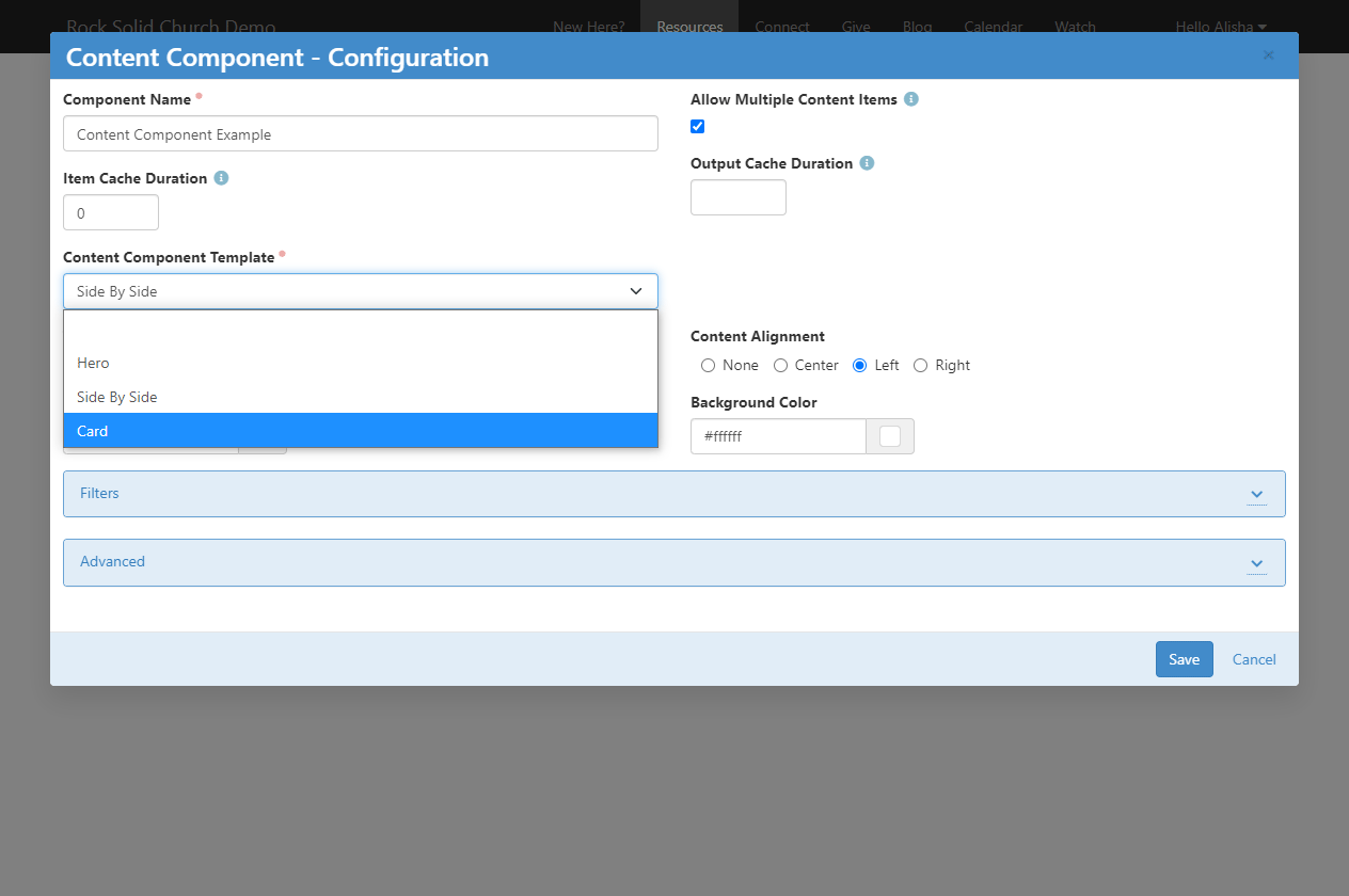
After the template has been changed the content will automatically be updated and will immediately look similar to this:
Card Template View
Simply changing the layout has resulted in a page with identical content but a very different look. Changing this setting, along with the
other available block settings, ensures your website can look just how you want it without requiring editors to wade through complex coding.
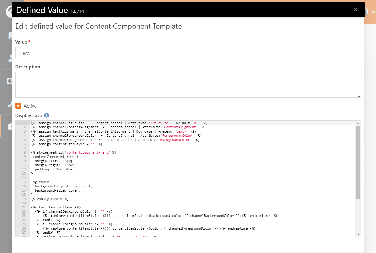
Creating Content Component Templates
Three content component templates are available to you right out of the box, but you can create as many as you need.
To create a content component template, navigate to
Admin Tools > CMS Configuration > Content Component Templates
and click the button on the grid.
Content component templates function just like content channel item lists, so all the power of Lava is available to you.
To see all of the available attributes and properties just add {{ 'Lava' | Debug }} to the
Display Lava field.
To make things easier we recommend copying an existing content component template (i.e., everything in the
Display Lava field) to use as a starting point for
building your own template. Your Lava will have access to both the content channel items related to the component as well
as the configuration settings (like the heading size).
Content Component Template - Display Lava
Content Component Item Attributes
Content Components allow you to add attributes flexibly. You can make attributes available to an individual content component,
to content components that use a specific template or to all content components.
Adding Attributes to Content Component Templates
Typically, you'll be adding content component item attributes to a content component template. This allows you to use
the attributes in a content component Lava template, guaranteeing that it will be available every time a block is added
to the page.
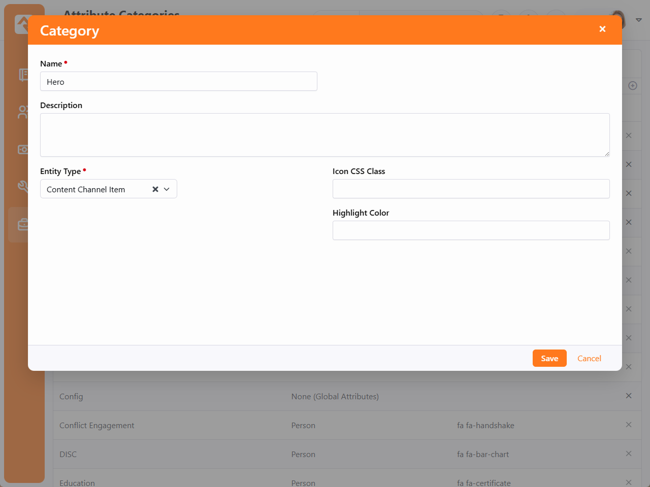
To get started we'll add an attribute category to the setup. Navigate to
Admin Tools > General Settings > Attribute Categories
and add a new category.
In the Name field, provide a name that is identical
to the content component template name to which the attribute will apply. For example, enter "Hero" for attributes you'd
like to add to the Hero content component template. In this case, the attributes would not be available to the "Card"
or "Side By Side" templates. You only need to add one category for each content component template you have.
Next, select "Content Channel Item" as the Entity Type.
Content Component Attribute Categories
Now, add attributes to your newly-created category by going to
Admin Tools > CMS Configuration > Content Channel Types
and editing the Content Component entry to access its
Item Attributes.
Content Component Item Attributes
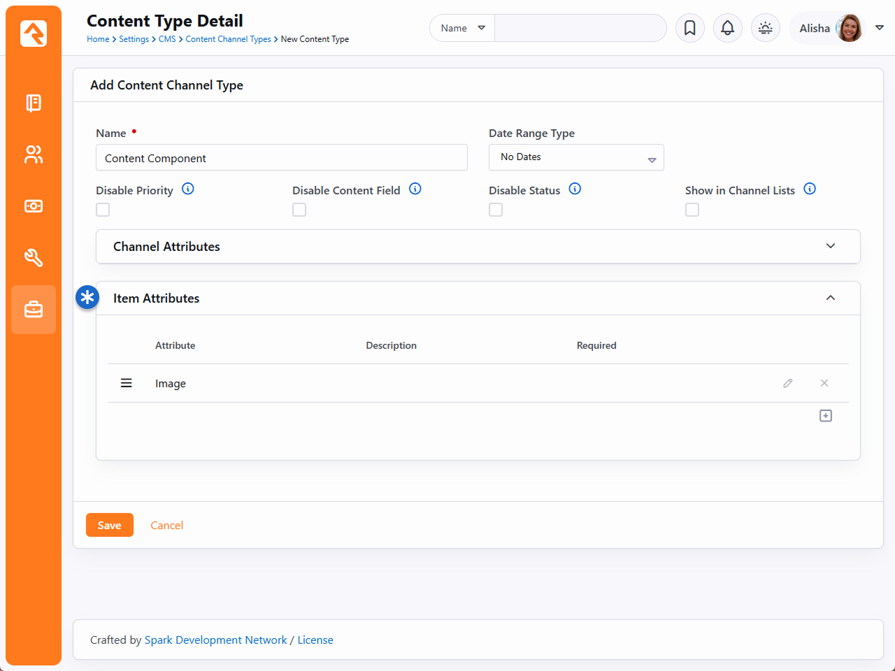
As pictured above, an item attribute for Image is already present.
Click the icon to add a new Item Attribute.
When adding the new Item Attribute, use the Categories field to select
the Content Component Template on which you'd like the attribute to appear. The rest of the setup is the same as any other attribute.
Same Attribute, Different Templates
Making a single attribute available across multiple templates is very similar to the process described above.
First, you'll repeat some of the above steps to create attribute categories for each content component template. Using what ships with Rock,
that means adding "Side By Side" and "Card" categories in the same way that we added the "Hero" category. Then, when adding the attribute,
you can select multiple categories (instead of just one) and the attribute will appear for each template according to your selection.
This method is the preferred way of adding attributes because it avoids duplication and prevents unnecessary attributes.
Adding an Attribute for All Content Components
Making an attribute available for all content components is easiest of all. Just like the scenarios described above, you'll start by
navigating to Admin Tools > CMS Configuration > Content Channel Types.
Edit the Content Component entry to access its
Item Attributes.
Then, add a new attribute by clicking the icon as described above. The only difference here is that
you'll leave the Categories field blank. Because a
Category isn't specified, the attribute will be available for use with
any template.
Managing Dynamic Content
Rock's advanced dynamic content tools allow you to extend the application without having
to write any code. That’s kind of a big deal, right? You can customize Rock for your
organization without any programming knowledge!
You may have already read a bit about content channels in the
Admin Hero Guide and
Event & Calendar Guide.
We're going to talk about how to manage content that is added to content channels, then dive
into how to set those content channels up. But first - a quick overview of the components that
make up Rock's dynamic content features.
Components of Dynamic Content
Rock's dynamic content tools are made up of three components.
Dynamic Content Diagram
- 1 Content Channel Types
- Channel types define the structure for the dynamic content tools. They define
what attributes are available on both the channels and content items. Rock ships with
several content channel types ready to use out of the box.
- 2 Content Channels
- Content channels are implementations of the channel types. For instance,
because there is a channel type of Blogs,
you can make blog channels for the organization's website, a specific person
and/or a specific area of your organization.
- 3 Content Items
- These are the specific data elements that make up a content channel. For a
blog channel these would be the specific blog posts; for the website ads channel
these would represent the specific promotions.
Now, let's jump right into adding and managing content items.
Managing Content Items
While it's possible to add new content items on the channel configuration page
(Admin Tools > CMS Configuration > Content Channels),
most of your staff won't have access to these screens. For staff, it's easier for
them to add their content under Tools > Content.
On this screen they will see a list of each content channel they have
View access to.
Clicking one of the items will display the content items for that channel.
Content Channels
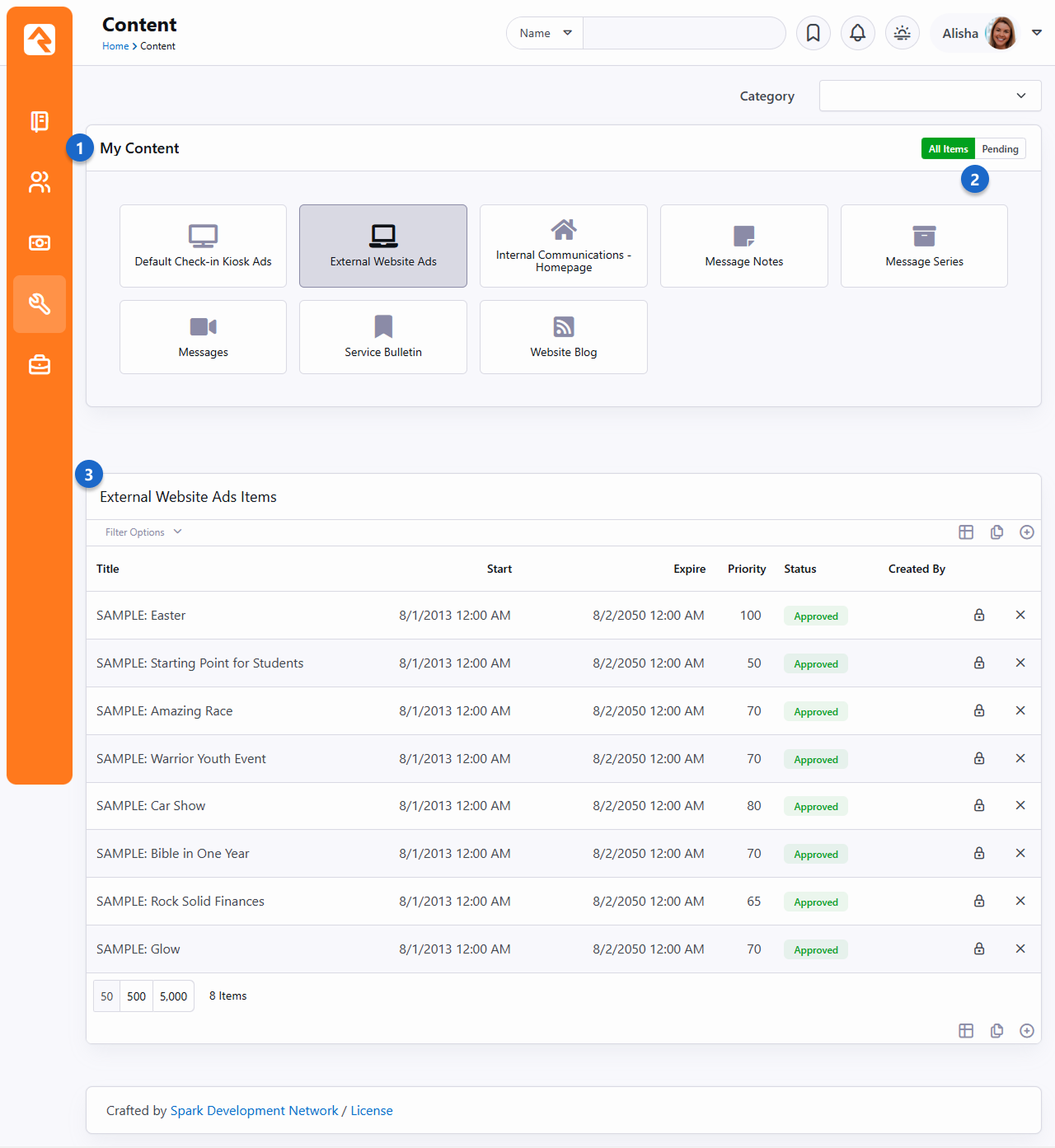
- 1 Content Channels
- List of the content channels that the current user has
View rights to.
A count of the number of Pending
items is displayed in the upper right corner of the channel.
- 2 Display Toggle
- Toggle switch to display all content channels, or only those with pending items.
- 3 Content Items
- A listing of all content items in the channel with the ability to filter by status,
date range or title.
Adding Content Items
To add a new content item, click the
button in the grid footer. This will bring up the add/edit screen pictured below.
Adding Content Item
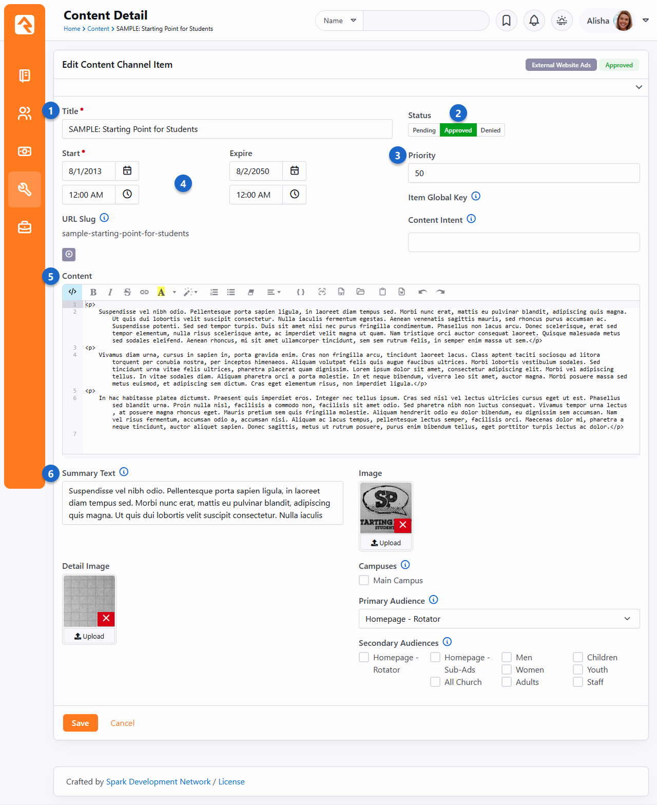
- 1 Title
- The title for the content item.
- 2 Status
- If approvals are enabled for the channel and the user has
Approval
rights, they will be able to set the approval status.
- 3 Priority
- The channel defines if the content items have a priority. If it's enabled, you
can set the priority here.
- 4 Dates
- Dates associated with the content item are defined here. The content channel type
determines what date options are available (Single Date, Date Range or No Dates) for the
item.
- 5 Content
- Every content item, no matter what type, has a content field. The channel
can determine if this field should use the HTML editor or the code editor.
- 6 Summary Text
- A short description of the item.
OK, now that we have an idea of how dynamic content works, let's take a closer look at content channels and content channel items.
Content Channels
Rock's static content tools are great. We've already seen how we can customize our
messaging using the HTML editor. Sometimes though, you still need the ability to
add structured dynamic content to your site. In the old days that meant firing up
a development tool and writing your own code. While custom coding is certainly an
option in Rock, in many cases it's simply not needed.
Let's take a look at how Rock's dynamic content tools can have you extending Rock in no time (and without
learning C#). Here are the three main components we'll review:
Dynamic Content Diagram
- 1 Content Channel Types
- Channel types define the structure for the dynamic content tools. They define
what attributes are available on both the channels and content items. Rock ships with
several content channel types ready to use out of the box.
- 2 Content Channels
- Content channels are implementations of the channel types. For instance, because
there is a channel type of Blogs,
you can make blog channels for the organization's website, a specific person and/or a
specific area of your organization.
- 3 Content Items
- These are the specific data elements that make up a content channel. For a blog
channel these would be the specific blog posts; for the website ads channel these
would represent the specific promotions.
Channel Types
The first concept we'll discuss is channel types. As you work on your site,
look for repeating data patterns. Items like web promotions are well-structured,
having data items like title,
image,
summary text,
intended audience
and content.
While you could edit all of this content with the HTML editor, hopefully you
can already see how that would be very tedious and prone to error. Here's
where content channel types come into play.
Content channel types help define reusable data structures (think of a
container for specific types of data). Rock ships with a couple of these
channels already defined. Let's look at a few to see their role and purpose:
-
Website Ads: This channel type is used to help manage
your website promotions. It allows your staff to enter promotion
information that your website administrator can approve, with the
option to edit, and then publish to the site.
-
Bulletins: This content type is used to help manage
the bulletin creation process.
-
Content Component: Gives web designers a great tool to control the look and layout of content on a page
while allowing content creators the ability to create this
structured content on-the-fly directly on the website.
-
Blogs: The blog content type is useful to build blogs for your organization.
-
Universal Channel Type: Rock ships with three Universal Chanel Types.
Each is a unique and powerful tool to help you from having to create
'One-off' channel types. We discuss these channel types in more detail below.
Anatomy of a Content Channel Type
As we mentioned before, the role of the content channel type is to define
the container and settings for a particular type of content. Let's walk
through the administration screen found under
Admin Tools > CMS Configuration > Content Channel Types.
Content Channel Type
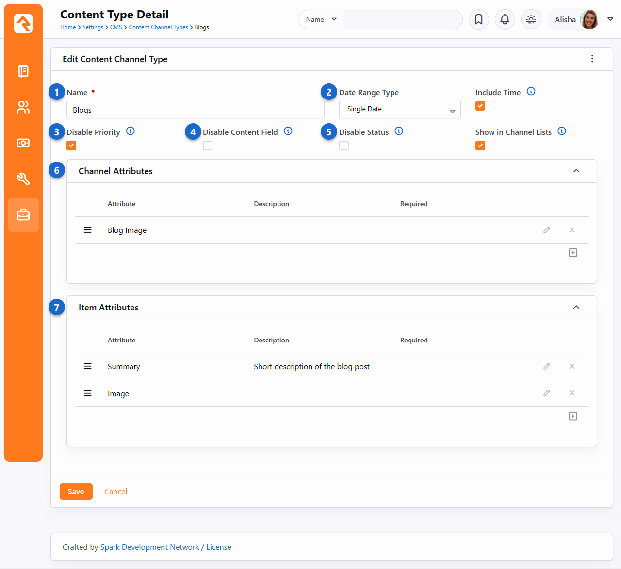
- 1 Name
- The name of the content channel type.
- 2 Date Range Type
- The individual content items that are added to the content channels can be
valid for a specific date (for example a blog post would have a
specific publish date) or a date range (a web promotion ad would be
valid for a range of dates). For some content items it might not make sense to have a date
at all, so you can also select
No Dates.
- 3 Disable Priority
- Some content items might have the concept of priority, while
others may not. For instance, a web ad might be low priority (which
would limit when and how it's shown), while a blog post would not
need to use the concept of priority. This setting allows you to turn
the need for priority on or off.
- 4 Disable Content Field
- This option allows you to disable or hide the content field, which can be really helpful if you want
to simplify the screen view as you build your channel, or if you want to create a kind of blank template
using only attributes.
- 5 Disable Status
- This option allows you to bypass the status and treat all content as "approved".
- 6 Channel Attributes:
- This section allows you to define attributes that relate to the
channel. For a blog channel this might be something like
blog description,
author,
or image.
Channel attributes aren't as common as item attributes; so, don't
worry if you have a hard time coming up with any.
- 7 Item Attributes
- Item attributes apply to each content item that is added to the
channel. Most content items get a date (depending on the
Date Range Type
discussed above) and a content field. Any other bit of information
you want to track for the content item will need an attribute to
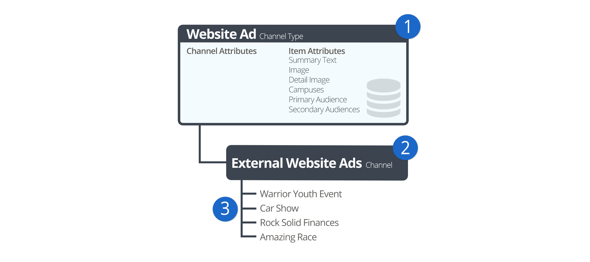
store it. For example, the website ads channel has the following
item attributes:
- Summary Text
- Image
- Detail Image
- Campuses
- Primary Audience
- Secondary Audiences
Content Channels
If content channel types define the structure, content channels
represent the implementation. Here's an example: you might have a channel
type of Blog
and channels Pastor Foster's Blog
and Rock Solid Church's Blog
that implement this type. You might be wondering why channel types are
even needed. The answer is that they help enable reuse. In our blog
example above, if you didn't have channel types you would have to define
the structure every time you wanted to create a new blog - yuck!
Create a new channel under
Admin Tools > CMS Configuration > Content Channels.
Add Content Channel
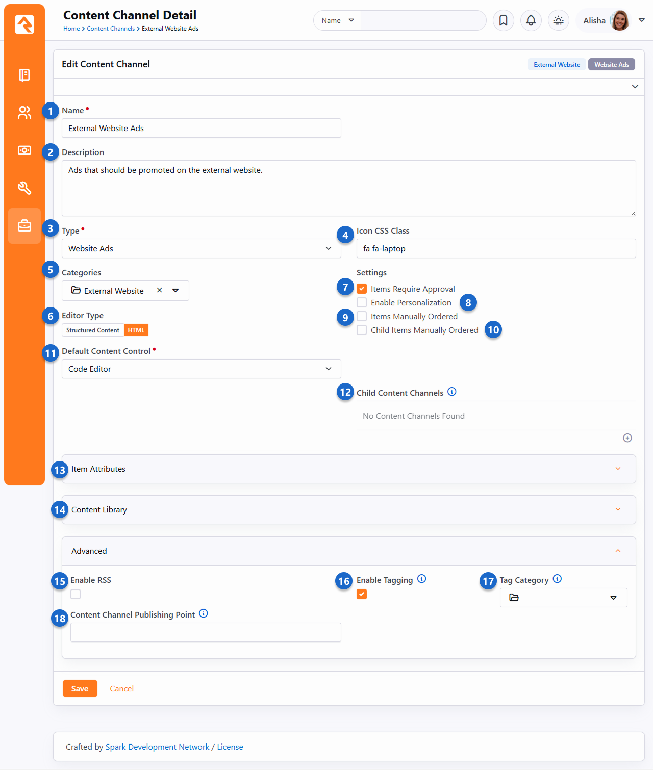
- 1 Name
- The name of the channel should be descriptive but not too long.
- 2 Description
- A description of the channel. This description is available to be displayed on the page.
- 3 Type
- The content channel type that this channel is implementing.
- 4 Icon CSS Class
- A CSS icon class to be used on the various internal entry and administration screens.
- 5 Categories
- Add categories so you can group and organize your content channels according to how they're used.
Navigate to
Admin Tools > CMS Configuration > Content Channel Categories
to add the categories you need for your content. Like other entities, a channel can be in more than one category if it's
needed in different areas.
- 6 Editor Type
- This is where you'll select the editor that will be used when adding new content.
- 7 Items Require Approval
- Depending on your use case, you might want content items to require
approval before they are displayed. This setting allows you to define
this on a per channel basis.
- 8 Enable Personalization
- This enables the personalization features for this channel's items. For more details see the
Personalization chapter below.
- 9 Items Manually Ordered
- Many times, content channel items will be ordered by date. Sometimes though, you'll want to manually
order them. This setting enables manual ordering.
- 10 Child Items Manually Ordered
- This setting determines if child content channel items should be manually ordered.
- 11 Default Content Control
- Select the default editor type used when creating content items.
- 12 Child Content Channels
- If content channel items are allowed to have child items, this setting determines which content channel
those items are allowed to be from.
- 13 Item Attributes
- Content channels inherit all of the item attributes defined by the channel type. There
may be times when a specific content channel needs to add a new attribute specific to its implementation.
You can add these new attributes here.
- 14 Content Library
- Define settings for the Content Library.
- 15 Enable RSS
- This setting enables the channel's RSS features. This allows the
content items to be published to an RSS feed that can be consumed by
an individual's RSS aggregator or another software system that
supports RSS integrations.
- 16 Enable Tagging
- Select this option if you'd like to allow the items in this content channel to be tagged.
- 17 Tag Category
- If you select Enable Tagging, the Tag Category dropdown menu is displayed, allowing you to select which category of
tags you want to use to identify the items in this content channel.
- 18 Content Channel Publishing Point
- If you want to provide a direct link to the content channel, you can enter the URL into this Lava-enabled field.
You’re not limited to HTML just because a Content Channel started that way. By enabling Is Structured Content, you can start using the structured content editor right away for every new item you add. This means team members who aren’t comfortable with HTML can jump in to help write blog posts, update external website ads or collaborate on ministry updates. It’s a great way to share the workload and invite more voices into your communication without losing the work you've already done.
Note that Content Items that were originally created with HTML will stay that way, but all new items will use Structured Content.
Content Channel Tags
Just as you can tag people in Rock, you can also use tags to help identify and categorize content channels. One small difference, though, is
only organizational tags can be used with content channels (as opposed to personal tags), and those tags must belong to a category specified
when the content channel is configured.
Let's take a closer look at how to set this up.
- The first thing you need to do to start using tags with content channels is set up tag categories. Categories are created in the Category Manager,
found at Admin Tools > General Settings > Tag Categories. Create as many categories
as you want. Once a category is created you will need to add a Role to the security under the Tag section for each. Otherwise added tags in that category will not be saved.
Using Categories
Each category will have a list of tags. Say you have a "Sermon" category and a "Podcast Sermon" category you would create two tags for each category.
Tags are all about how you want to organize your Content Channels. The power is in your hands to create the categories the way it makes sense for your organization.
- The next step is enabling tagging in your content channels. Select the content channel you want to tag from the list found at
Admin Tools > CMS Configuration > Content Channels
and click Edit to modify its configuration. Check the
Enable Tagging box, then select the category you'd like to be available for the content channel.
- The final step is creating the tags you'll use with your content channel items. You can create as many as you need. Tags are created in the Tags screen, located at
Admin Tools > General Settings > Tags. For each tag you create, use the Entity Type of "Content Channel Item"
and select "Organizational" for the Owner. Leave the Qualifier Column and Qualifier fields blank. Alternatively, you can add tags directly from the content channel.
You will be able to view and edit those tags in the general settings after they've been created if need be.
Now that your categories and tags are set up, you can add tags to content channel items. Simply type the tags you want to use in the
"add tag" area of the Content Detail screen and click Save when you're done.
Content Detail
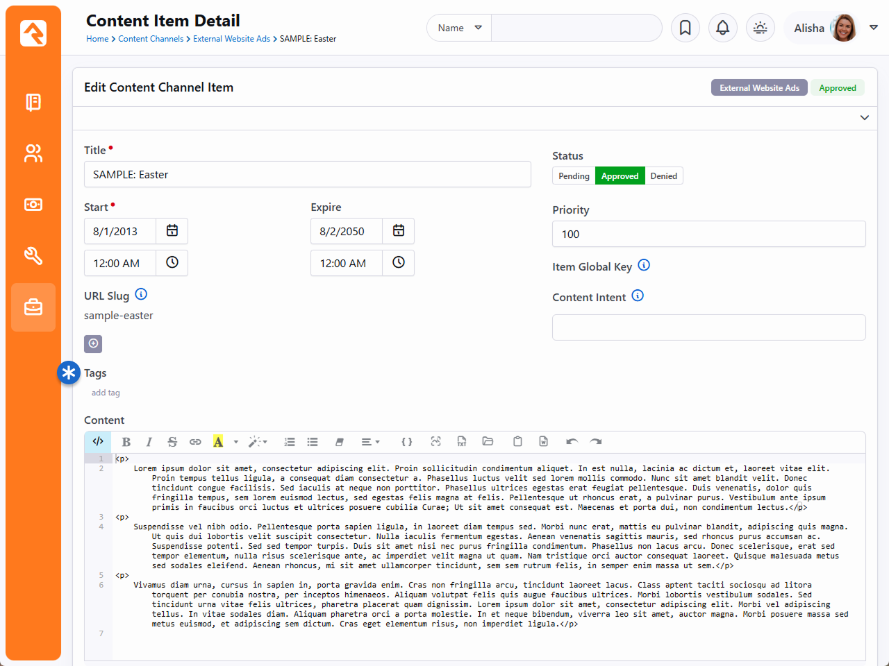
Block Settings
You can create a page dedicated to viewing all your content channel tags using the block settings.
Content Channel Items
Once you have your channels set up, it’s time to bring it all together and add some content. This is done by
adding Content Channel Items to your
Content Channel. If your channel is a blog,
then the channel item would be a single blog post. You can add items in one of two ways:
-
You can enter content right on the
Admin Tools > CMS Configuration > Content Channels
screen under the channel details by adding a row. This is more of an administrative screen.
-
Specific content entry pages can be found under
Tools > Content.
These are the pages that your staff can use to enter content,
and your communications team will use to approve and manage
entries. These screens are covered in the
Communicating with Rock
manual in detail.
The example pictured below is a sample content channel item entry for a Podcast series. The fields you see on this
page may vary according to your configuration as described in the prior sections.
Content Channel View Configuration
- 1 Title
- This is the title of the content item.
- 2 Start and Expire
- Items will only appear in the content channel on or after the Start date. You can optionally set
an Expire date to automatically remove the item in the future.
- 3 URL Slug
- You can add one or more slugs to customize the URL of the item. URL slugs are unique to each content
channel. This means you can use the same slug on items in different content channels without causing conflicts.
However, you can't use the same slug on multiple items within the same channel.
- 4 Item Global Key
- The Item Global Key is automatically
generated when you save, using the title of the content channel item. The value can be re-generated if
the item title is changed.
- 5 Content
- In this case we selected the HTML Editor
option when setting up the channel, giving us this editor. From here you can manually switch to the
Code Editor by clicking the icon.
If Is Structured Content
was selected in the channel setup, this area will look different, but you'll have many of the same tools.
- 6 Summary
- This field is an attribute that was added to the content channel setup. Each item added to the channel will have
a summary field like this one.
- 7 Image
- Like the Summary, this is also an attribute.
From notes to pictures, there's a lot you can do with content channel item attributes.
- 8 Child Items
- You can add child items here, as allowed by the channel's setup.
Lava In Your Content
You can use Lava in the
Content
area of the content channel item. However, for it to render on a Content
Channel Item View block, the block's settings must be updated. The
Lava Template
block setting needs to contain {{ Item.Content | RunLava }}.
Security Rights on Content
So now that we have covered content channel items, you might be wondering are there permissions that I can set up for these content channels? If you said yes, perfect you’re in the right place. If not, maybe check it out – just in case!
Rock provides special security rights, also known as verbs – that work to grant users permissions to specific pages. Right out of the box, Rock offers the traditional three settings – view, edit and administrate.
In addition to the basic three security rights, content channel items also have interact. Now on face value you might be thinking isn’t that the same thing as view or edit? Interact is similar – but totally different – in the best way possible.
Think of it this way…Say your organization creates high quality content that you want to offer to your website visitors. You want every individual who views your site to see that the content exists, so you give them view rights. However, only those who have interact rights will be able to watch or read the full details.
Another Lava Tip
For the Lava enthusiasts, there is Lava short code to make this happen for you. Try out the Lava filter “Has Rights To”.
Allow Approvals
If you have a staff member who needs to approve items before they go live, you'll set that up at the Content Channel Type entity level. Simply create a Security Role for your team, navigate to Admin Tools > Settings > Entity Administration > "Rock.Model.ContentChannelType" and allow the Approve permission for that role.
The Universal Channel Type
As you start brain-storming ideas for using content channels you'll find yourself needing to create
one-off channel types that will be used by a single content channel. For instance, when we set out to create the
Lava documentation we first needed to create a new channel type called
'Lava Channel Type'. We could then add a new content channel 'Lava Documentation' that implemented that type. Creating the
type for use with a single content channel was wasted effort, especially since content channels can add their own item attributes.
Hence the generic Universal Channel Types
were born. These channel types are generic types that you can use to build your
one-off content channels from. They have no attributes defined, so your channel will define all of the item attributes you
need. No wasted effort. The only difference between each type is what date fields are available, or if
no dates will be used.
No Magic Here...
There's nothing special about the Universal Channel Types. We created them to save you time and also provide a
consistent (well known) type that we (and plugin developers) can use to add new content channels from in the
future. Yep... we're always thinking ahead!
Showing a Channel on a Page
Now that you understand how to create content channels and items, the
next step is adding them to your external website. The main
block you will use to format channel content is the
Content Channel View
block. Adding this block to a page zone will allow you configure the
settings listed below.
Content Channel View Configuration
- 1 Channel
- The content channel you would like to display on the screen.
- 2 Status
- The content item status to filter on when creating a list of content items.
- 3 Format
- This is the Lava template selected to iterate through when
displaying content items on the screen. See the
Rock Lava
documentation for tips and tricks on using Lava in Rock.
If you're not using a template that ships with Rock (e.g., AdList.lava)
you'll likely need to start with
{% for item in Items %}
to iterate through the content items.
- 4 Items Per Page
- The number of items to make available for the Lava template.
- 5 Item Cache Duration
- Rock can cache the items returned from the database to help improve performance.
- 6 Output Cache Duration
- Rock can cache the page output as well. This improves speed but is best used for
non-personalized information. You don't want to display a wrong name because the page is displaying cached output!
- 7 Cache Tags
- Cache tags are used to link cached content so that it can be expired as a group. We have
a whole chapter on creating and using cache tags below.
- 8 Set Page Title
- This will set the page's title based on the channel content. By
default, it will display the channel name. If the query string
contains an item id (in the format of Item=1) then that item's title
will be used for the page title.
- 9 Merge Content
- When this setting is enabled, the block will look for Lava fields in
your content and attributes. Then, it will compile and render the
Lava. This allows you to put Lava logic in your actual content.
Think of the power of having blog posts that can actually be dynamic
to the user reading them!
- 10 Detail Page
- This setting allows you to define the detail page to add as a
Lava merge field. This allows your Lava template to link to the
detail page.
- 11 Enable Tag List
- You can add organizational tags to your content channel items as described
above. Enabling this setting lets you control the display
of content channel items by their tags in the Lava template (the
Format field described
above). Click the help tip icon for this setting for
details on the Lava. Enabling this setting also lets you use a query string parameter of
?Tag=tagname to filter the content channel items. These tags are used in
addition to, and not in place of, any filters (see below) you have configured.
- 12 Enable Archive Summary
- This feature gives you an option to let people access old or expired content, without having to keep
that content prominently displayed on your site. Using the additional 'ArchiveSummary' collection available
in Lava, the items'
Start Dates can be used
to order and group this content by month and year.
- 13 Filters
- The content filter is very similar to the data view screens. This section
allows you to filter by any attribute or property of the content item.
- 14 Context Filter Attribute
- This setting serves as a precision tool for your Content Channel View block. It allows
you to designate a content channel item attribute that can have its value referenced against the page's
context,
ensuring that only relevant items are displayed. Simply select the attribute
name from the list, ensure the content channel item has a value for that attribute, and
observe as your content seamlessly aligns with the context of the page. Before using this
feature, ensure you've defined the entity type in the block's properties to establish the
context.
- 15 Enable Query/Route Parameter Filtering
- When this setting is enabled, the block will try to determine the content item to
display based on a query string or route parameter value (other than the default ‘Item’
parameter). For instance, if you set this property and then include
?Title=Car Show in the
URL, the block will look for an item that has a
Title of ‘Car Show’. You
can also add an item attribute for your channel ("slug", for instance) and include that
attribute in the route to this page (series/{slug}, in this case). Additionally, you can add
'Month' and 'Year' parameters to filter content items by their Start date.
- 16 Order Items By
- Allows you to set the display order of the content items.
- 17 Personalization Options
- You'll use these settings to decide how personalization segments and request filters
are applied to the page. For details and a description of the options see the
Personalization chapter below.
- 18 Meta Description Attribute
- This setting allows you to pick an attribute to use for the meta description
tag in the page header. This description is used when people share the page
on social media.
- 19 Meta Image Attribute
- Allows you to set the page’s meta image tag in the header to the selected image
attribute defined on the content channel.
But Wait... There’s More
The settings above provide a ton of capabilities when adding dynamic
data to a page. This block can also respond to specific query string
parameters to alter its behavior. Let’s look at each of them:
-
Item: If you pass in an item’s numeric id, the block
will only load that specific item into the Lava merge fields. The
query string parameter you add to the end of the URL would look something
like
?Id=27.
-
Page: If you have more items than fit on a single
page, you can navigate between pages using the
Page
query parameter. Simply pass in the page number you wish to
display, like
?Page=2. If you pass in a page number
beyond the last page, the last page will be shown. If the page number
is less than 1, the first page will be displayed.
-
Attributes: Content channel items can have attributes,
and you can reference those attributes in the query string parameters. You'll
use the attribute's
Key and
Value to
do this. For instance, let's say you have an attribute indicating the general
topic of content channel items. If you just want to see items related to "Finances"
then your query string might look like
?Topic=Finances (or
?Topic=2 if the attribute is a single/multi-select field coded
with numeric values).
Rock also supports passing in multiple values for Defined Value
attributes that have 'Allow Multiple' enabled. In that case, the value you want
in the query string parameter will be the GUID of the Defined Value you're looking for.
Multiple values (i.e., multiple GUIDs) can be separated by a comma in the query string.
This will return any items that have at least one of the provided values.
Showing a Single Item on a Page
Your Content Channel View
block is great for showing all of the posts in a channel, but what about a block to show a
single content item? You can use the Content Channel View block and use an ID or Title parameter,
but we really want more SEO-friendly URLs. Enter the
Content Channel Item View
block, which brings you this and more.
Content Channel Item View Configuration Options
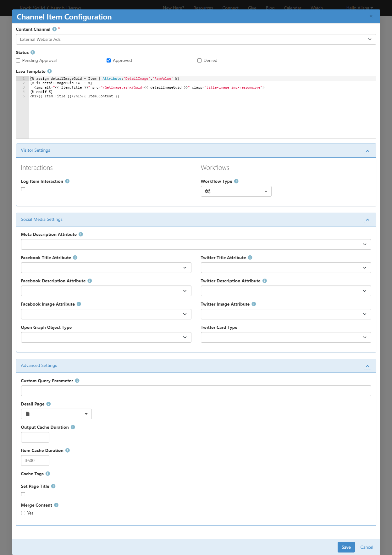
This block gives you the option to "lock" it to a specific channel so that you can have a
sermon series called "Moneywise" and a blog post titled "Moneywise" without having to worry
about your pages getting confused about which item to show. To limit its search to a single
channel, simply specify the
Content Channel in the
top input.
The Lava Template is the
template which will be used to determine what shows up on the page. Initially, this will
simply show the title of the item and the content below, but you can get really detailed in
specifying how this page will be laid out. Using the Item object, you can access
the properties and attributes of your content item for display on the page and even provide
links to other pages.
In the Visitor Settings
section, you can choose whether an interaction is logged every time someone views an item on
a page with this block. You can also specify a Workflow Type that should be launched whenever
this block is used to show an item. The workflow will be passed a
Person entity which you
can use to store the person who viewed the page (if they're logged in). If your workflow has a
Content Channel Item attribute
with a key of ContentChannelItem, that attribute will be automatically filled in
as well. You can use that attribute to discover which item they viewed, and optionally perform
different actions based on that information.
The Social Media Settings
section will let you link any item attributes you added to the channel to special meta tags on
the page. For instance, if your blog post has an image they've provided in an attribute, you might
want that image to be shown on the preview that appears in Facebook when someone shares your post
there. But you might want to ask your post author to provide a different image for Facebook than
the image for Twitter, so you can use these fields to specify which attribute will be used for
each social network.
Finally, in Advanced Settings,
you can specify what this block calls a slug, if you use that parameter in the URL. For example, if
you wanted to provide a URL with ?sermon=MoneyWise at the end instead of
?slug=MoneyWise, you could type "sermon" into this box, and it would look for an item
with a slug matching the "sermon" parameter in the URL. (Of course, using parameters like this would
break the SEO friendliness that this block was designed for, so it would be an unusual case that
you would want to put anything in this field). Usually, you'll just want to access the page using
an address like "/sermon/MoneyWise" which would match a Page Route of sermon/{slug}.
You can also specify whether the output and the item content itself is cached to speed up page
loads. You can also allow the item being viewed to set the page title so that your users aren't
seeing a generic title like "Our Sermons" when they load a page that is showing a sermon called
"Our Cloud of Witnesses".
Tips and Tricks
Below are some tips and tricks to help you maximize your usage of dynamic data:
-
When you enable the ability to use Lava in content items, be
sure that your Lava is set up to display data when the current
user or other merge items are not available. When the content is
made available via RSS, many of the merge fields will not be available.
-
The RSS feed for a channel can be linked to from the address:
http://yourserver/GetChannelFeed.ashx?ChannelId=N
where N is the channel id.
Publishing Content Through Feeds
Once you enter your content, you may want to make it available through feed systems like RSS. Rock provides an
endpoint that allows you to push your content in this way. The URL for this end point is:
http://yourserver.com/GetChannelFeed.ashx?ChannelId=X
The only required parameter is the ChannelId of the channel you want to publish.
This channel must be configured to Enable RSS
for the feed to return content.
The structure of the feed is defined by a Lava template. The RSS template is used by default, but you can
create and configure additional templates to suit your needs. These templates are managed under
Admin Tools > General Settings > Defined Types > Lava Templates.
Once you create a new template, you can enable it by placing the
TemplateId= parameter in the query string.
The TemplateId will be the Defined Value's Id.
Note that the defined value can also set the MIME type that should be used with the template.
Other query string parameters you can pass into the handler include:
- Count: Limits the number of content items to return. The default value is 10.
- TemplateId: The defined value id of the Lava template you wish to use.
- EnableDebug: If present on the query string (with any value), the feed will output all
available merge fields for you to view.
Child Content Channel Items
Content channel items can have child items. These child items can be from other channels. For instance, the podcasting feature
in Rock uses this capability. The 'Podcast Series' content channel items are configured to have child items from the 'Podcast Messages' content
channel. This concept is powerful as it allows the series items to have their own attributes and settings, yet they can work
together to create robust applications.
When adding a child content channel item, you have the ability to select an existing item, or to create a new item. This is helpful as it minimizes
the amount of clicking required to add child items.
Adding A Child Item
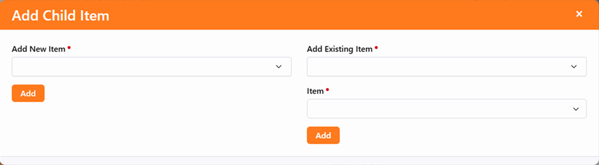
Keep in mind that a single channel item can have more than one parent. Child items can also have their own children. The sky's the
limit on what you can create.
Content Channel Item Self Update
You already know from the sections above that content channel items will appear in the
content channel on or after the Start date and before the Expire date. But what if you have an
item that needs to be shown or removed more dynamically, perhaps based on an event that only
happens every few months? You could manually update the Start and Expire dates every time the
event approaches and passes, but that can be a pain. That’s where the Self Update feature comes
to the rescue.
Content channel items can be shown on your website in
several different ways. It’s all driven by the
Lava template you provide. Because Lava can
look at the content channel item’s attributes, you can use those attributes to control how items
display on your site. The best part is that the
Content Channel Item Self Update
job automates changing those attribute values for you, automatically changing what’s shown on
your site.
Getting it Set Up
There are a few steps to this process, but the automation that comes with it makes it
worth the effort. You’ll need to get some attributes set up for your content channel
items, and then you’ll need to tell the
Content Channel Item Self Update
job how to find those attributes. There are a couple more steps along the way, and we’ll
walk you through it all below.
Adding Content Channel Item Attributes
You’ll start by adding at least two new attributes to your content channel items.
One of the attributes must be of type
Lava. We’ll talk about the second
attribute in a bit, but let’s focus on the Lava attribute for now. Pictured below is
an example of how you might set this up from
Admin Tools > System Settings > Entity Attributes
using an Entity Type of
Content Channel Item.
Lava Attribute
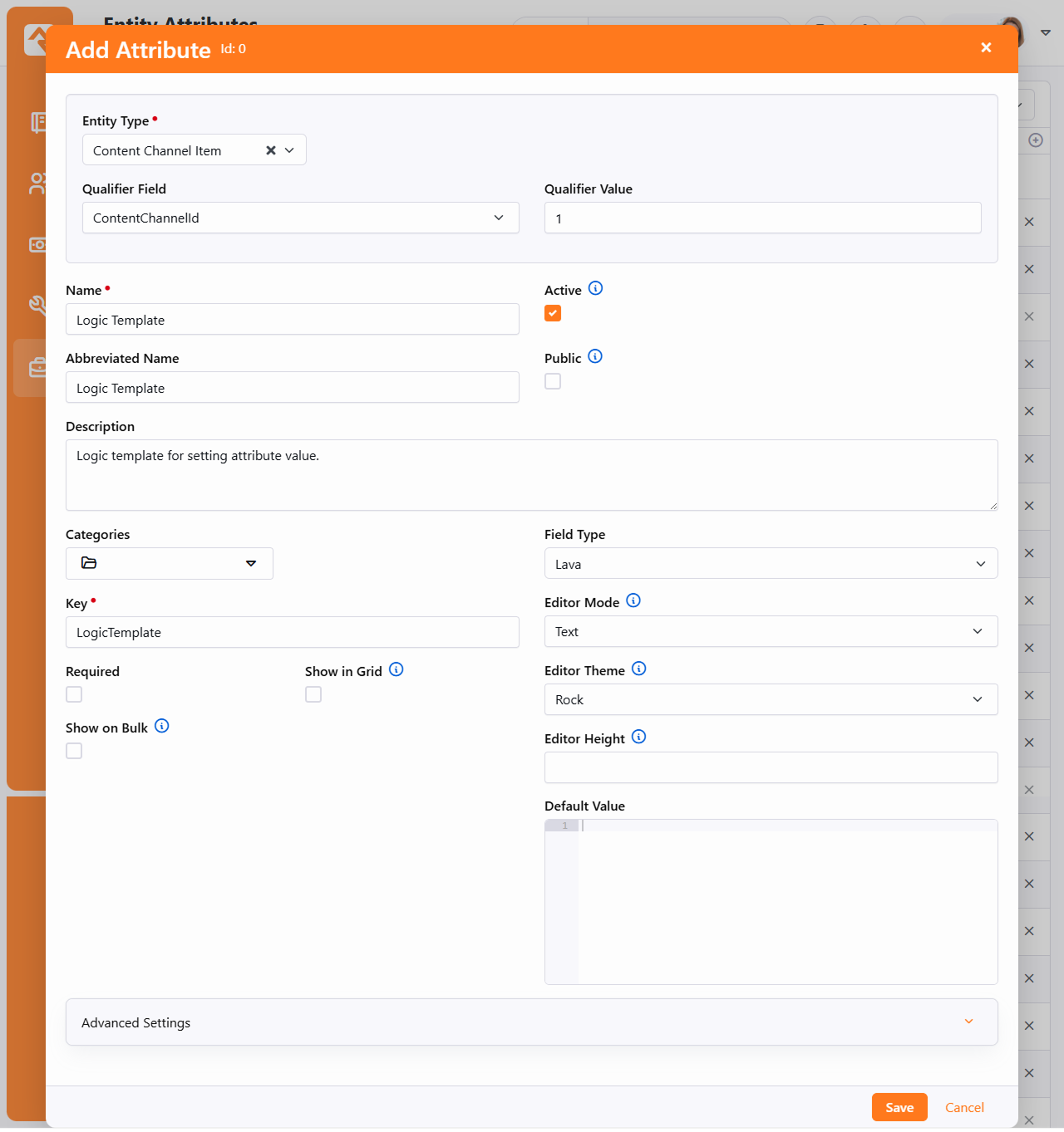
You might notice there isn’t a
Default Value
provided in the example pictured above. You can certainly add your Lava here so that
it automatically gets applied to your content channel items. Just keep in mind that
changing the
Default Value
Lava here will not automatically change the Lava that’s already been applied to
existing items.
Next, let’s add our second attribute. In this example we’re going to keep it simple
and use an attribute of type Boolean. This will give us a basic ‘Yes’ or ‘No’ to
work with. We’ll use this attribute to indicate whether the content channel item
should be displayed on the website.
Boolean Attribute
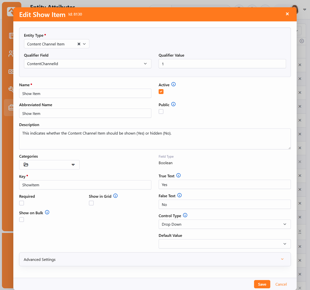
Setting the Attribute Values
With both attributes in place, we’re ready to see how they look on the content
channel item itself. You’ll need to access the item to fill in values for these
attributes initially, unless they have been populated by a
Default Value
configured on the attributes.
Attribute Values
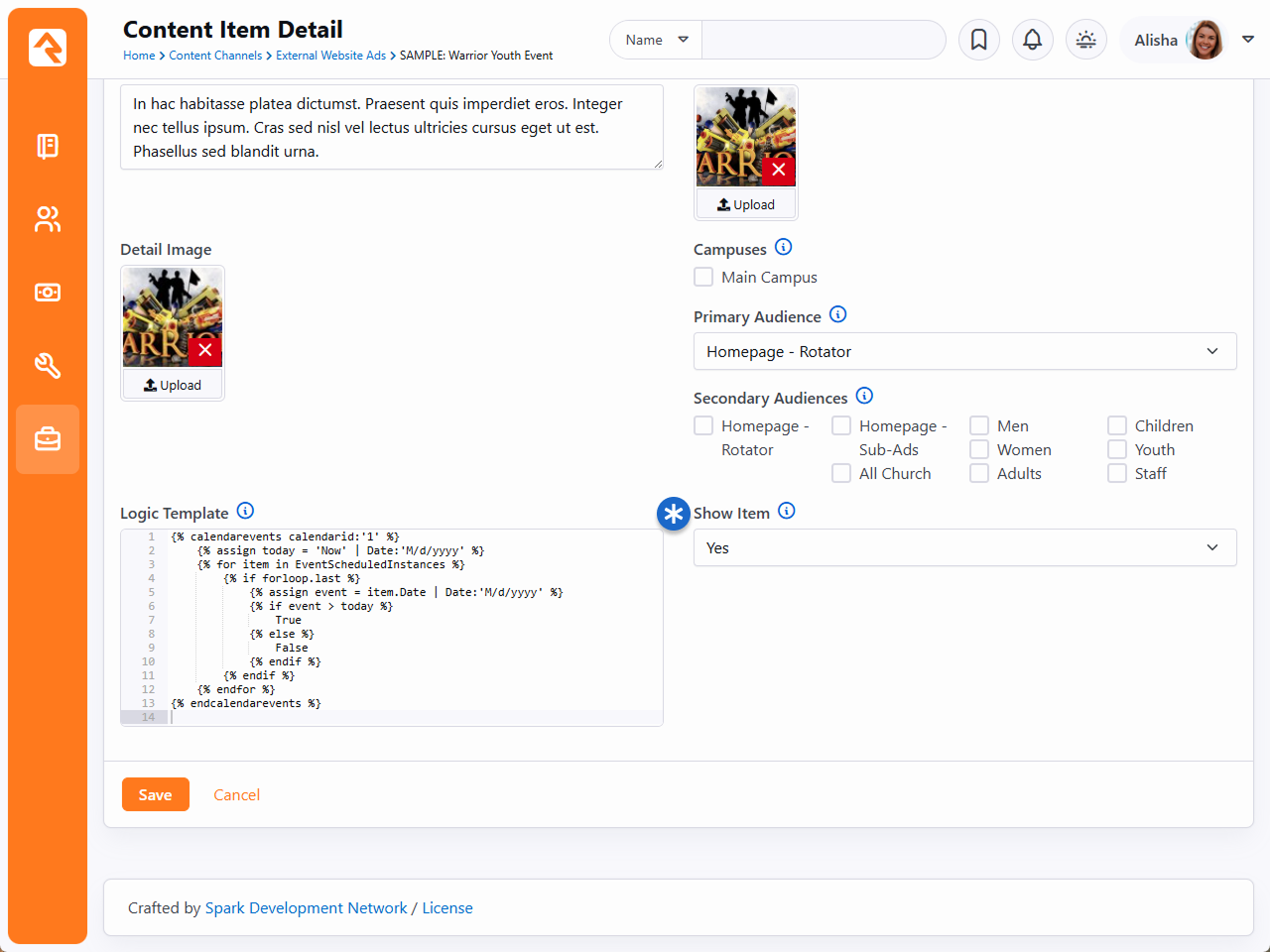
Pictured above you can see the Lava we’re using for this item, and the
Show Item
attribute we also added.
The Lava in this example will return either 'True' or 'False' depending on whether
an event’s date is in the future. This Lava will be evaluated by the
Content Channel Item Self Update
job when it runs. The result is used by the job to update the
Show Item
attribute, which can accept a value of 'True' or 'False'. Remember, the Lava must
produce an output that makes sense to the attribute being updated by the job. If our
Lava produced a date, then this wouldn’t work because a date doesn’t make sense to
our Boolean
Show Item
attribute.
Setting up the Job
With the attributes and their values in place, the hard part is over. All we need to
do now is tie it all together by setting up the job.
Job Configuration
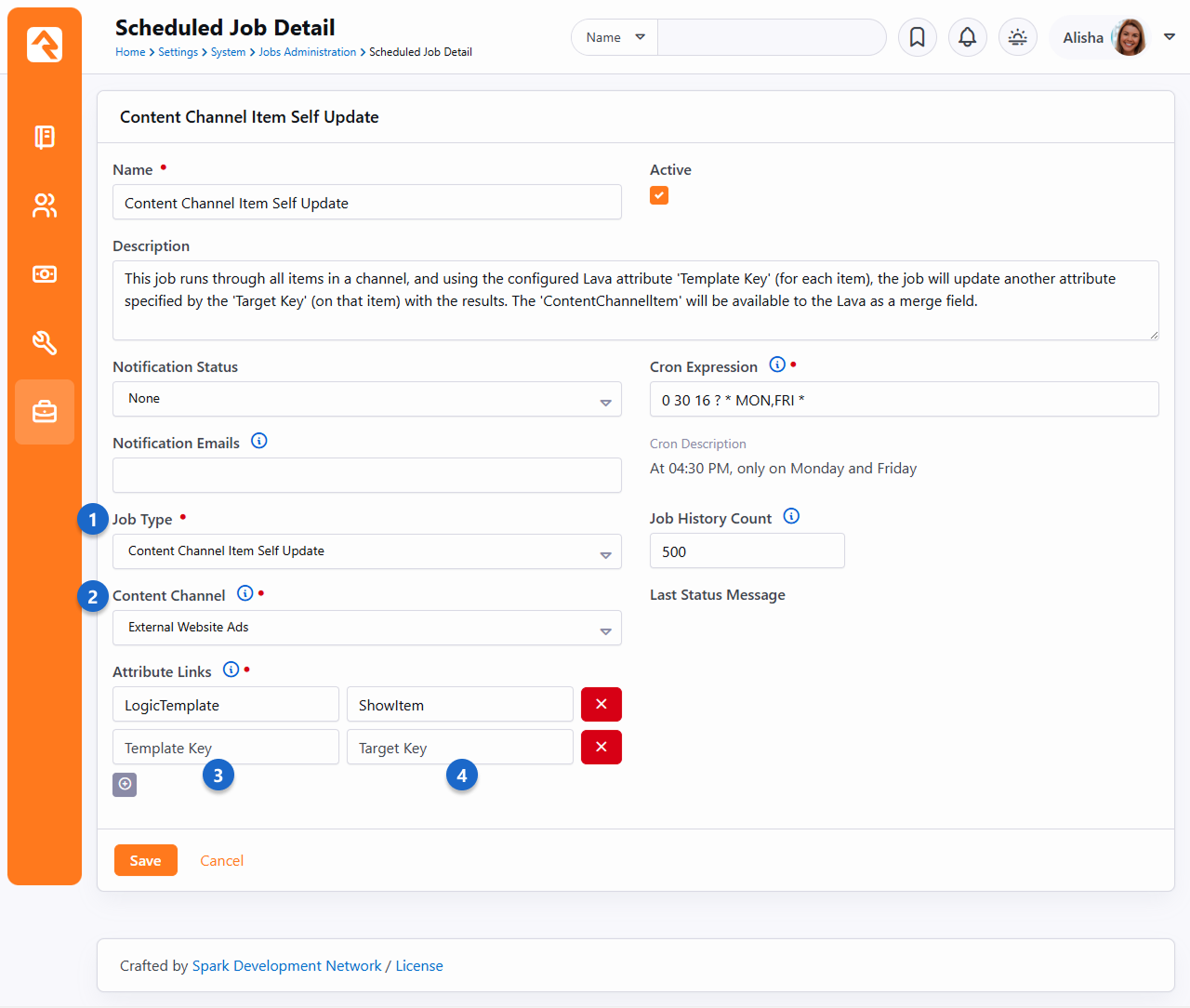
- 1 Job Type
- Be sure to select
Content Channel Item Self Update
as the
Job Type.
This will provide you with the additional fields you need to continue your
setup.
- 2 Content Channel
- The job will go through all items in the selected channel, to check for your
Lava template and the related attribute. You will need multiple jobs
configured if you’re using this process across multiple content
channels.
- 3 Template Key
- This is where you’ll add the attribute
Key for
the content channel item attribute that contains your Lava.
- 4 Target Key
- The
Target Key
will be the
Key for
the attribute that you want updated by the Lava template. In this example,
we want the
ShowItem
attribute updated by the
LogicTemplate
Lava.
With the job and attributes in place, our webpage can now reference the
Show Item attribute’s
value to have Rock automatically display or hide this content channel item.
Content Collections
Let's say you have a content channel for blog posts, and a content channel for sermons.
You can group those two content channels together under a single collection, known as a
Content Collection.
Content collections put the content for those channels in one place, unlocking the ability to search
for content across both channels at once. So, if you have a blog post about finances and a sermon
about finances, a person could search your content collection for "finances" and find both items.
You can add any number of content channels to your collection, as well as calendars.
Content Collection View
The Content Collection View
block is where content collections come to life. As pictured below, this block provides robust
search and filtering capabilities across all the items in your content collection at blazingly
fast speeds. Out of the box this block is not applied to any pages.
Content Collection View
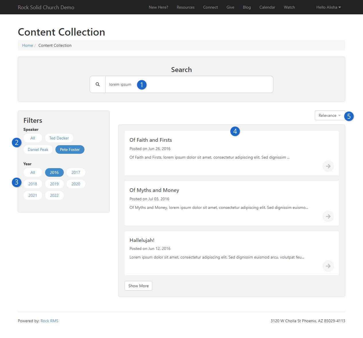
- 1 Search
- Rock provides full text indexing to allow a person to search for words or phrases
across all of the content contained in the collection. This happens so quickly, the list of
items below the search bar are updated in real time as you're typing.
- 2 Attribute Filters
- The Speaker
search filter is actually a content channel item attribute. Later on, we'll cover how to
use item attributes as filters.
- 3 Year Filter
- The year filter comes for free, but you can disable it in the block settings.
- 4 Content Channel Items
- This is the list of items that match the search criteria and any filters that have been
applied. These items could be from multiple different content channels included in the
collection.
- 5 Relevance
- By default, the items are listed based on relevance to the search, but you can change
how they're sorted here. Block settings let you control which sort options are
available.
Universal Search
For those who are curious about how things work under the hood, the Content Collection View
block utilizes the Universal Search feature. This allows for powerful searches at super-fast
speeds.
We already mentioned a couple of the settings for this block. Now let's take a detailed look at
the other available options. You can change or completely disable different
parts of the block, allowing you to customize how it works according to what makes the most
sense for your content collection. For instance, if the full-text search wouldn't be as useful
because your content is all audio/video then you can simply turn it off.
Content Collection View Block Settings
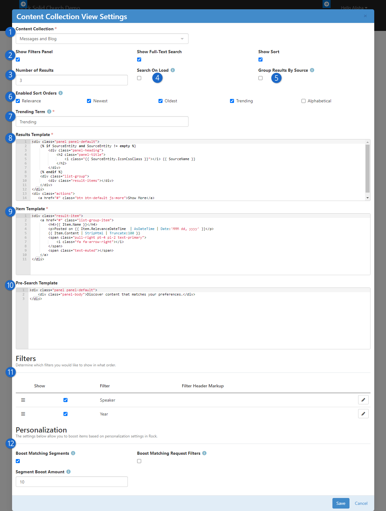
- 1 Content Collection
- Here you'll choose which content collection to use. Try to use descriptive names
for your content collections so they're easy to identify when you're setting up this
block.
- 2 Search Options
- As pictured in the prior screenshot above, a person can use the filters panel and the
full-text search, as well as adjust the sort order. Any of these items can be disabled.
- 3 Number of Results
- This controls how many results will be shown at a time. If the search returns more
than this number of results, there will be a
Show More button to
show additional results.
- 4 Search on Load
- If this is enabled, then a person will see items listed without performing a search.
The number of items the person sees is set by the
Number of Results
setting.
- 5 Group Results by Source
- Content collections pull in content from different sources, such as content channels
and calendars. Enable this option to group search results according to their source. This
means you'll get results for each source. For instance, if your content collection contains
two content channels and if your
Number of Results is
set to five then you would see two sections with five items each, for a total of 10 items
in the results.
- 6 Enabled Sort Orders
- The person viewing the block will be able to sort the results by the options you
select here. This setting only applies if
Show Sort is
enabled.
- 7 Trending Term
- This setting only applies to the name of the sort order for "trending" items. You might
choose to call it "Popularity" or "Most Watched". We'll talk more about trending features
below.
- 8 Results Template
- This is an advanced setting that lets you change how the results are displayed
overall. For instance, this controls the
Show More button.
- 9 Item Template
- This is another advanced setting, but this lets you control how individual items
show up within the search results. You'll need to update this area to tell the block
what page to go to when an individual item is clicked, to view that item. Out of the box
the change will need to be made on line 2, replacing the # symbol with
the URL to the new page.
- 10 Pre-Search Template
- Before the person performs a search, and if you have
Search on Load
disabled, the template here will be shown to the person where search results would normally
appear. Like the above two settings, this is an advanced setting that you won't be
changing often, if ever.
- 11 Filters
- Here you can choose which filters to show on the page. You can also click and drag
each filter so that it appears above or below other filters. Lastly, you can click the
icon to add a custom header that will appear above the filter.
- 12 Personalization
- Content channel items can have personalization segments and request filters applied
to them. If a match is found with the current person and/or their visit, those content
channel items will be "boosted" (moved up) in the search results, by the amount chosen in
the Boost field.
See the Personalization chapter for additional
details on setting up personalization.
Content Collection Security
Content collections index, store, and display items without regard to their individual
security settings. Ignoring security helps greatly with performance, however it can make
restricted content accessible to people or groups who wouldn't have access elsewhere
in Rock.
Setting up Content Collections
Now that you've seen what you can do with content collections, let's take a look at how to set
one up. The process is simple because you don't have to change anything about your content
channels or calendars, or how they're structured. You'll want to think strategically about your
collections, to ensure you've got the right content in the right places. For instance, you might
have a content collection for resources, or a collection of all of your messages, devotionals,
and blogs. You can have as many content collections as you need, and you can use the same
content in more than one collection.
We'll start by navigating to
Admin Tools > CMS Configuration > Content Collections.
As pictured below, we'll be looking at an example content collection called "Resource Library".
Content Collection Detail
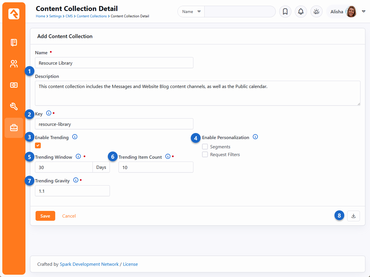
- 1 Name / Description
- Provide a meaningful name and a strong description. When you're setting up the
Content Collection View
block, only the name of the content collection will be visible.
- 2 Key
- The key needs to be unique across all content collections. Typically, you'll want to
provide a key that easily identifies the content collection without being too long.
- 3 Enable Trending
- People using the
Content Collection View
block can choose to sort the search results according to what is trending. For instance,
content channel items with the most views will be at the top of results. See the
Trending section below for details on how this is calculated.
Rock uses Interactions to track views, so the
Content Channel Item View
block(s) you're using need to have
Log Item Interaction
enabled under Visitor Settings.
- 4 Enable Personalization
- You can choose to look at Segments, Request Filters or both, to find content channel
items that match the person or their visit. You can bring matching items to the top of
the results list by adjusting the block settings for the
Content Collection View
block.
- 5 Trending Window
- This is simply the number of days to look back for trending data. This helps keep
your trending data fresh and relevant.
- 6 Trending Item Count
- In this example, only the top 10 trending items will be marked as trending. There needs
to be a cutoff, otherwise every item would be considered trending if they were viewed at
least once.
- 7 Trending Gravity
- This applies to items that are new or more recent. Because these items haven't been
around long enough to score lots of views, you can choose to give them more weight. The
result of this would be that a new item could be considered trending even if it has
fewer views than other older items.
- 8 Rebuild Index
- Click this button to re-index the items in your collection. This ensures all the items
in your collection are accounted for and can be searched. The
Index Content Collections
system job will do this for you automatically overnight, but you may want to manually
rebuild the index to capture changes made during the day.
The items above define the framework of your content collection overall. Next, we need to add
actual content to the content collection. Pictured below you can see we've added two content
channels and a calendar to the content collection. Keep in mind that we didn't need to change
anything with the content channel or the calendar. Your existing configuration will work
as-is.
Content Collection Content Sources
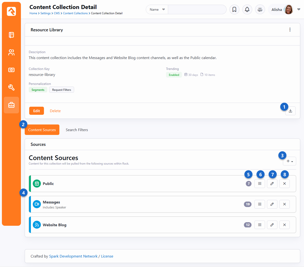
- 1 Rebuild Index
- Click this button to re-index the items in your collection. This is the same button
as described in the prior screenshot above. Remember that the
Index Content Collections
system job will automatically rebuild the index every night.
- 2 Content Sources
- Here we're looking at content sources. In the next screenshot below, we'll show you what
it looks like when we toggle over to the
Search Filters view.
- 3 Add Item
- From here you can choose to add a new calendar or content channel to the content
collection.
- 4 Sources
- This is a listing of all the content sources included in your collection. In the
remaining points below, we'll go into the options you have for each source.
- 5 Item Count
- This is simply a count of how many items (content channel items, event items) each
source has. Here we can see there are 19 content channel items under the Messages content
channel.
- 6 Move Source
- The order of the content sources influences the order in which items will appear in the
Content Collection View
block. For instance, if we had
Search on Load enabled
in the
Content Collection View
block for this example content collection, then event items from the Public calendar would
appear at the top of the list when a person first visits the page.
- 7 Edit Content Source
- For calendars and content channels you can click this to indicate which item
attributes should be added to the index. In other words, you can select which attributes
to use as filters on the
Content Collection View
block. For calendars, you can additionally choose how many future occurrences to show.
- 8 Delete Source
- This one's pretty obvious.
When you're adding a source you have a few options available to you. Primarily, you can select
which attributes you want to use as filters on the
Content Collection View
block.
Edit Content Sources
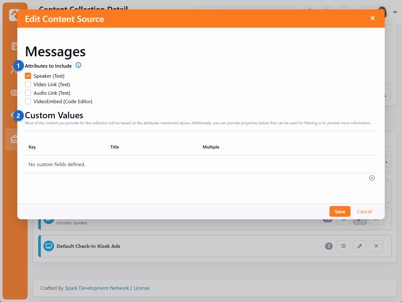
- 1 Attributes to Include
- Simply check the box next to any attributes you want to have available as filters
on the
Content Collection View
block.
- 2 Custom Values
- This is an advanced setting that lets you do things like create custom filters.
We're not done with this page yet. If you toggle over to the
Search Filters view, you'll be
able to see what we can use as filters when searching for content from the
Content Collection View
block.
Content Collection Content Sources
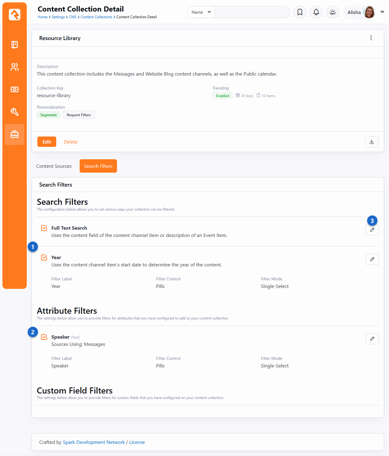
- 1 Search Filters
- Here are your overall search filters, which apply more to the content collection as a
whole. Generally, the
Full Text Search and
Year options will always
be available.
- 2 Attribute Filters
- This is where the filters that come from item attributes are listed. This is controlled
by the selections made under the
Content Sources tab (see
prior screenshot above).
- 3 Edit Filter
- Click here to enable or disable each search filter. For some search filters, such as
the Year filter in this example, you have additional options. First, you can change the name
of the filter. Then you can decide how the selectable options for that filter will appear on
the
Content Collection View
block (either pills or dropdown). Lastly, you can choose a filter mode (either single-select
or multi-select).
Trending
In the prior sections we mentioned some of the "trending" features related to content
collections. Below we're going to take a deeper dive into how trending works and how it's
calculated.
The Trending Window you set
on the content collection plays a big role in how trending data is calculated. To determine
which items are trending, Rock looks at how many views (interactions) an item in the content
collection has had over the time period specified as your
Trending Window. For
instance, if your
Trending Window is 30 days
then Rock will count how many interactions an item in the content collection has had in the last
30 days. Rock then takes that number and divides it by the age of the item (in days), up to a
maximum of your
Trending Window. For
instance, if an item is six months old and your
Trending Window is 30 days,
the count of interactions over the past 30 days will be divided by 30. This calculation produces
a number that is used to rank the items in the content collection.
The Trending Gravity
setting is used to apply more weight to items that are newer. The idea of gravity is that an
item which is only two days old that has been viewed 10 times is more popular than one that has
been viewed 30 times in the last 30 days. Gravity is applied to the number that is
calculated as described above, changing that item's score.
Troubleshooting Content Collections
You might run into a unique scenario where the
Content Collection View
block isn't working exactly as you expected. In those cases, you'll need to review your
configuration. Below we have some tips on where to start.
- Enable Personalization: If your personalized content isn't appearing as it
should based on the content collection setup, make sure you have personalization enabled at the
site level. If you've already checked that, then run through the
troubleshooting personalization list in the
Personalization chapter.
- Run the Index Job: Rock ships with an
Index Content Collections
system job that runs overnight and automatically re-indexes the items in your content
collection. Running this job manually may resolve your issue, especially if changes to
the content or content collection have been made during the day.
- Block Settings: Be sure to double-check the settings of the
Content Collection View
block. There are several settings that control how this block works, as detailed
above.
- Activated Filters: Remember that filters activated in the content
collection configuration must also be active in the
Content Collection View
block. Be sure to check both places if you're missing a filter
- Universal Search: Content collections utilize Universal Search. That
means you'll need an Active index component under
Admin Tools > System Settings > Universal Search Index Components.
For more information check out the
Universal Search
manual.
Working With Images
Rock provides several ways to store and display images. Picking the right solution for your requirements is important. The two most
common ways to store images are discussed below.
- Image File Type - This was the only way to store photos originally. It's still often the best way if you need to secure images so that
only certain people can view them (cough check images) or if you want to provide dynamic transformations on the images. We discuss image file types in more detail
below.
- Image Assets - You can also use Rock's Asset Manager to upload images. This is the preferred way to manage images for your website. This
option doesn't allow for security, but it is MUCH faster than the image file type in most cases. Since most images for your website don't need security, this is
the best option.
Image File Type
Serving your image files with the right dimensions is the simplest way to improve your website performance.
It means less load on your site and faster images for your users. And with Rock, it couldn't be easier!
We think you’ll find the information below helpful and straightforward on how to use these tools for your best benefit.
Oh, and if you are anything like us you might even find yourself having a little too much fun with your content.
So, we will spare you and only go over the primary and most useful commands, knowing that this is a powerful tool where the sky is the limit.
Before anything – you have to set up an image attribute on your content channel or whatever it is you are standardizing such as page attributes.
Alright let's look at an example. Let's say you have a content channel with an item attribute named "Public Photo."
Normally in your Lava you would add that image to your mark up like this:
GetImage.ashx?Guid={{ detailImageGuid }}
Here we see the original photo without any resizing.
Original File Size
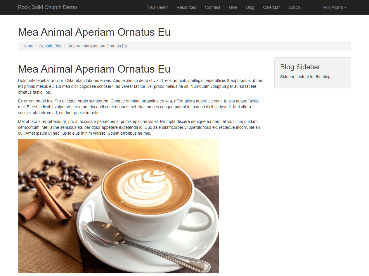
Let's make this image smaller. GetImage.ashx?Guid={{ detailImageGuid }}&w=468&h=232
Small size set
Those are super basic. Let’s add some extra commands. Say we always want the images to be a certain aspect ratio
and if the image uploaded doesn’t meet that size, then a black border will fill in the rest of the area and the image will align to the top center.
Our command would then look something like this:
GetImage.ashx?Guid={{ detailImageGuid }}&w=768&h=432&mode=pad&bgcolor=black&anchor=topcenter&quality=100
Large Size Set With Extra Settings
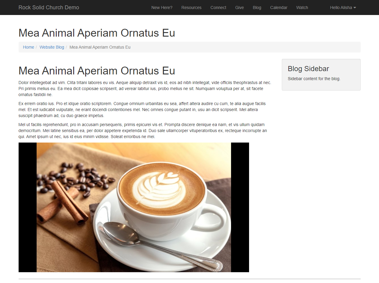
That’s just a glimpse of how you can use these tools to standardize your content.
Commands
Width and Height
&w= sets the width of the image in pixels.&h= sets the height of the image in pixels.
If only the width and height is set, then the aspect ratio of the image is maintained and defaults to the width size.
Modes
&mode=
-
max
Resizes the image to fit within the width and height boundaries without cropping or distorting the image.
The resulting image will match one of the constraining dimensions, while the other size is altered to
maintain the same aspect ratio of the input image.
-
pad
Resizes the image to fit within the width and height dimensions without cropping or distorting the
image and fills the remaining space with a solid color. Use the bgcolor command to set the color to fill the space.
-
stretch
Stretches the images to the W and H parameters regardless of the actual size of the image.
Background Color
&bgcolor=
Named colors and hex values are supported.
Alignment
&anchor=
The alignment parameter allows you to specify the starting location within the size parameters. Valid values are:
topleft
topcenter
topright
middleleft
middlecenter
middleright
bottomleft
bottomcenter
bottomright
Crop
&crop=
Resizes the image to fill the width and height dimensions and crops any excess image data.
The resulting image will match the width and height constraints without distorting the image.
Cropping is used by coordinates, x1, y1, x2, y2.
Disable Optimizations
&disableoptimizations=true
Allows disabling resizing by adding disableoptimizations=true to the query string. This allows a CDN or image optimization service to do the resizing. Without this, the query string parameters for resizing will often conflict causing both Rock and the CDN to resize and optimize the file.
Compression and Performance
Compression helps remove unnecessary data from your images, while providing the control you need for high quality at small sizes.
format
The output format to convert the image to. Valid options are jpg, png, gif.
quality
Controls the output quality. Valid values are in the range of 0-100, and the default is 90.
Quality can often be set much lower than the default, especially when serving high-DPR images.
More Info
For a list of even more image resizing options, checkout this website: ImageResizer.
Asset Manager System
The Asset Management system gives you first class integration between your Rock system and a remote
cloud storage system (such as Azure or Amazon S3). With the Asset field type, you can add
an attribute to existing things (such as a Content Channel, Person, Group, etc.) and give your
content editors the ability to select files and images stored in your cloud accounts.
Storage Provider
Access
Before you get started, you'll need to set up your Asset Storage Provider. Amazon S3, Google Cloud
Storage, Azure Cloud Storage and your local Server File System are currently supported out of the box.
More asset storage providers may be available in the Rock Shop.
The asset provider is configured under
Admin tools > System Settings > Asset Storage Providers.
This page is where you will configure providers. Depending on the storage type you choose,
additional fields will be required as pictured below. This is why it's important to set up your
provider first, because you'll need that information to complete the configuration in Rock.
Asset Storage Provider Detail - Server File System
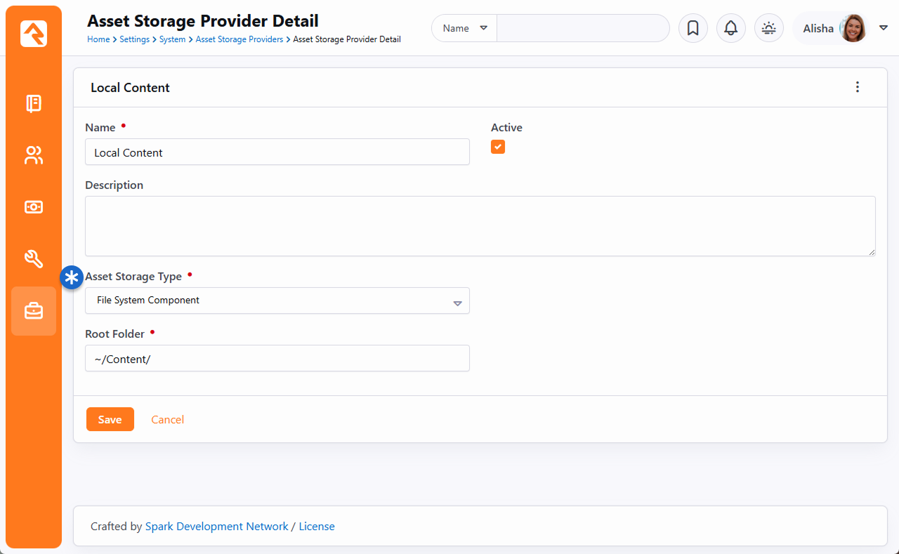 Asset Storage Provider Detail - Amazon S3
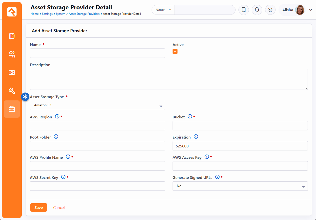
Warning: Signed URLs
If you've chosen to use Amazon S3, you'll be given the option to use signed URLs. Signed URLs are unique on every
request, so be careful when using them in RSS feeds or with other content that might be scraped or cached by other
3rd parties. It's possible that these 3rd parties will see that these URLs are constantly changing, and will keep
downloading them, which will cause your storage costs to get high. In these cases, use an unsigned URL because
they are always the same across all requests.
Asset Storage Provider Detail - Azure Cloud Storage
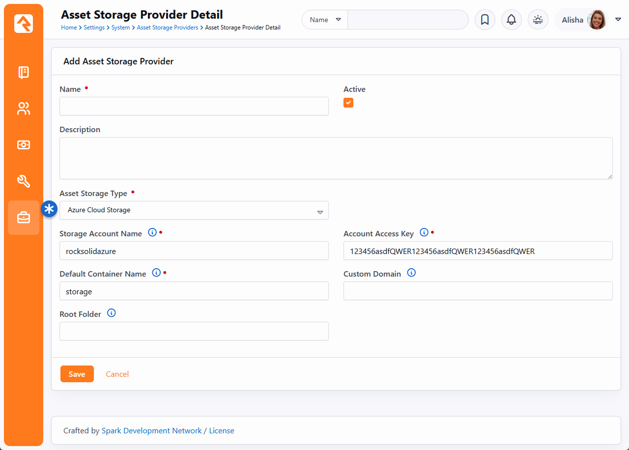 Asset Storage Provider Detail - Google Cloud Storage
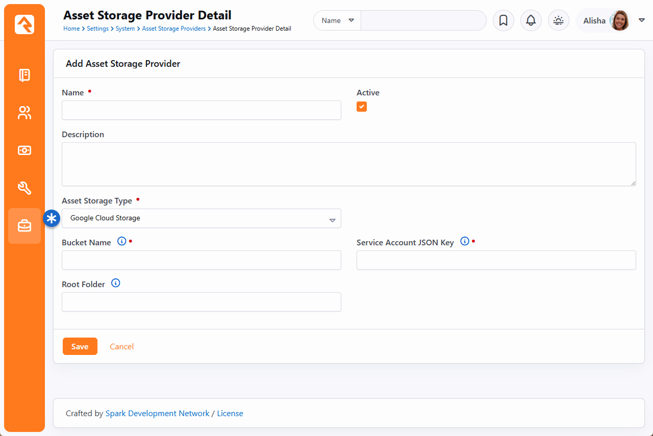
Google Cloud JSON Key
If you're using Google, you'll need to provide a Service Account JSON Key
in Rock. To get your key, log in to your Google console and access your
Service Accounts. Under the
Actions column for your account click the three dots and choose
Create key.
Create Key
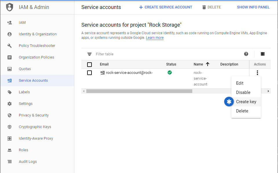
You'll need to export your key as a JSON file, so it can be added to Rock. Select JSON as pictured below and click "Create"
to download the file.
Output Key to JSON
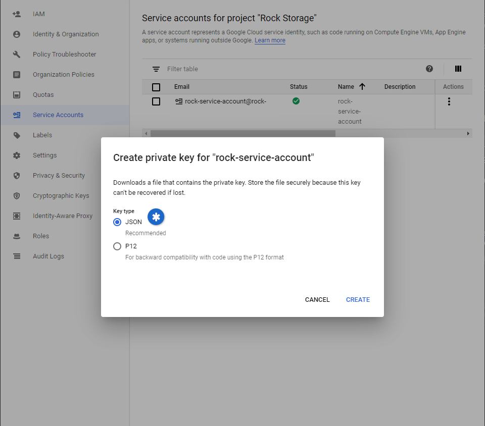
Open the downloaded JSON file and copy all of its contents. The full content of the entire file needs to be copied,
not just the elements labeled as keys. A quick Ctrl + A
and Ctrl + C is all you need.
With the contents of the JSON file copied to your clipboard, you can finish your setup in Rock. Paste the file contents
into the Service Account JSON Key field as pictured
below.
Add JSON Key to Rock
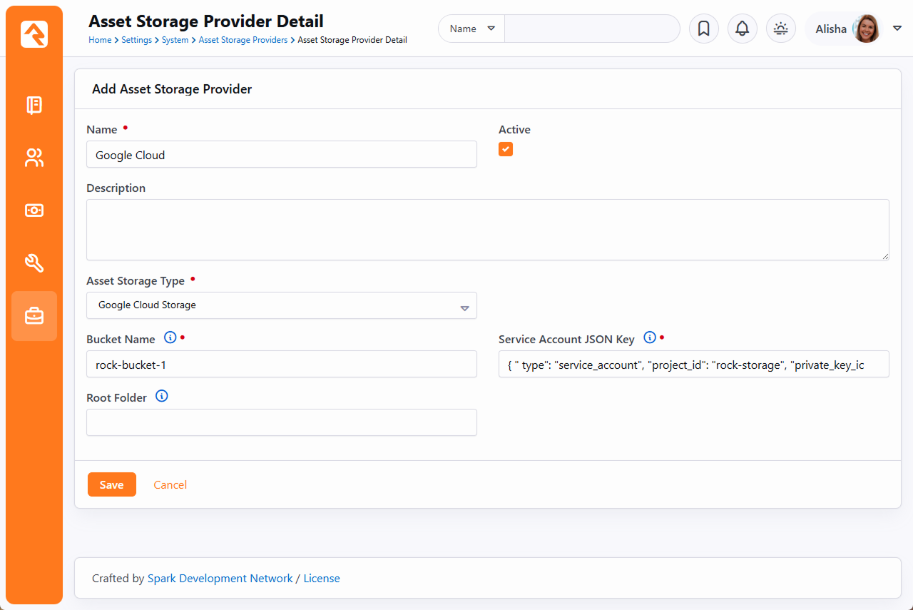
Asset Management
You can view and manage the files in the Asset Manager under Admin tools > CMS Configuration > Asset Manager.
This block allows you to view and manage documents in the providers you have configured. Think of this as your file manager for your cloud storage and Rock server.
Asset Manager
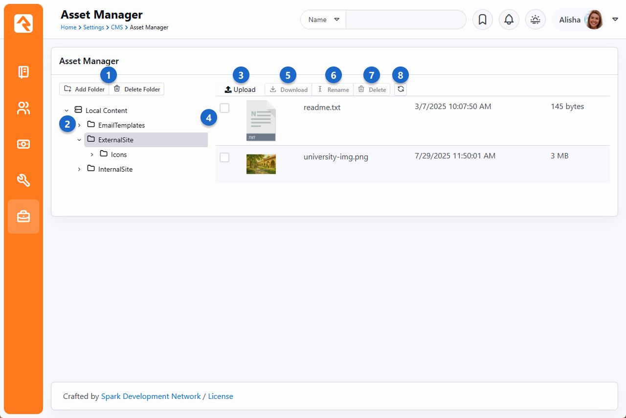
- 1Add and delete folders
- From here you can add or delete folders in the asset manager.
- 2Folder tree
- The folder tree shows parent folders with child folders within them.
- 3Upload a file
- You can upload a file from your local machine to the asset manager here.
- 4Selecting files
- Selecting one or more files to use.
- 5Download
- While a file is selected - you can download it to your local machine.
- 6Rename
- While a file is selected - Rename it.
- 7Delete
- While a file is selected - Delete it.
- 8Refresh
- Refresh the folder if files were uploaded from the source and aren't showing on the list yet.
Adding Content
You might be wondering, when should I use the asset manager and when should I use a file attribute? The difference is subtle.
File attributes are best used to attach files to content channel items or people where you don't care about the details of where the file is stored
(this is all handled for you in the file type setup).
Using the asset manager gives you much more control of where and how the file will be stored. It allows you to select files that are already stored in your cloud provider.
This is handy in cases where someone has already uploaded an asset that you want to use. This is common in many media arts workflows.
With that said, there are two ways you can use assets. One is using an asset attribute, and the other is through the HTML editor. We'll touch briefly on both options below.
Asset Attribute
When you configure an attribute of type Asset, you'll be given the option to
Select Asset. Selecting this will display a modal where you can select or upload the asset.
Asset Manager
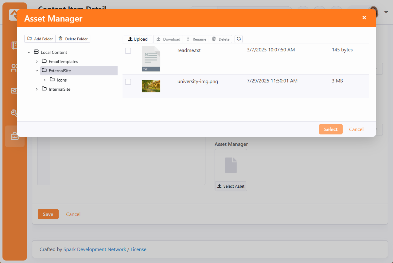
HTML Editor
Rock's "WYSIWYG" editor tool also allows you to work with assets. On the toolbar you will see a
icon which opens the asset manager to search for your files.
Asset Manager
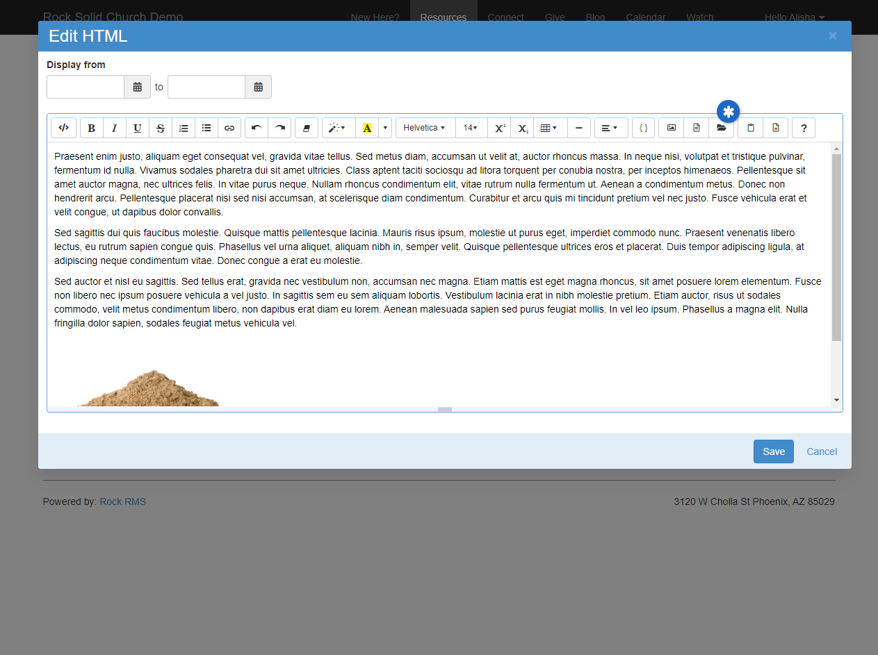
- * Asset Manager File Folder
These settings are available on both the internal and external editor tools.
Podcasting
Instead of writing dedicated podcasting tools we added powerful features to Rock’s content channels to enable
podcasting. Rock ships with a basic implementation. Feel free to add to it by adding attributes to either
the Podcast Series or Podcast Messages content channels.
To help give you an idea of what’s possible we’ve added a few series and messages. Special thanks to Central Christian Church
(Arizona) and NewSpring for donating their series graphics. Below is a quick walk through of the various external pages
that make up podcasting.
Podcast Watch Page
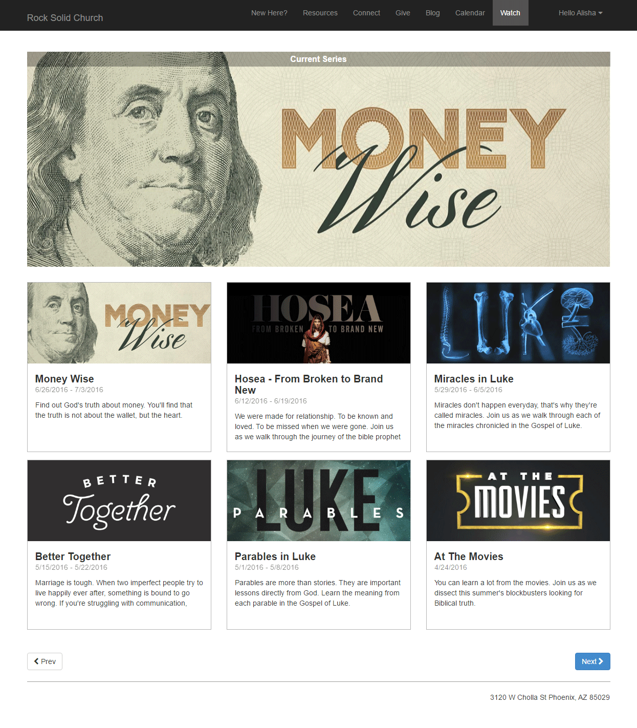 Podcast Series Page
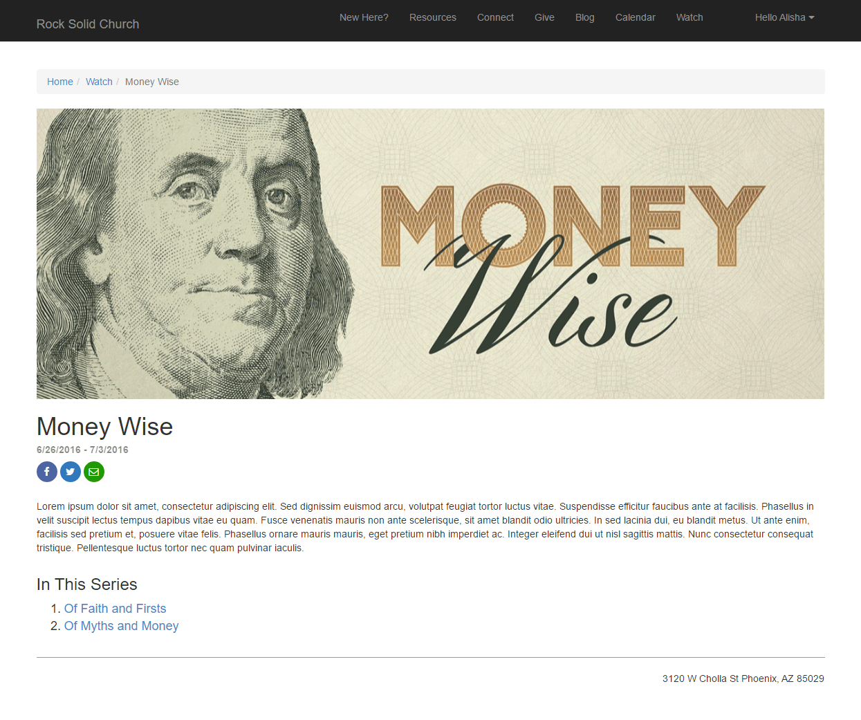 Podcast Message Page
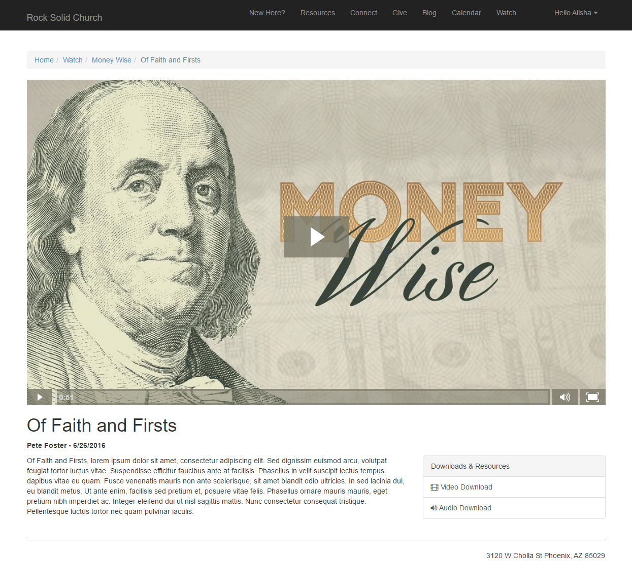
Keep in mind these pages are using the Stark theme which is devoid of styling. What you see is a blank canvas for you to create from.
Podcasting File Types
While you’ll probably host your podcast files on a video hosting platform / content delivery network you may want to change the
file type that the series graphics are hosted with. Out of the box we configured the graphics to use the default 'Unsecured' file type.
This, however, saves the graphics to the database. There are advantages to doing this, but it does take up valuable database space.
You may consider moving to a file type that uses the file system or better yet use one of the plugins in the Rock Shop to
store the files on Amazon S3 or Azure.
So, get out there and spread your message!
Landing Pages
Now that you have the tools in your belt for adding content to pages, let's look at a special type of page that you can use for specific purposes: Landing Pages.
What Are Landing Pages and Why Should I Use Them?
Landing pages are designed to drive people to a single focus, usually for a specific event or resource. For instance, you might set up a landing page with information about your Christmas services, to register for a conference, or to join a small group.
It's different from your external website's homepage because your homepage has a lot of information about your church in general, with links to more specific areas the visitor might be interested in. A Landing Page is designed to be self-contained, with very few links off of the page, and usually gives all of the information someone might need about the topic on a single page.
This is important because it helps you make sure that you're providing your visitors with exactly the information they're looking for, without making them search through your entire site for it. It's a better experience for them, and helps your message reach the people who are looking for it - talk about a win-win!
If your goal is to get your visitors to take a specific action, such as joining a group or filling out a form (referred to as a "Call To Action"), you'll be able to add those items to these pages as well so that they can take action as soon as they have the information they need.
A Sample Landing Page
Enough talk! Let's take a look at the sample Landing Page that comes with Rock, and you can start to see what you can do with these types of pages.
Sample Landing Page
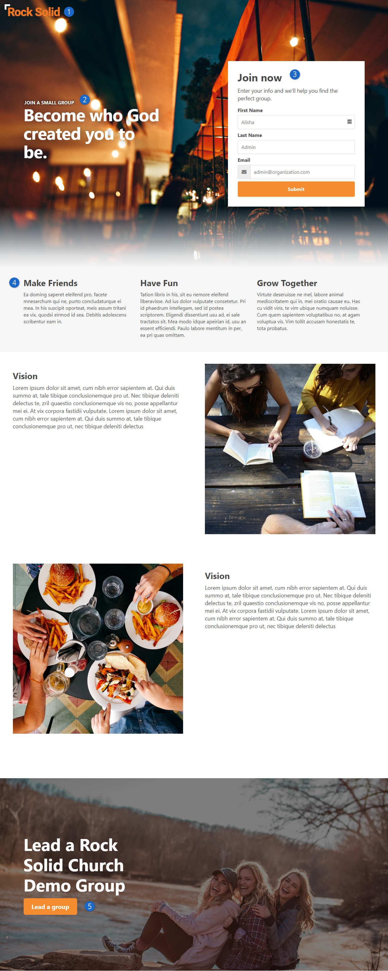
- 1 Logo
- The logo you provide in the site configuration will be shown at the top left of any of your landing pages
- 2 Headline and Hero Image
- Each page will have a Headline zone where you can add an HTML block, for instance, and get your succinct "above the fold" message up front and center. The Hero Image is a page attribute, so you can specify the background for this area on each page.
- 3 Workflow
- The sample page has a Workflow Entry block, showing you how you can provide a Call To Action to fill out a form. Check out the
Blasting Off with Workflows
guide for more information on building these forms.
- 4 Page Content
- There are several zones in the main body of the page where you can add multiple blocks, such as HTML blocks, content channel blocks, etc.
- 5 Secondary Hero
- Near the bottom of many of the Landing Page layouts is a secondary hero section. You can specify which image is used for each page on the page settings and provide an HTML block or other type of block to display content and secondary calls to action over the image.
Getting Started with Landing Pages
Hopefully your imagination is already running with all of the ways you will be able to use these simple and beautiful pages! The best part is all of the complex styling to get the text in the correct positions over the images is already done for you. All of the content on this sample page can be added using the HTML block WYSIWYG editor - no knowledge of HTML needed.
So, let's get started! Your Rock installation already has a Landing Page site with the LandingPage theme installed. Your landing pages will usually be a page on this site, rather than being an entire Rock site of their own. You can find this page from your internal site by clicking on Admin Tools > CMS Configuration > Pages and choosing "Landing Pages Home Page" in the menu on the left.
Now click the copy button shown below, and de-select "Include Child Pages".
Copy Landing Page
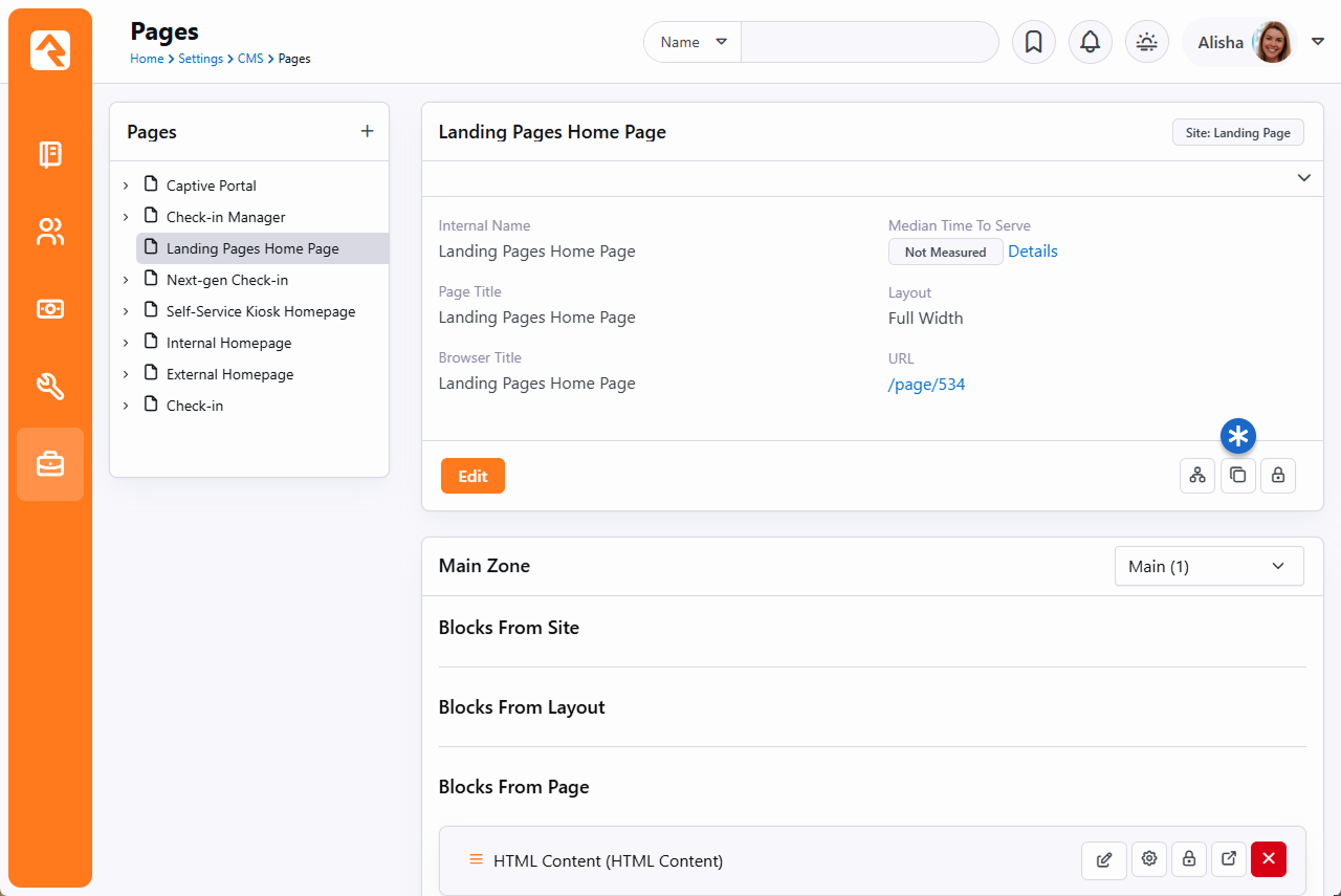
Once the page is created, click Edit and you can fill in a little bit of information about the new landing page.
Edit Landing Page
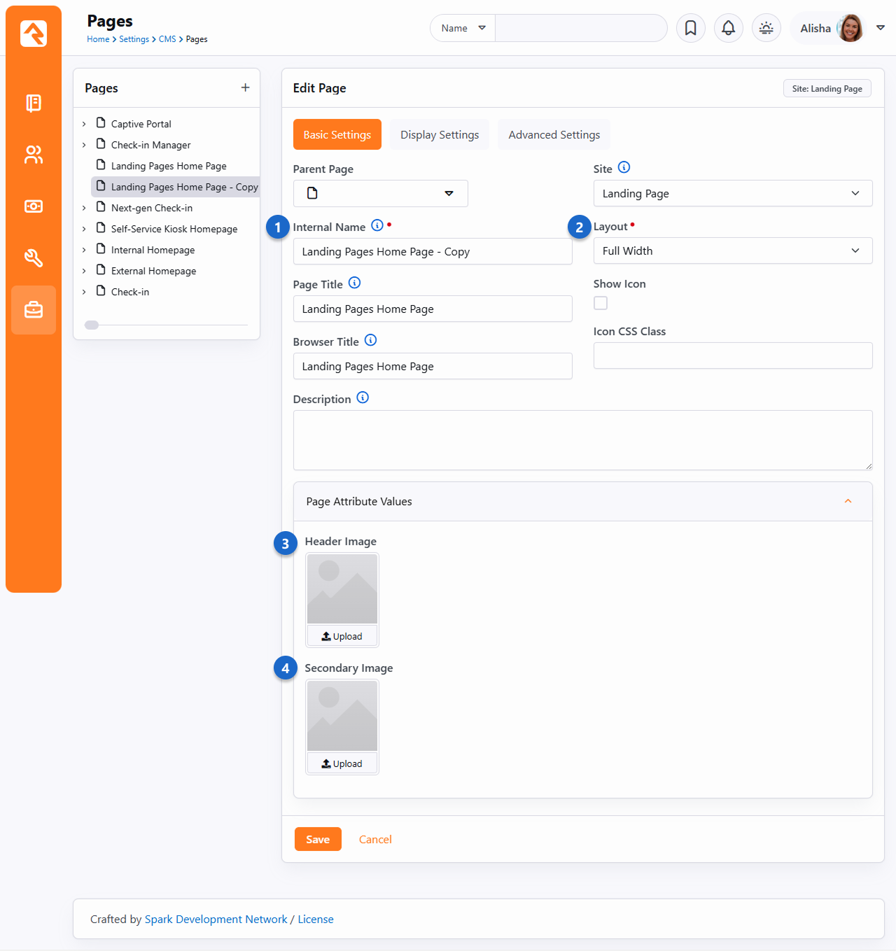
- 1 Page Names
- Provide at least an Internal Name for the new page: this is the name you'll see for the page from the admin side of Rock. Frequently this will be the same name as you provide for the Page Title (which can be displayed on the page body itself) and the Browser Title (which is what the browser tab will be called when the page is loaded), but they can be different if you wish.
- 2 Layout
- On a site using the LandingPage theme, you have more layout options than most of your other themes. Select the layout you want for this particular landing page here (refer to the below section for more information on your choices).
- 3 Header Image
- This is where you can upload an image that this page will use as the background for the hero image at the top of the page. All of the fancy formatting is done for you- you just need to provide the image itself.
- 4 Secondary Image
- Some layouts have a secondary hero image near the bottom of the page (such as we saw in the sample Landing Page above). If the layout you selected above has this zone, you can upload an image here for it to use as the background.
Once you've updated all of the information for the new page, click Save. When the page reloads, you'll see a link (e.g., /page/123) to your new Landing Page.
Click that link and you'll be taken to your new landing page, with the logo and graphics already in place, and content copied from the initial demo page,
ready for you to edit as you wish.
Wasn't that easy? Now you can use the "Zones" button on the Admin Toolbar and start adding blocks and content to your page
More Information on Landing Page Layout Options
As we mentioned above, Landing Pages have a few more layouts than other site templates. Here are some thumbnails of the layouts available to you along with the available zones, so you can decide which layout to use for your new page.
Notice that some pages are designed not to scroll (those called "Simple") and will adjust to the height of the browser they're loaded on whenever possible. Most of the "Full" layouts have hero image sections based on the height of the browser (which is labeled "Viewport Height" on these thumbnails). You don't have to have content in all of the zones shown; they're simply available to you to make sure you can easily add any blocks to the page where you want them to lay out. Any of the layouts with two image placeholders will use both the Header Image and the Secondary Image you specify in the Page Attributes.
Landing Page Layouts
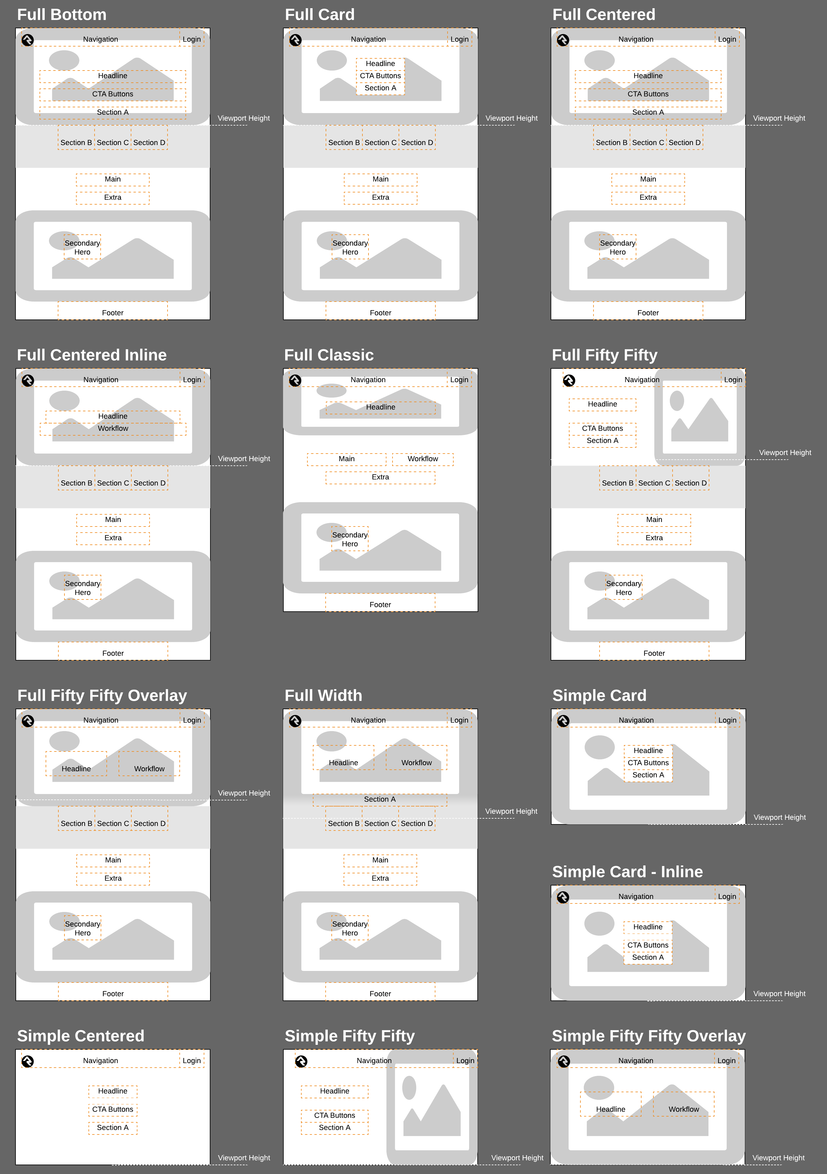
Strategies for Managing Your Site
As you're working through your content strategy for your site it's
important to think about how you will maintain each page. There are several
tools you can use to reduce the burden of keeping your site up-to-date.
Let Dynamic Content Do the Work
The dynamic content tools discussed above can save you a lot of time by giving you an easy workflow for adding
content to pages. Think of these tools as structured bits of content that can be
scheduled to display on your site. On each page think about how dynamic content could
be used to keep the content fresh.
Remove the Bottleneck through Delegation
It sounds scary but allowing your ministry leaders to edit their content
on the website can be safe. The secret is in the configuration. Below are
some tips to make this a success.
-
Give the ministry leaders access to small pieces of content, not the whole page.
-
Use the HTML editor's pre/post text to ensure that the wrapping
markup cannot be changed. Say for instance you give the ministry
access to edit a Bootstrap alert box on the page. Be sure that the
markup for the alert is in the pre/post text so the user cannot
remove or edit it.
-
Enable the HTML editor's approval system. This will allow you to
review the changes before they are published to the site.
-
Use security wisely. Don't give a single user access to edit a
specific content block. Instead, consider creating reusable security
roles (e.g., Website Editors – Childrens).
This will allow you to add similar user permissions in the future.
Routes
As we've discussed, webpages in Rock don't exist as files on the server's
file system. Instead, they are dynamically created as they are requested
from the database to be individually tailored to the permissions of the
current user. In the past this meant some really ugly URLs with numerous query
parameters. For instance, some similar systems may have used an address like this:
http://www.mysite.com/index.php?page=152&groupId=12
Not only are these addresses unattractive, they are also not very friendly
for search engines visiting your site (aka SEO friendly). Rock uses the
concept of Routes
to help beautify its addresses. The default route for a page will look
something like:
http://www.rocksolidchurchdemo.com/page/123
But you can do better. Let's say page 123 in the example above was actually
a promotional page for an upcoming car show. You could add a new route on the
page property dialog ( on the
page's admin bar then look under Advanced Settings)
with the value of carshow.
This would enable the link http://www.rocksolidchurchdemo.com/carshow to
also work for this page.
Multiple Routes
In fact, you could create several routes for the same page. This is
especially helpful in tracking the success of each of your marketing pieces.
If the mailers, mass email and invite cards each have a different address, you
can measure which is more successful at getting people to your site.
Avoid Multiple Page Routes for Indexed Pages
Having multiple routes present for a page that you wish to be indexed by search engines can be significantly damaging
to that page's ranking. This is because the search engine is unable to detect that each individual route is pointing
to the same page, and instead interprets them as duplicate pages, with identical content. The result is that a page
with multiple routes will essentially be competing with itself, diluting its page ranking in the process.
Advanced Routes
So far, we've looked at how to create simple routes. Pages that contain
dynamic content might have one or more required query parameters to be
able to display. Consider a page that displays calendar events. Its
default route might be http://www.rocksolidchurchdemo.com/page/234?EventId=12.
Creating a route with the value of Event/{EventId}
would add the ability to load the page with the address of
http://www.rocksolidchurchdemo.com/Event/12. This new address is not only
visually more appealing but is also SEO friendly.
You can add as many query parameters to your route as you like. For
instance, the route of Event/{EventId}/{TabId}
would enable the address of http://www.rocksolidchurchdemo.com/page/234?EventId=12&TabId=3
to be represented as http://www.rocksolidchurchdemo.com/Event/12/3.
If you would like to manage all routes defined in Rock, you can see them listed under
Admin Tools > CMS Configuration > Routes. From
here you can edit or delete any route in the system.
Global Routes
From the Routes page
you can designate certain routes to be Global.
Global routes ignore a site's Enable Exclusive Routes
setting.
Routing Order
Rock uses the following order to choose what page is displayed for a provided URL.
In cases where there is no matching route on a given site the oldest matching route
from any site is used.
- Page ID (/page/12)
- Matching page route and matching site
- Matching Shortlink and matching site
- Oldest matching page route from other site
- Oldest matching shortlink from other site
- Page not found (404)
Site Scoped Routes
Keep in mind that routes are scoped to the site. That means you can use the same route more than once as long as each instance is on a different site.
Creating A New Site
Creating a new site in Rock is simple. But it helps to do things in the
proper order. Following the steps below will lead to a well-configured site
every time.
-
First, navigate to the site list page Admin Tools > Websites
-
Click the (add) button at the bottom of the grid of sites.
-
Fill in the site configuration outlined below:
Add Site
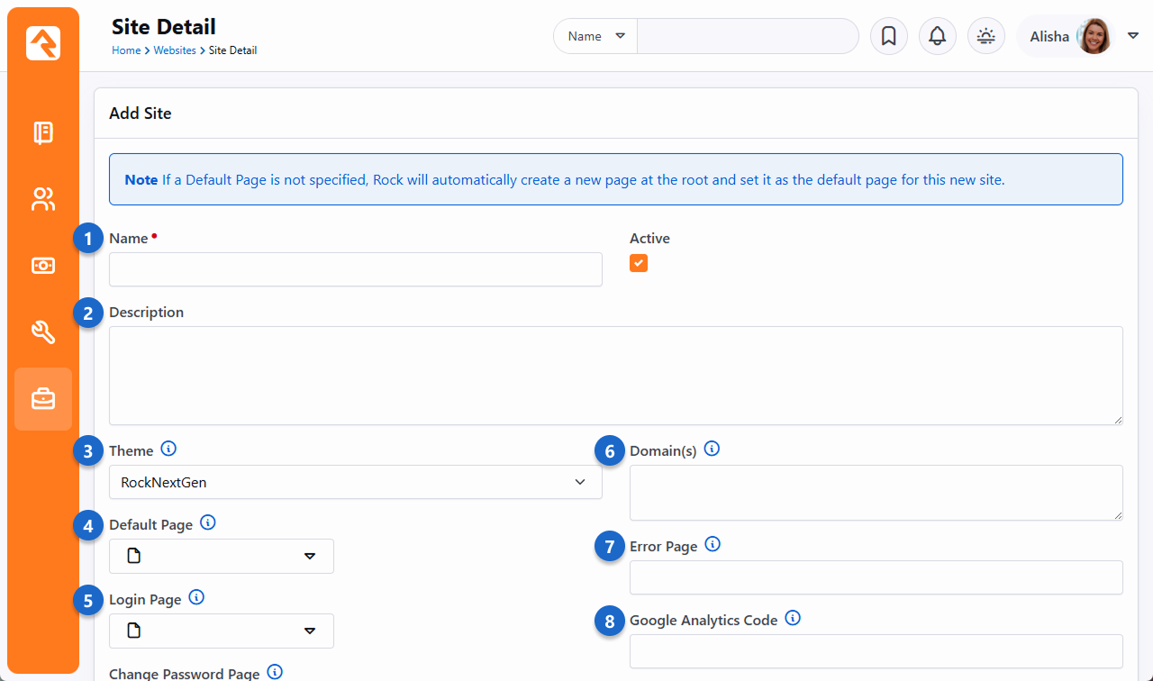
- 1 Name
-
Provide a name for your site. This name will not appear on the
site itself, just the admin screens used to support it.
- 2 Description
-
Provide a description for your site.
- 3 Theme
-
Select a theme for your site. If your theme is not yet ready, we
recommend that you pick the Stark
theme basic template.
- 4 Default Page
-
Important: We highly recommend leaving the default page
blank. If you do not provide a default page, Rock will create it
for you at the root page level with all the right settings.
Creating this page before the site can cause misconfiguration.
- 5 Login Page
-
Each site defines its own login page. This page will be used when
an unknown user clicks to a page that requires additional security.
You do not have to select one at the time of creation. You may
wish to configure this later.
- 6 Domain(s)
-
In order for Rock to serve up your site, it needs to know what
domains (e.g., www.rocksolidchurchdemo.com) it represents. You
can provide multiple domains in this field delimited with a comma.
- 7 Error Page
-
Let's face it, errors happen. Instead of displaying the default
Rock error page you can design and show a custom page for your site.
- 8 Google Analytics Code
-
You might want to integrate your site with Google Analytics. Rock
makes this simple by allowing you to provide your site's Google
Analytics code. We'll do the rest.
Active - Inactive
You can mark web sites inactive. This is handy if you have older websites that you still want to keep around but are not actively being used.
Marking them inactive removes them from the site list. There is a filter to allow them to be displayed if needed.
An inactive website will still function, it just won't be displayed on the list of sites.
Add Site 2
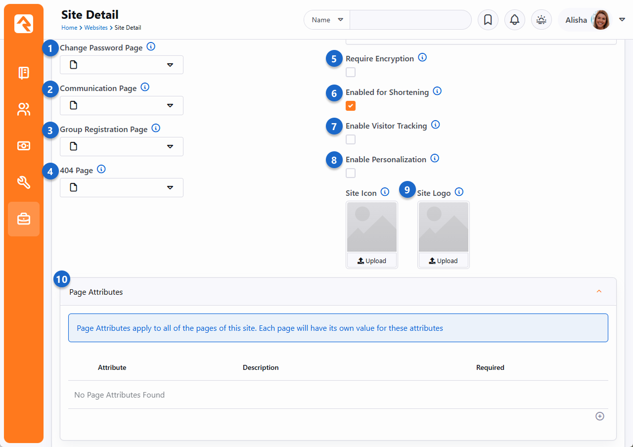
- 1 Change Password Page
-
This setting will determine the page to link to for changing the password.
- 2 Communication Page
-
The Grid uses this setting to determine what page to redirect the user to when clicking the New Communication button at the bottom of a grid of people.
- 3 Group Registration Page
-
The group registration page setting is not yet implemented in Rock.
- 4 404 Page
-
You have the option to provide a custom page not found
(aka 404) page for your site. This too can be set at a later date.
- 5 Require Encryption
-
This setting will require that all pages on this site load with SSL encryption. If
a page is attempted to be loaded with http, Rock will redirect it to https.
- 6 Enable Shortening
-
Should this site be available when creating shortlinks?
- 7 Enable Visitor Tracking
-
If an anonymous (i.e., not logged in) person visits your site, should Rock track how they are interacting
with your site? If you're using Rock's Personalization features, you'll
want this enabled.
- 8 Enable Personalization
-
Rock's Personalization features help get the right content in front of the right people. For Personalization
to work on your site, this option must be enabled. See the Personalization
chapter below for details.
- 9 Site Icon
-
If you want your site to have a site icon (aka, 'favicon'), upload it here. The recommended image size is 192x192.
Rock will automatically create all of the sizes required by different browsers and devices based on the image you supply.
Once uploaded, you can turn the icon on and off for individual pages by checking the Site Icon box in each page's properties,
accessed in the Admin Toolbar. Similarly, there's an option to upload a site logo, which some themes use to apply some change to a site.
See the theme's documentation for sizing information.
- 10 Page Attributes
-
This is where you can add attributes to the pages of your site. Page Attributes apply to all of the pages
of the site, but each page has its own value for each attribute. To learn more, see the Page Attributes section below.
Add Site 3
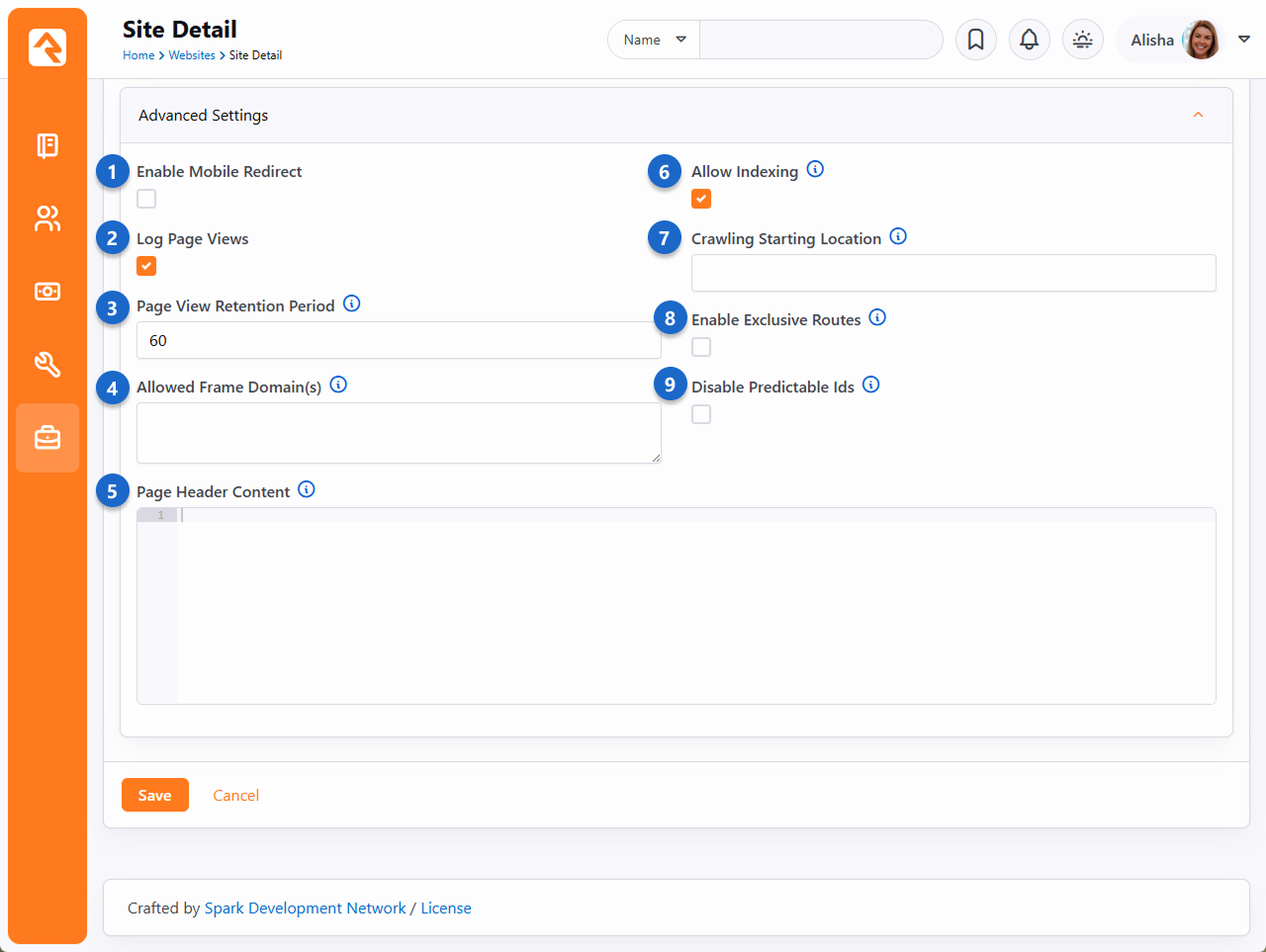
- 1 Enable Mobile Redirect
-
This checkbox enables mobile redirects. This allows you to route
your mobile users to a different page or site if they visit any
page on this site.
- 2 Log Page Views
-
This setting determines if each page view of this site should be tracked. This
allows you to gain valuable metrics about a page AND more importantly about
your guests' activities and interests.
- 3 Page View Retention Period
-
If page tracking is enabled, you can set how long the page views are stored.
You'll find that for popular sites this data will grow quickly. You may want to limit how much of it you keep.
- 4 Allowed Frame Domain(s)
-
If you need to allow an external site/domain to be able to embed your site (such as
in an iframe) just enter each domain as a space delimited list. Rock will then
take care of sending the correct page headers that block all sites not in the list.
The value you enter here will be used for the
<source> as described in
Content-Security-Policy frame-ancestors directive.
NOTE: Your Rock URL must also appear in this list otherwise you will lock yourself out
of Rock's modal popups (such as the HTML editor, block settings, etc.) Therefore, if you wanted to
allow www.yoursite.com to be embedded on www.xyz.com, you would specify the following in your list:
http://www.yoursite.com https://www.yoursite.com http://www.xyz.com https://www.xyz.com
- 5 Page Header Content
-
The content provided in this field will be added to each page's head section. This is one area where you can do a lot of
interesting customization of your site by using page attributes. For more information, see the Page Attributes section below.
- 6 Allow Indexing
-
This setting will enable or disable the pages of the site from being indexed by web indexes such as Google and Bing.
If you disable indexing, Rock will add <meta name="robots" content="noindex, nofollow">
tag in the page header to keep web indexes from crawling your site.
- 7 Crawling Starting Location
-
Provide the URL for the page from which the Rock indexer should start. See the
Universal Search
guide for additional details.
- 8 Enable Exclusive Routes
-
If enabled, other sites will not be able to use this site's routes, and routes from other sites will not work on this site. This means the domain in the URL used with the route must match the site's configured Domain(s).
If the route is configured as "Is Global" then this setting is ignored.
- 9 Disable Predictable Ids
-
This setting will prevent Rock from accepting simple number Ids when used in several places. For instance,
a standard URL like the one below displays an image with the Id 112.
https://www.rocksolidchurchdemo.com/GetImage.ashx?FileId=112
With this feature enabled, Rock will use non-guessable, obscured values in the URL instead of simple number IDs. This will prevent someone from simply changing 112 to 113 in order to load a different unsecured image. However, you may have templates that require a number Id in the URL, so this should only be enabled if you're sure you understand the implications and know the site works properly without simple number IDs.
-
Once you've provided the above information and clicked Save,
your site is ready for the next step, which is to start creating pages.
The best way to get to your new default page is to use the Page Map
under Admin Tools > CMS Configuration > Pages.
From here you can click on your default page.
Site Attributes
Attributes can be added to any entity in Rock, including Sites. If you've added any site
Attributes, you'll be able to see and provide values for them from the Site Detail block. See the
Entity Attributes
chapter of the
Admin Hero Guide
for more details.
Page Attributes
The Page Attributes section of the Add Site screen is an advanced setting that gives you a ton of control over your layout of your site. The attributes you create here will apply
across all of the pages of your site, but each page will have its own attribute value. For example, you create an image attribute for a page, then dynamically access that
attribute in your header, as shown in the following sample code:
Set Banner Image
                <script runat="server">
                    protected void Page_Load( object sender, EventArgs e )
                    {
                    var page = ( RockPage ) this.Page;

                    var bannerImage = page.GetAttributeValue( "BannerImage" );
                    headerMainText.InnerHtml = bannerImage;
                    }
                </script>

                <header id="headerMain" runat="server">
                </header>
Cookies
Rock is designed to use cookies (the electronic kind, not chocolate chip) to store and transmit information. Cookies are
packets of data carrying identification information, such as logins and passwords, which are sent from ISPs to browsers and back to
track server access. This is why sometimes when you browse to a website, it already knows who you are. That site
has stored a cookie containing your identification information. Typically, cookies are created when you click a "remember me on this computer"
option when logging into a site. Some cookies are site-specific, meaning they only apply to a certain website address. Other cookies are global,
meaning they apply to all sites at a specified domain.
By default, Rock doesn't share login info across domains, but you can override this setting
to allow your sites to use global cookies. This can come in handy when you have both an internal and external site, and you want your members
to be able to move easily between them without having to log in twice. It also may be useful to admins when they need to impersonate another person.
(For more information about impersonation, see the
Impersonating
Another Person section of the Rock Admin Hero Guide.) Global cookies
are configured in the Domain Login Sharing screen, located at
Admin Tools > General Settings > Defined Types.
Domain Login Sharing
Enter the common domain in the Value field to allow login access for all sites with that domain name. For example, entering a value of "rocksolidchurchdemo.com"
would allow a person to log in at http://www.rocksolidchurchdemo.com and be logged
into http://admin.rocksolidchurchdemo.com simultaneously.
One thing to be aware of when using global cookies is it can lead to instances where both a global and a site-specific cookie are in use. When this
happens, a person may be required to log out twice in order to clear out both cookies.
Authentication Cookie Persistence Length
The authentication cookie length is set in
Admin Tools > System Settings > System Configuration
and is in minutes.
By default, the timeout will occur after 43,200 minutes, or 30 days. See the
Admin Hero Guide
for more information.
SEO
Many people ask about Rock's SEO features. While we've worked hard to ensure many of the SEO best-practices, the requirements in this
area change on a daily basis (just being honest). If there's something you think is missing, or you'd like more information on let
us know.
Below are the topics people ask us most about:
- Google Analytics The analytics token is set on the site. Rock then applies it to each page on that site for you.
- Friendly URLs These are the routes mentioned in the Routes chapter above. They are configured on the Page Properties modal
(the gear in the admin toolbar at the bottom of each page) on the ‘Advanced Settings’ tab.
- Page Description This is also set on the Page Properties screen.
- Keywords This and all other meta tags can be set using the Header Content field on the page properties. Basically, whatever
you add to this field will be placed into the HTML HEAD tag. We didn’t add a special field for keywords because
search engines stopped supporting them a while back.
Getting Social
Read any blog on web design and you'll find plenty of posts on the importance of search engine optimization. While
it's certainly true that your site must be search engine friendly, it also needs to be social media friendly. Below
are some tips on how to ensure your Rock pages play nicely with the most popular networks.
One Thing You Must Do
If you can only do one thing, we highly recommend adding a description to each page you believe will be
shared on social media. This is quick and easy to do by accessing the Page Settings from the Admin Toolbar
at the bottom of each page.
Without a page description, the social shares will try to figure out a description for your page by stripping the
first chunk of text from your page that looks to be the main content. But why make the social networks guess
when you can give them the exact description you'd like?
Getting Deeper
Setting the Page Description is nice, but that's just the start. Each social network allows you to describe how
your page should be shared using meta tags in the page's header. Unfortunately, there is little consistency in
how this is done. Below we show you how to optimize each page's social network share information using Lava. Simply
put these tags in any HTML block on the page and your site will be socially beautiful.
Adding Make Up For Facebook
Let's start with Facebook. The three main attributes you want to set for an attractive Facebook share are the title, description,
and an image. Below we show you the Lava for each. Again, these Lava statements can be on any HTML block on your page.
- Title
{{ 'Title for Page Here' | AddMetaTagToHead:'property','og:title' }}
- Description
{{ 'Description for Page Here' | AddMetaTagToHead:'property','og:description' }}
-
Image
{{ 'URL to image here' | AddMetaTagToHead:'property','og:image' }}
Note: You'll need to upload the image to the website and link to it for the URL. Your image should be sized to:
1200px x 630px.
After setting these values, your share should look something like the example below.

Don't simply trust that it'll look right though. Use the Facebook Share Validator
to see your formatted share along with tons of debugging information.
Terrific Tweets
Just like Facebook, Twitter has several custom page attributes for you to use to make great looking shares. In fact, Twitter
allows you to control even more settings. Let's take a look at the basic settings and we'll move on from there.
- Title
{{ 'Title for Page Here' | AddMetaTagToHead:'property','twitter:title' }}
- Description
{{ 'Description for Page Here' | AddMetaTagToHead:'property','twitter:description' }}
-
Image
{{ 'URL to image here' | AddMetaTagToHead:'property','twitter:image' }}
Note: You'll need to upload the image to the website and link to it for the URL. Your image should be sized to:
440px x 220px (well that's one recommended size at least, read on...)
Very similar to Facebook, no? But wait... there's more... Twitter allows you to define two different formats of shares which they call
summary cards. One card has a large image and the other a smaller.
Large Image
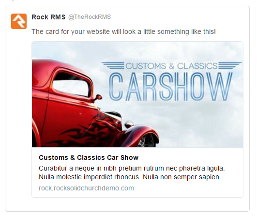
{{ 'summary_large_image' | AddMetaTagToHead:'property','twitter:card' }}
Small Image
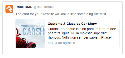
{{ 'summary' | AddMetaTagToHead:'property','twitter:card' }}
Twitter also has a helpful validator to help visualize what your share will look like.
You can also read more about what's possible by reading their documentation.
Calendar Events
Of all the content on your site calendar, events are probably one of the most shared types of content. To assist you in making this easy
we've added the social attributes Lava above in the Lava templates for calendar events. We've also added two new event attributes on the
public calendar to help you upload specifically formatted images for both Facebook and Twitter. If you've created a custom theme before
Rock v6, you'll want to copy and paste this Lava code into yours.
Using Context
Pages are very dynamic. Take for example a page that is a part of a group
toolbox which is used to display a roster for the group. When Ted logs in
and navigates to the roster page it will show the contents of his group,
but when Bill comes to the same page his roster is displayed. This all works
because, while the page is the same, the "context" of the page is specific to
their group. This context can be set through either a parameter in the page
address query string (e.g., yourserver.com/page/387?GroupId=12)
or by the internal code of a block (the query string method is most common).
You're probably thinking, "Yeah that all makes sense. The page loads with a
query string of GroupId=12 so the roster block shows the member list of that
group. Simple." And you would be right, but you can also have more fun with
the page. Say you wanted to have a custom message on the page for that
specific group. How could you make that happen? Luckily some blocks,
including our friend the HTML editor, are context aware. This awareness
allows them to look at the context of the page and adjust their content
accordingly.
HTML Block
To implement our group-specific message, we would first set the
HTML block's Context setting to
Group.
HTML Block Context Setting
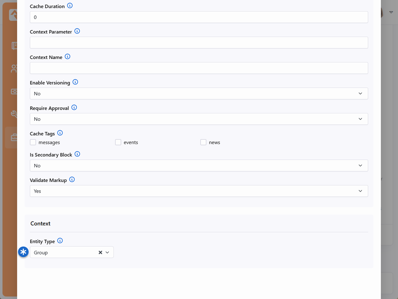
The HTML block is now aware that it's working with groups. That's step one.
Next, we need to tell it how to find the specific group you're working with.
To do that, you'll go to the Page Properties. Under the Advanced Settings
you'll find a section for Context Parameters. This is where you'll tell the page the
name of the query string parameter that indicates the group.
So, in our example, the group is identified in the URL by a parameter
of GroupId. So, that's what we'll use as our Group Parameter Name.
Page Context Configuration
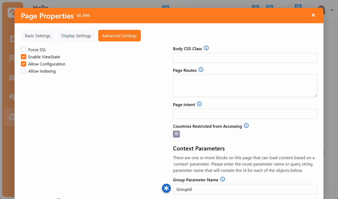
Now we can use the HTML block to do all kinds of things. With Group context
you have access to data for group types, attributes, and group members.
For instance, let's say you want to show the campus associated with the group.
To show that on the HTML block using Lava, use a special "Context"
formatting: {{ Context.Group.Campus }}.
That will display the group's campus
on the page with the group context (in this case, the Group Toolbox). The example
pictured below is for a group from the Main Campus. That will automatically
change to show the name of a different campus if the group you're looking at
is at a different campus.
Display Group Campus
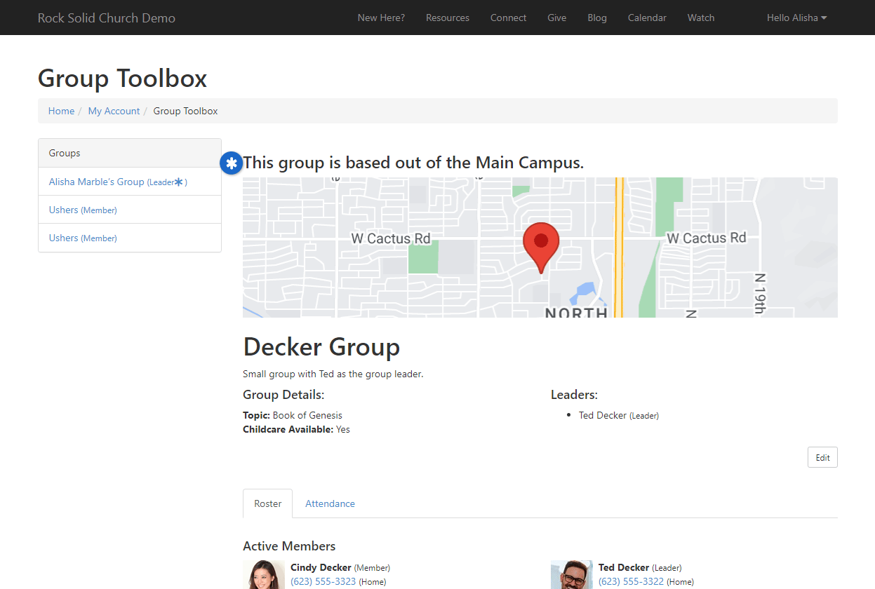
Campus Context Setter
Rock's context aware
features mean that campuses can share many of the same pages while still
providing campus-specific content. Using the
Campus Context Setter
block allows you to set the campus context in these scenarios.
Take, for example, the below screenshot. We have a
Campus Context Setter
block on the left, and an HTML block on the right. We've selected the "Main Campus" on
the left, and we're being shown content for that campus on the right.
Campus Context Setter - Main Campus
Now all we have to do is change the selection from "Main Campus" to
"Sun City" and we see unique content specific to the Sun City campus,
even though we're still on the same page.
Campus Context Setter - Sun City Campus
To set this up, you'll need to access the HTML block's settings and set the
Context Entity Type
to "Campus" just like we set it to "Group" in the prior example. Unlike the prior example,
you won't need to set anything on the page's configuration. Rather than pointing to
a query string parameter, the
Campus Context Setter
block determines which campus is being viewed.
With the HTML block configured, separate your HTML content by
campus. In the below example we used the Campus Id to distinguish campuses, but you
could also use the GUID of the campus. Notice how on the first line
we used the Context syntax to get to the Campus Id.
Campus Context Setter - HTML
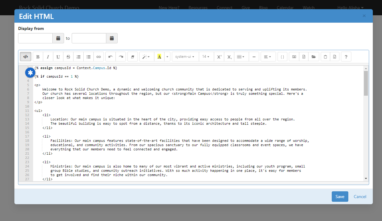
While you're there, be sure to review the block settings for the
Campus Context Setter
block. Typically you won't need to make changes here, but you
can do things like set a default campus, or restrict which types
of campuses can be shown. There's also a setting to be aware of
called
Update Family Campus on Change.
If this is enabled, the person's Family Campus will change based
on the campus they select, regardless of where this block is
placed or how it's being used.
Context on the Person Profile
The Person Profile
page ships with blocks that are already set up with Person context.
For instance, if you edit the settings for the
Person Bio
block, you can use the Context syntax in the Custom Content field to access
information about the person.
Person Bio Block Settings
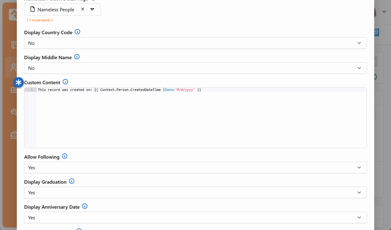
Notice that nothing was done to set the context here. This makes the
Person Bio
block unique. In fact, you can add an HTML block anywhere (any zone, any tab) on the Person Profile
and the Context syntax will automatically work for you. You don't
have to do any extra configuration.
Personalization
Churches need to focus on getting the right content to the right people, both during the
weekend and throughout the week. That's why Rock's personalization features are critical to your
digital strategy. They enable you to have content on your site that is dynamic and custom
tailored for the person viewing it. This ensures visitors to your site are seeing relevant content
personalized for them, even when the person isn't logged in.
For instance, you might want to prominently feature information about childcare to adults who have
visited your children's ministry page recently. Or you might want a special welcome message that
only shows if it's the first time the person has visited your site. These are just a couple of
simple examples to get you thinking about how personalization can be used in your organization
to show relevant content that directly applies to the person viewing it. The pictures below
show an example of personalization that's based on an IP address of a college campus.
Showing Content for Students
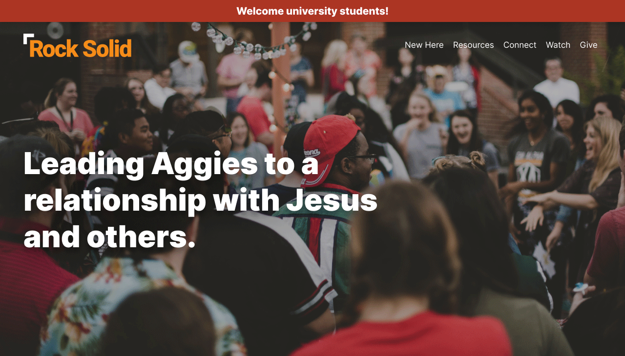
- We're showing the above content only to university students. We are able to identify
the visitor as a student because their IP address comes from the university.
Showing Content for General Public
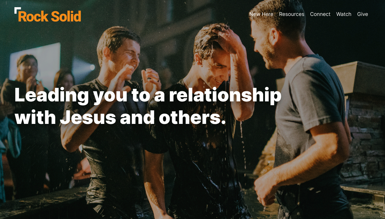
- This is the same page as shown to the left, except this person isn't coming from
the university so the content appears differently for them.
Before you can start using Rock's personalization features there is some configuration you'll need
to do. You'll need to set up
Personalization Segments and
Request Filters.
Personalization Segments have
to do with the characteristics about the individual. These characteristics can be related to any
data in Rock (e.g., location, status, gender, age, class participation, etc.) or their recent
browsing behaviors (e.g., pages they've visited, time since their last visit, etc.). You could
use a personalization segment to identify males over 35 who have recently visited your small
groups page. This lets you customize content based on the person and their actions.
Request Filters relate to
the technical characteristics of the visitor's browsing session. You could use
a request filter to show content only if the person is on a mobile device, or if they're coming
from a certain IP address.
Aside from your segments and filters, you'll also
need to make an update to your site configuration. We'll walk you through all these items below.
Personalization Segments
As we mentioned earlier, personalization segments let you filter content based on something
about the person (think Data View) or based on a person's browsing history. We have data about
people in Rock, so it's only natural we would personalize content using Rock data. For instance,
you might want information on baptisms to display only if the person visiting your site has not
been baptized. As an extension of that, you could have content that only shows to people who
have been baptized but haven't taken a next step class. Or you may want some content to target
men who have visited your men's retreat info page but have not yet registered. Similarly, you
could have special content for people who have visited your camp webpage but don't have a camp
registration. These are just a sample of the options we'll cover in this section.
You'll want to think strategically about how your segments are configured. The best
configuration is to have simple segments that can be reused in different contexts.
Some segments will last longer than others depending on the content
they're applied to. Remember, you can filter on attributes about a person AND their
previous activities on your website.
To view or configure personalization segments, navigate to
Admin Tools > Settings > Personalization Segments.
Personalization Segments
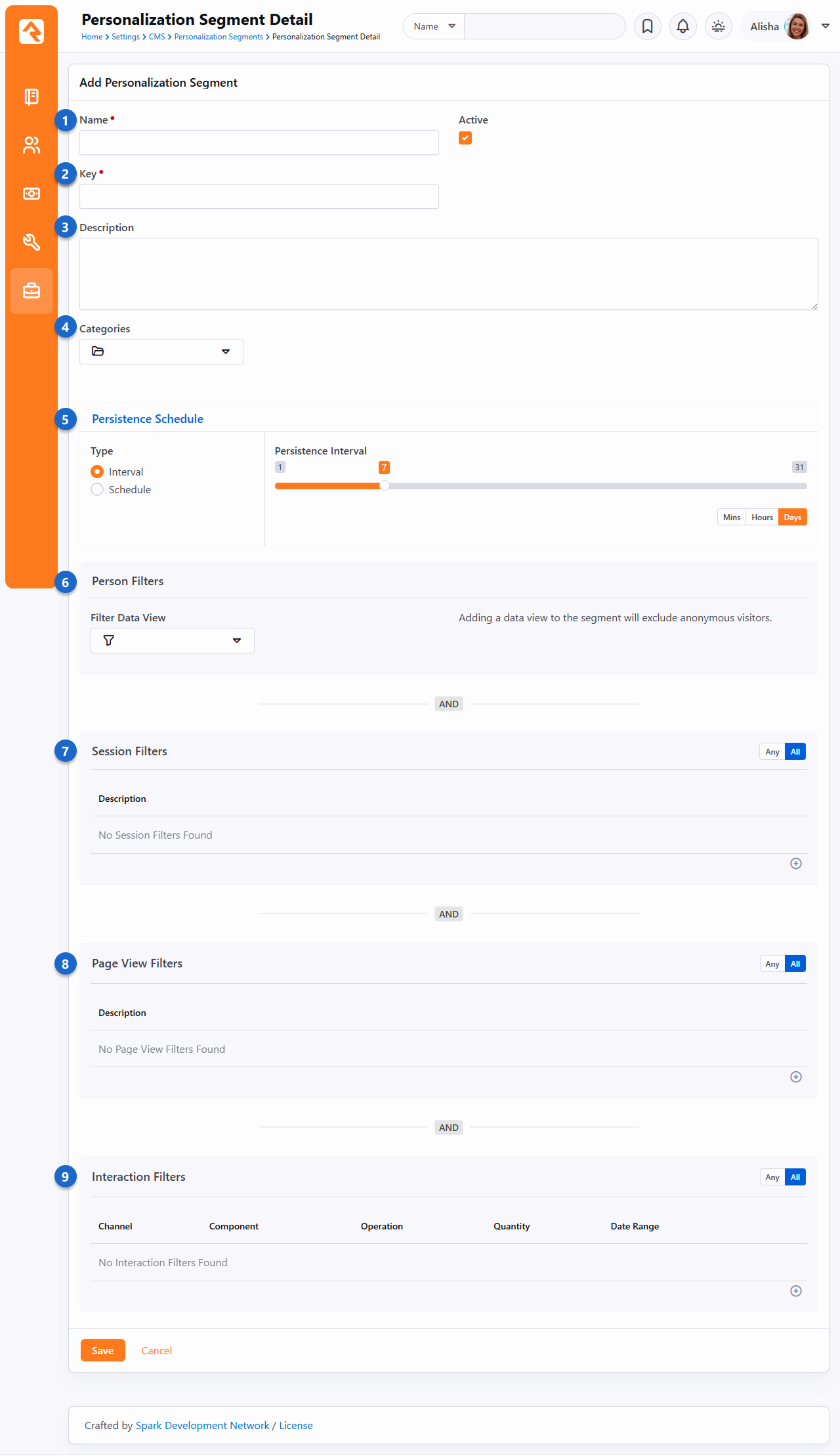
- 1 Name
- Consider a good, descriptive name for the segment. This helps distinguish it
from other segments and makes its purpose clear.
- 2 Key
- The Key is how you'll reference this segment when you're using it on your site.
Specifically, you'll use the Key with the
PersonalizationItems
Lava filter, or with the
Personalize
command. By default, the Key will be the Name of the segment with the
spaces removed, but you can change it to any unique value. Be sure there are no
spaces in your Key and avoid special characters.
- 3 Description
- Do your future self and your team a favor and make a note of what this personalization segment is for. You will thank yourself later!
- 4 Categories
- Add Categories to group and organize your Personalization Segments according to how they're used. Navigate to Admin Tools > System > Category Manager then select to add a new category. Make sure the Entity Type is Personalization Segment. Like other entities, a segment can be in more than one category if it's needed in different areas.
- 5 Persistence Schedule
- Every personalization segment must have a persistence schedule. Choose one of the following types:
- Interval
Saves segment results at a regular cadence, such as every 12 hours or every 7 days.
- Schedule
Gives you control over specific days and times to persist results, like M/W/F at 3 a.m. This is helpful for large segments with many people.
- 6 Person Filters
- Here you'll select the persisted data view that contains the
people you want included in the segment. In this example we're using a data view
returning adult females who are members or attendees. Keep in mind that a
data view can only return people with a record in Rock, so don't
use a data view if you want the segment to pick up
anonymous visitors.
- 7 Session Filters
- Add conditions here to filter people based on whether they have visited a
particular Rock website. You can optionally add a date range. You
might use this filter to select people who have visited your external website in the
past month.
- 8 Page View Filters
- This is similar to the Session filters, except it looks at page views instead of
sessions. You can set conditions for which pages a person has viewed. In the
example pictured above this filter selects people who have
viewed the "New Here?" page on the external website within the previous month.
You can also add Urchin Tracking Module (UTM) filters to narrow the population
down further.
- 9 Interaction Filters
- As you might have guessed, this filter looks for interactions the person has
logged. You could use this to select people who have filled out a
particular form, or who have logged an interaction by visiting a page on your site.
Data Views
The data view for Person Filters must be persisted.
This keeps things fast, but means the data is not in real time.
Also note that if you're using a data view then it's impossible to use the segment with
anonymous visitors.
Every filter area where you have conditions listed must match for a
person to meet the conditions of the segment. For instance, if you have a Person filter and a
Session filter, the person must meet both requirements to be selected by the segment. This is
pointed out on the page itself, reminding you that these filters are linked together with an
AND condition.
You can, however, use
OR logic within each of the filter areas by toggling the Any/All button. Select
Any if any one of the filter's conditions can be met or use All if they all
need to be met. For instance, you might use the segment to filter for people who have
visited your New Here page OR your Connect with Us page. Combine that with a
data view that pulls only females, and you have a segment for women
looking for information about your church.
Request Filters
Request Filters relate to the technical characteristics of the person's visit to your site. You
can use Request Filters to show content only if the person's IP address falls within a certain
range, or only if certain query string parameters are present in the URL. With Request
Filters, you don't need to know who the person is.
To access request filters, navigate to
Admin Tools > CMS Configuration > Request Filters.
Request Filters
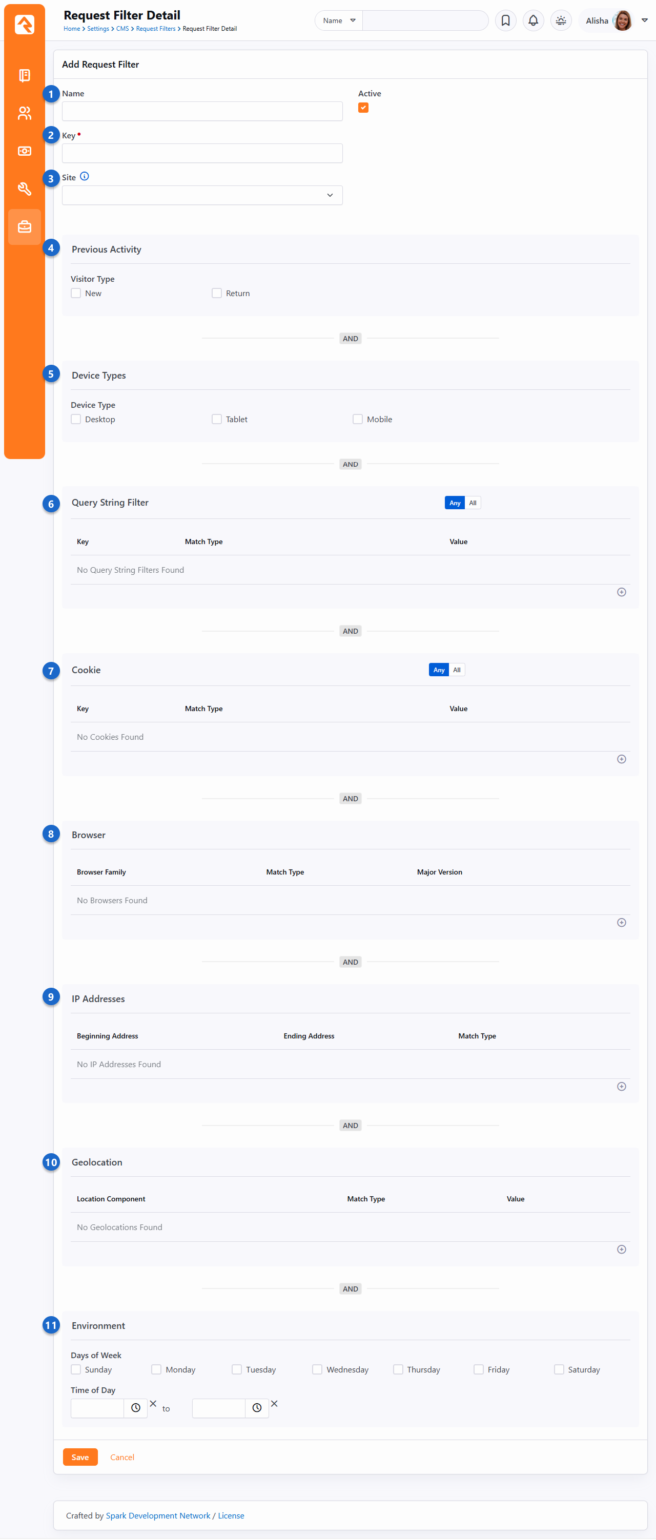
- 1 Name
- Don't skimp on the name. A good name helps you distinguish this filter from other
filters and makes its purpose clear.
- 2 Key
- By default, the Key will be the Name of the filter with the spaces removed.
You can change the key to something else, just avoid spaces
and special characters. You'll use the Key with the
PersonalizationItems
Lava filter, or with the
Personalize
command.
- 3 Site
- You can restrict the filter to reference a particular site. If this is left
blank, then all sites will be considered.
- 4 Previous Activity
- This simply lets you choose if the person is new or returning.
Whether the person is new or returning is determined via a cookie.
- 5 Device Types
- You can limit the segment to specific types of devices. For instance,
you might want this segment to only apply to people visiting your site from
a mobile device.
- 6 Query String Filter
- Request Filters can look at the query string in the URL and filter off of any parameters
that are present. All you need to provide is the name of the parameter (e.g., GroupId)
and the value the parameter should have (e.g., 101).
- 7 Cookie
- Here you can provide a Key and Value to use cookies as a filter.
- 8 Browser
- You can filter by the person's browser, and the version of
that browser. To select any version of a browser set the filter
to find versions Greater Than or Equal To 0.
- 9 IP Addresses
- A range of IP addresses can be provided so you can filter based on whether
the IP address of the visitor is in that range.
This is how we're identifying students coming to the site
from the local college.
- 10 Geolocation
- You can filter by location in a variety of ways including country, region and postal codes. This
information is based on the IP address which is automatically geocoded by Rock described in the
IP Address Geocoding chapter in the
Rock Admin Hero Guide.
- 11 Environment
- Select the days and/or the time range of the person's visit. For instance,
you could target content only to people who visit the site after
Sunday services.
Site Configuration
The last step in getting Rock ready for personalization is to
update your site's settings under
Admin Tools > Websites.
For each site that you want to work with, check the box for
Enable Personalization.
While you're there, you'll also want to check the box for
Enable Visitor Tracking,
which we'll talk more about in the next section below.
Enable Personalization
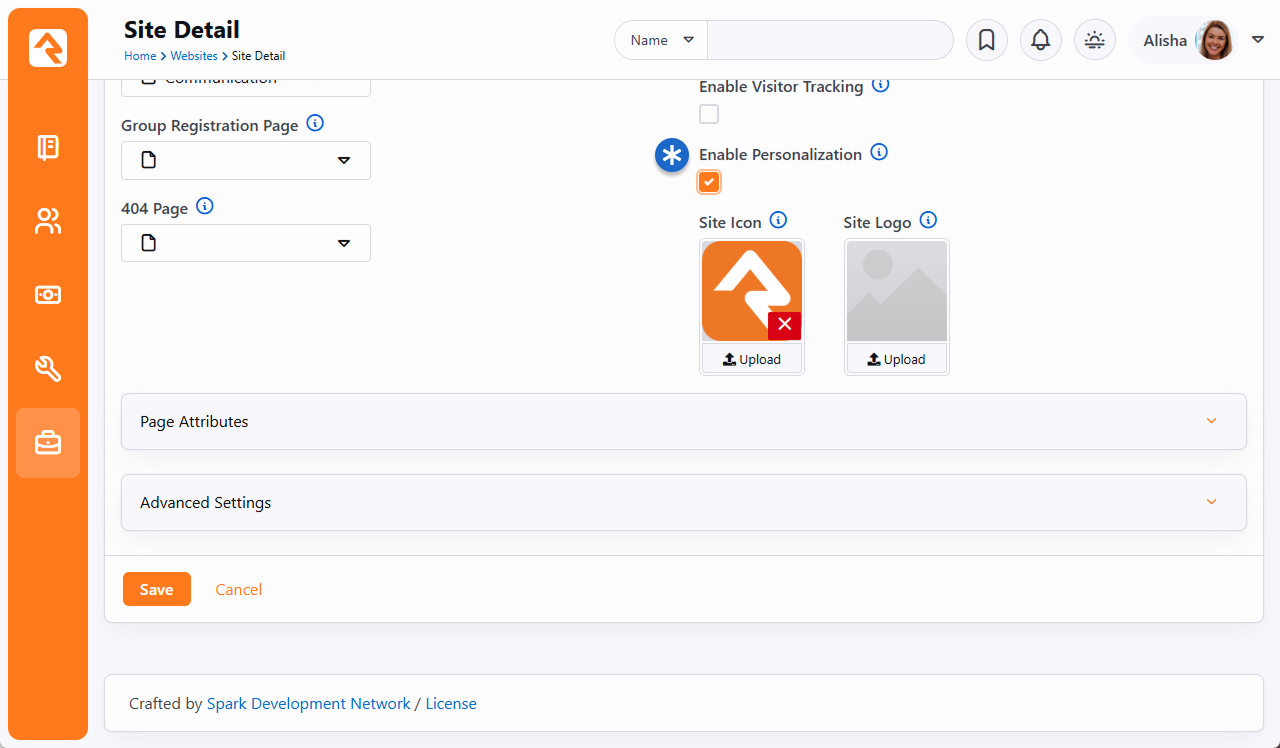
How Personalization Handles Anonymous Visitors
If someone comes to your site and we don't know who they are (i.e., they're not logged in) we
consider them an anonymous visitor. Even though we don't know who this visitor is,
we can still personalize content for them using a browser cookie.
When an anonymous visitor comes to your site, they'll get a cookie placed on their browser.
This will start tracking certain actions, like page views. Using a
cookie allows us to personalize the content they see even though we don't know who they are.
Then, Rock will recognize them and know where they've been when they come back later. By
default, this cookie lasts 365 days, but you can change that by navigating to
Admin Tools > System Settings > System Configuration
and updating the
Visitor Cookie Persistence Length.
For all of this to work, you'll need to turn on
Enable Visitor Tracking for
each site where you want tracking to occur. This setting can be found under
Admin Tools > Websites.
Enable Visitor Tracking
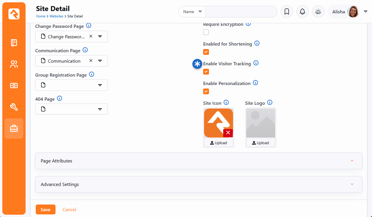
Ideally visitors won't stay anonymous forever. We want them to log in.
When they do, their page views are seamlessly switched over to the known person.
You won't need to know this, but for those who are curious, what's happening behind the scenes
is your anonymous visitor is tracked under a Person Alias record. When the person logs in,
that Person Alias record is linked to their Person record.
Personalizing Content Channel Items
Often, content is published to your site using Content Channel Items. Rock provides a
built-in way to show, hide or prioritize Content Channel Items based on whether the person
viewing them meets the criteria of the personalization segments or request filters you've
created.
Personalization for Content Channel Items is enabled at the Content Channel level under
Admin Tools > CMS Configuration > Content Channels.
Edit the Content Channel and check the box for
Enable Personalization.
Enable Personalization on Content Channel
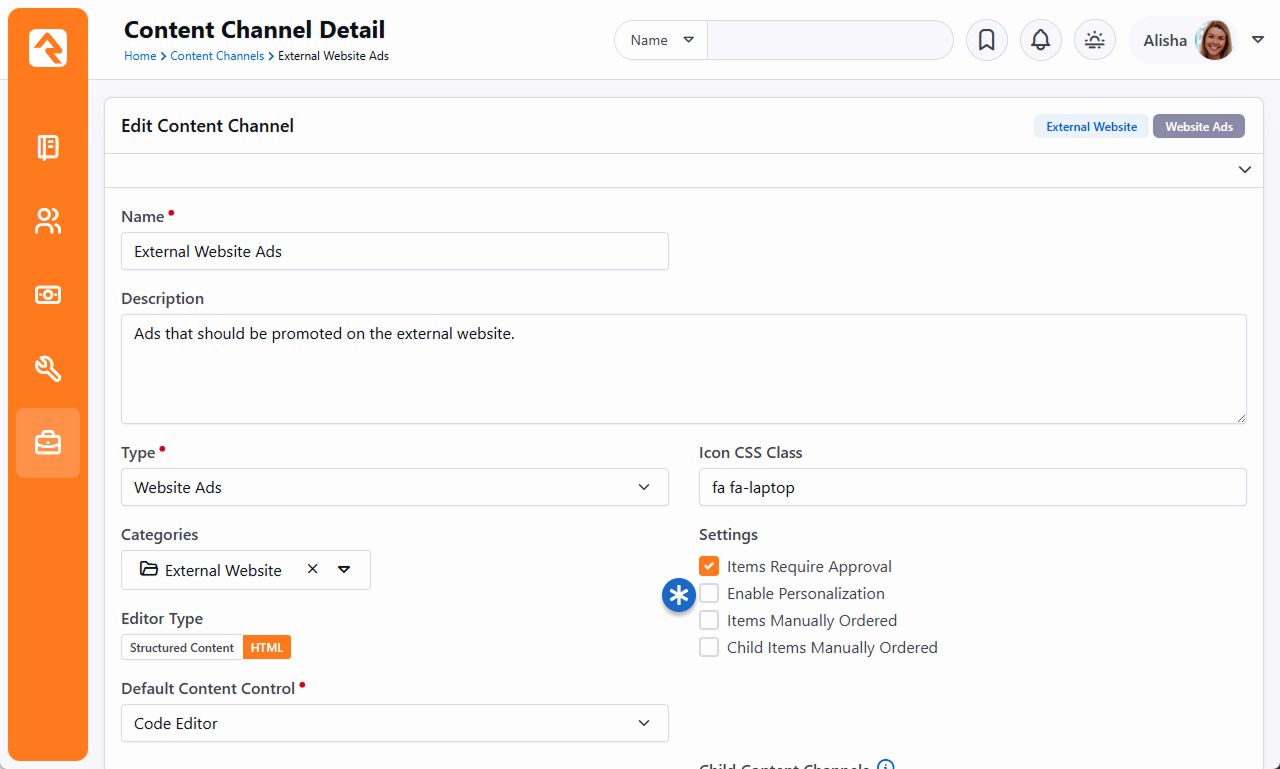
With personalization enabled, you can now start updating your Content
Channel Items. Each item can be assigned one or more personalization segments and request
filters. How these segments and filters are applied to the Content Channel Item is
determined later, which we'll talk about in a minute.
The Content Channel Item configuration is accessed under
Tools > Content or by drilling
down from the Content Channel.
Filters and Segments on Content Channel Items
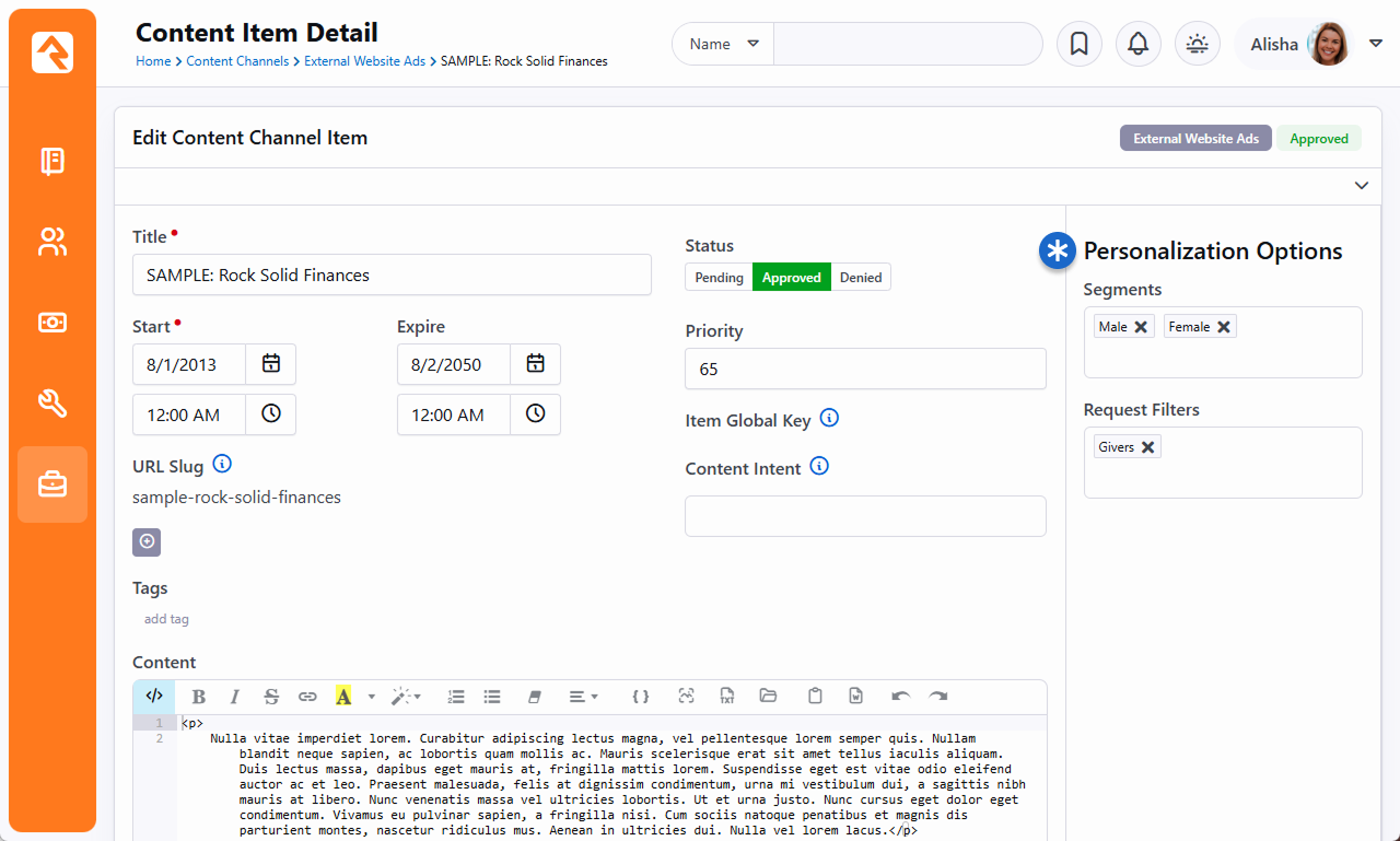
- * Personalization Profile
- Note that we've selected two segments. As part of our segment strategy, we have reusable
segments like these to identify men and women. When multiple segments are selected like
this, the person viewing the item can meet either of them. The same is true for filters.
However, if you have both segments and filters listed, the person must match at least one
segment and one filter for the personalization to apply. In this example the
person must be either female and a college student, or male and a college student.
With the above pieces in place, you'll head over to your external website where the
content is being shown. You'll want to update the settings for the
Content Channel View
block, as pictured below. This is where you decide how the segments and filters configured
above should be applied to the Content Channel Items.
Content Channel View Personalization Options
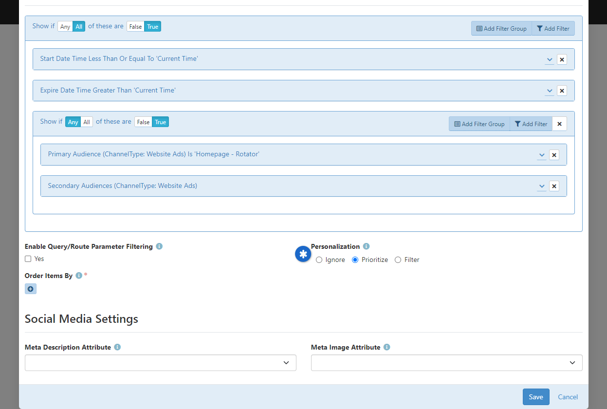
- * Personalization Options
- Use these settings to decide how segments and filters are applied.
The options include:
- Ignore: This is the default setting. Segments and filters won't
be considered when displaying content channel items.
- Prioritize: Prioritize puts content channel items that
match the segment or filter at the top of the list of items.
If multiple items match, they will be ordered according to the
Order Items By
block setting. The remaining items will be displayed after
the set of matching items and will be separately ordered according to the
Order Items By
block setting.
- Filter: If this option is selected then only content channel
items that match the segment or filter will be shown. Items that have no
filters or segments will always appear since they have nothing to filter on.
Personalizing Content Using Lava
Using Lava you can personalize
content in many places, such as the
HTML Content block. But
you're not limited to blocks. Personalization can also be used in communications too, so feel
free to personalize content within an email.
There are two ways to get personalization using Lava. The first is the
Personalize
command. This is the most straightforward option, because all you need to do is provide
the segment key or request filter key, and the content will be shown if the person/action meets
the configured conditions for that segment/filter. Don't forget, this command can be used in
emails!
The second option is to use the
PersonalizationItems
Lava filter. You can use this to apply logic such that content only shows if the person is
in a particular segment or request filter.
See the Lava documentation
using the links above for examples and details related to these items.
Update Personalization Data Job
The
Update Personalization Data
job keeps the people returned by your personalization segment up to date
and accurate. The job adds or removes people from the list based on whether they
currently meet the conditions of the segment.
If you ever need to check the current list of who meets the conditions of a segment, just click
the
button on the
Personalization Segments page
located at
Admin Tools > CMS Configuration > Personalization Segments.
The
Update Personalization Data
job updates this list.
View Segment Members
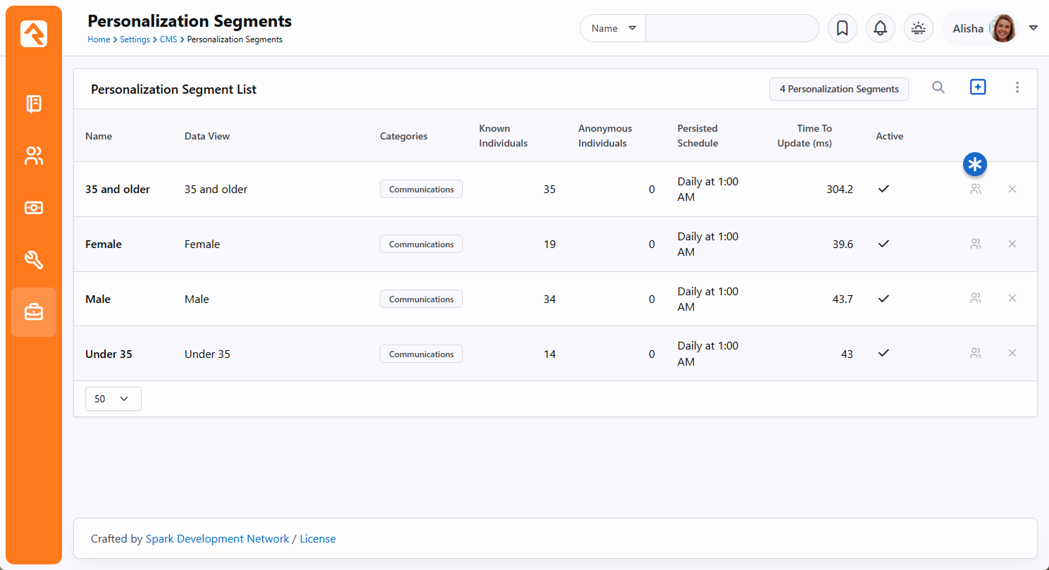
If you're curious about what's happening behind the scenes, what this job is actually doing is
updating the
PersonAliasPersonalization
table. This table is very basic and acts as a link between the person
(PersonAliasId) and
the segment. The
PersonalizationType
field on this table has a value of "0" for all rows, which represents
personalization segments. The
PersonalizationEntityId
field is simply the Id of the segment the person has been matched to.
Troubleshooting Personalization
You might encounter a scenario where personalization appears to be working differently from
how you intended. In that case, the tips below should help you resolve any problem you're
facing.
- Check the Person: It's always a good first step to double check that the
person actually meets the requirements of your segments and filters. For instance,
segments looking for "males" or "females" would overlook people with an "unknown" gender, so
you'd want to make sure the person actually has a gender recorded in Rock.
- Enable Personalization: You can have everything set up perfectly, but
it won't work if personalization hasn't been enabled for the site. This simple step is
easy to overlook, so it's worth checking.
- Active Segments and Filters: Be sure to check that the segments and filters
you're working with are Active. Don't assume...you'd be surprised how often this ends up
being the culprit. Note that you'll need to turn on the
Include Inactive block
filter setting to see inactive items.
- Persisted Data Views: The data views used in your segments must be
persisted. This ensures great performance, and means the data isn't in real time. So,
if your segment isn't working as expected, it could be that the underlying data view needs
to be refreshed.
- Update Personalization Data Job: As noted in the section above, this job
keeps the lists of people returned by your personalization segments up to date and accurate.
You may need to run this job to get the latest data, especially if you recently updated
or refreshed data views used by your segments.
- Content Channel Items: Keep in mind that content channel items without any
segments or filters will always display regardless of the Personalization Option chosen in
the Content Channel View
block settings. Also, double check the filters you're using to ensure the content channel
item isn't being filtered out for other reasons (e.g., due to a Start date in the
future). Lastly, ensure you're not viewing a cached version of the content.
- Browser Session/Cookies: As a last resort, logging out, closing all
browser windows, then logging back in can resolve some issues. Clearing your
browser's cookies will have the same effect. But this should really only be needed
if you're testing by logging in and out as different people.
Segment Cookie
There is a cookie that gets placed on the person's browser called
ROCK_SEGMENT_FILTERS. This stores the segments that the person meets. By
default, this data is refreshed every five minutes, so it will not change in real time. You can
change this refresh interval by adjusting the
Personalization Segment Cookie Affinity Duration
setting under
Admin Tools > System Settings > System Configuration.
Adaptive Messages
Being able to personalize content is great but what if you want to vary a particular personalized message slightly,
based on nuances within the data or a period of time? Adaptive Messages
take content personalization to the next level, allowing you to tailor messages based on differences in an individual’s data,
view counts, and date ranges. Building on the foundation of
Personalization Segments, Adaptive Messages
introduces features you may not have considered possible.
Suppose you want to communicate about the topic of “giving” but adapt the message for different audiences:
Active Giver with a Scheduled Recurring Gift
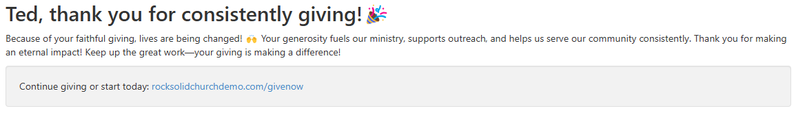 Active Giver without a Scheduled Recurring Gift
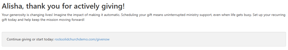 Non-Active Giver
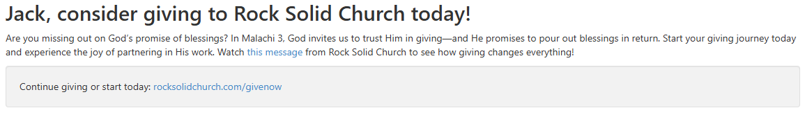 New or Default Audience
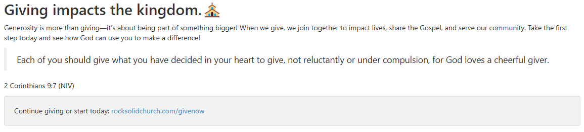
Using multiple Lava Personalize commands to handle these segments can get tricky, especially when a person overlaps into more than one segment. For example:
{% personalize segment:IsActiveGiverWithScheduledGive %} … {% endpersonalize %}
{% personalize segment:IsActiveGiverWithNoScheduledGift %}…{% endpersonalize %}
{% personalize segment:NotAnActiveGiver %} … {% endpersonalize %}
{% personalize segment:IsNoneOfTheAbove %} … {% endpersonalize %}
Not only can overlapping segments cause issues, but managing these messages over time can also become cumbersome.
Adaptive Messages to the Rescue
With Adaptive Messages, you can handle these scenarios elegantly and efficiently using a single Lava command:
{% adaptivemessage messagekey:'personalized-giving' adaptationspermessage:'1' %}
  <h2>{{ messageAdaptation | Attribute:'CallToAction' }}</h2>
  <p>{{ messageAdaptation | Attribute:'Details' }}</p>
  <div class="well"> Continue giving or start today: {{ messageAdaptation | Attribute:'CallToActionLink' }}</div>
{% endadaptivemessage %}
This single Lava command delivers multiple benefits:
- Reusability: A single Lava snippet can be used across your website.
- Centralized Management: All content is managed within the Adaptive Messages feature.
- Flexibility: New adaptations can be added without requiring changes to your Lava snippets.
- Time-Based Messaging: Adaptations can include start and end dates, allowing you to schedule messages in advance.
- Message Saturation Control: Adaptive Messages can track how often a message is shown and stop displaying it once the optional saturation limit is reached.
For more information, see the Adaptive Messages Lava documentation.
Setup
Let’s look at how to set this up for the example described above. We’ll assume you’ve already created Personalization
Segments for the first three groups of people mentioned above. No need to create a segment for the default group.
Simply include a fallback message directly in the Adaptive Message configuration.
Let’s navigate to Admin Tools > Adaptive Message
and set up a message called Personalized Giving:
Adaptive messages "Personalized Giving" Overview
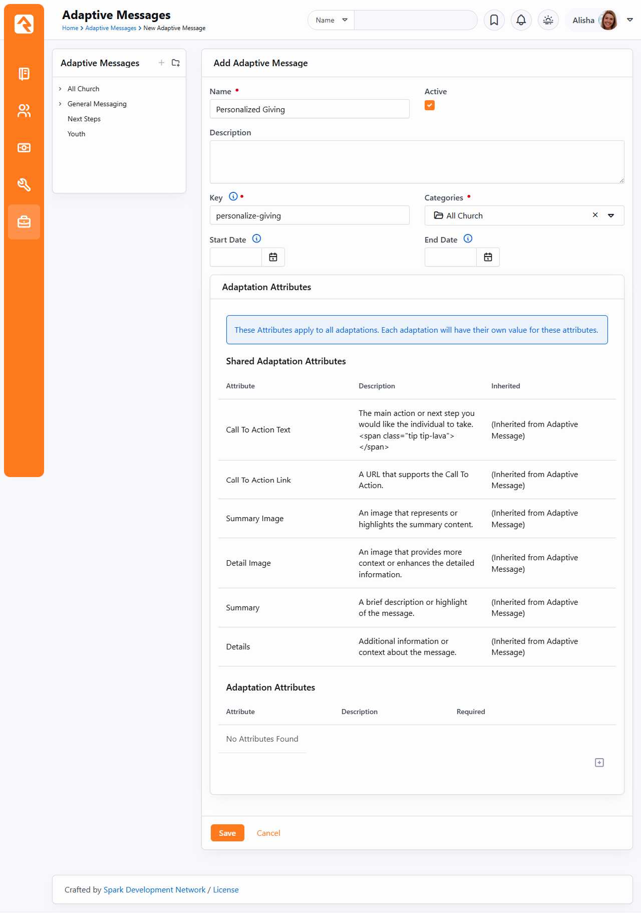
Now let’s add those specific adaptations for the first three segments.
Message Adaptation Detail
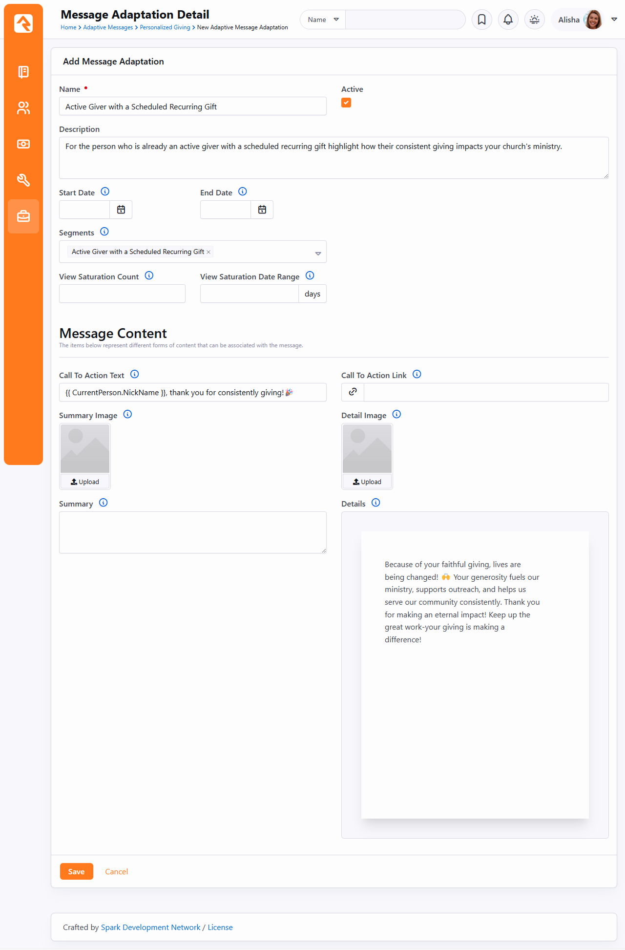
Saturation ensures that a viewer isn’t repeatedly shown the same message.
You can define the maximum number of views and the timeframe (in days) before a message is considered "saturated."
This feature works with the adaptivemessage Lava command. When trackviews is enabled,
an adaptation will stop being displayed to a viewer once it reaches its saturation point,
based on the combination of the View Saturation Count and View Saturation Date Range.
In the example above, we will do the same for the Active Giver
Without a Scheduled Recurring Gift and the Non-Active Giver
Personalized Giving Adaptive Messages
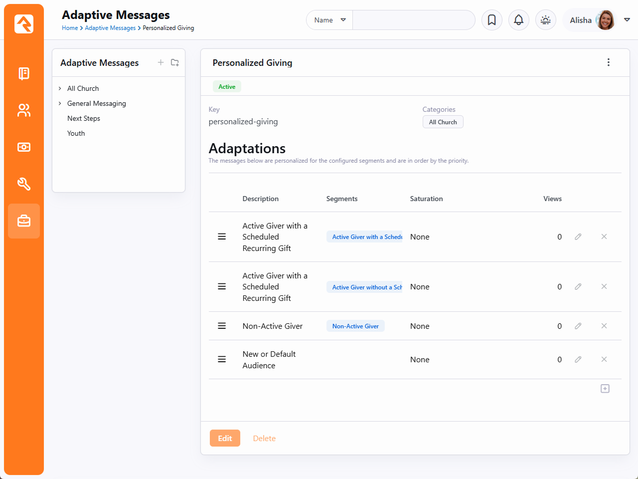
Arrange the order of adaptations to prioritize which message to show if someone belongs to multiple segments.
By using Adaptive Messages, you ensure a personalized, organized, and
scalable communication strategy that engages your audience
meaningfully while saving time and effort.
Looking Deeper at Layouts
As we discussed earlier, layouts are what give pages their structure. They
define zones that tell where blocks can live on a page. While layouts are
assigned to a page they are defined by the theme. We've standardized the
name of layouts so when you change the theme of a site, the page knows what
layout to use in the new theme. These standard layouts are shown below.
Standard Layouts
By following this pattern, you can update the entire look of your site simply
by changing the theme for your site.
We know what you're thinking though (because we thought the same way too). You're
thinking that there's no way you could possibly limit yourself to these
predefined layouts. We think, though, once you understand the level of
attention that went into them, you will find that they meet a vast majority
of your needs. That said, breaking free of these standard layouts is certainly
possible. You can create your own new layout types with their own zone names.
You will be giving up the ability to quickly and easily change the look of your
site. We'd strongly recommend coloring within the lines until you fully
understand the architecture and understand what you’re giving up by breaking free.
Standing On the Shoulders of Giants
Rock leverages several web design frameworks to help provide industry best
practices. Knowing about these frameworks will help you get a jump start on
customizing Rock's user experience for your visitors.
Bootstrap
Bootstrap is a front-end framework that brings consistent styling to Rock.
We are currently using Bootstrap version 3.4.1. Whether you're tweaking
content on a page or writing a custom template, you’ll want to get
familiar with the standard HTML/CSS mark-up that Bootstrap provides.
Reading through their excellent documentation
in its entirety is a great way to get started.
Interested in a Template?
If you're interested in creating a new Rock theme based on an existing
template, make sure it uses Bootstrap 3.4. This will save you a lot of
time.
Font Awesome
Rock uses icons in several areas of the application. These fonts all come
from the Font Awesome library.
Since these icons are all font-based vectors, they can be colorized and
resized very easily. To see a listing of all the icons in the collection
visit http://fontawesome.com.
jQuery
jQuery is a JavaScript framework that's used by a majority of Internet
sites. If you’re only interested in making minor changes it’s likely
you'll never need to work with jQuery, but if you plan to make custom
themes or blocks, you'll want to get familiar with it. Rock currently uses
version 3.5.1. You’re welcome to use a newer version in your theme but
be sure that your version is backwards compatible to 3.5.1 to ensure
Rock's core jQuery plugins work correctly. You can find out more about
jQuery at jquery.com.
Less
If you're familiar with Cascading Style Sheets (CSS), you've probably
experienced the frustration of repeating selectors and duplicate color
definitions. Less blends a programming language and CSS. It offers
concepts like reusable variables and object-oriented mix-ins. If you're
worried about learning another new technology, don't be. Less is super
simple. Soon you'll be able to brag to your friends about your knowledge
of Less! You can read up on what's available in Less at http://lesscss.org/.
A Hint About Less Files
You'll notice that some Less files are prepended with an underscore
(e.g., _print.less). That underscore helps to identify Less files that
are not directly compiled into related .css files but are instead used
as imports to other Less files. For instance, the _print.less file is
never compiled into a _print.css file. Instead, its contents are
imported (appended) to the theme.less file which is compiled into
theme.css.
Liquid
Liquid is a templating engine written by Shopify. We've extended and customized Liquid in Rock to form
our own templating engine called Lava (get it... liquid rock...).
You've already been
briefly exposed to the power of Lava in the introduction of this manual.
Lava is used in several places in Rock, so it's worth your time to learn
it well. Below are just a few of the places it's used:
-
HTML Editor: Used for dynamically mixing in personal merge
fields with your content.
-
Menus: Navigation menus and page lists use Lava to assemble
the HTML that is used to display them on the page.
-
Email Content: Emails and SMS communications use Lava to
personalize their content.
Learning Lava will make you feel like a superhero. Definitely take the time to master it. We've provided some
great resources for
you to learn Lava on our website.
Lava Shortcodes
Shortcodes are a way to make Lava simpler and easier to read. They allow you to replace a simple Lava tag
with a complex template written by a Lava specialist. This means you can do some really powerful things without
having to know all the details of how things work.
For example, instead of writing out Lava code to display a Google map with custom pins and styles, you can insert
a Lava shortcode where you want the map to be displayed, and let Rock do the work for you. Rock will replace the shortcode
with the full Lava code, which will then be displayed as a customized map when rendered by the browser. Shortcodes put the power of Lava in your
hands without you needing to be a coding expert.
To learn how to create and use Lava shortcodes, check out
The Long & Short on Shortcodes.
Less is More
The chapter title, while cheesy, is very true! Less is a technology that brings scripting
capabilities to CSS. This allows you to do things like create variables and reusable styling
nuggets (for a complete overview of what is possible see the Less website at
lesscss.org.) The
power of Less has always come at the price of having to manually compile your Less files to CSS,
that is until Rock came to town. In fact, Rock has several different tools to help you keep your
Less files compiled. Let's crack open the toolbox and see what we can do.
Methods to Compile
Compiling on Start
By default, Rock will compile all of the master .less files found in the theme folders. A
master file is one that does not start with an underscore. Each of these masters will be
compiled to ensure that the latest compiled CSS is available after each update and Rock
Shop install.
Performance Is Unaffected
If you care about performance as much as we do, you might be concerned about slowing
down the startup time. We've taken that into consideration. To reduce startup time,
the Less compile is performed on a separate thread.
Compiling from the Site Detail Page
You can compile the Less files for a specific site at any time from the Site detail page
found under Admin Tools > Websites > Site Details.
From this page you will notice the Compile Theme
link on the right side. Clicking this link will compile the site's Less files.
Using the Theme Styler
A theme's Less files can also be compiled by the built-in Theme Styler found under
Admin Tools > CMS Configuration > Themes.
From this page you will see a grid that lists each theme. Next to each theme is a compile
button. For more information on this page see the Theme Styler section below.
Themes
As we’ve already seen, the Theme Styler provides an easy way to compile our themes. That's just
scratching the surface of what's possible. Let's now go a bit deeper into all of the power
of Rock's theme tools.
Theme List
You can view a list of installed themes under
Admin Tools > CMS Configuration > Themes.
Theme List
- 1 Theme Name
- Pretty obvious…the name of the theme.
- 2 Purpose
- Indicates how the theme is used in Rock, such as for Check-in or legacy website layouts.
- 3 Allows Compile
- A theme designer can keep a theme from being compiled by Rock. This is rare and is
usually only done for internal themes developed for a specific organization.
- 4 System
- This notes that this theme is a system theme that came with Rock. These themes cannot
be deleted.
- 5 Compile
- This button allows you to manually compile a theme.
- 6 Copy
- This button allows you to copy the theme to a new theme with a name of your
liking. This allows you to change it without worrying about affecting others.
- 7 Delete
- This button allows you to delete the theme.
Theme Styler
Selecting a theme from the list will take you to the Theme Styler. Below is the theme styler
for the Check-in Adventure Kids theme.
Theme Styler
- 1 Theme Variables
- You'll notice that the theme designer has provided several variables for you to modify.
These variables allow several different customizations. Some you'll notice allow you to
choose colors. Others modify fonts, images and units of measure.
- 2 Variable Refresh
- After changing a variable you'll notice a small
x next to it the next
time you enter the theme styler. Selecting this
x allows you
to return the value back to its original state. Be creative… you can always go back to the
default if you don't like your selection.
- 3 CSS Overrides
- You may find that there is no variable for the change you want to make. Never fear, you
can enter any overriding CSS in this box. It will be placed at the bottom of the compiled CSS
to ensure that it gets the last say on how an element should be styled.
- 4 Save
- Pressing the save button will not only save your changes, but also compile the Less file
to CSS. If you're editing the internal Rock theme, you'll notice your changes right away!
Not All Themes Support Variables
It is up to the theme developer to add support for modifying variables. You may encounter
some themes that do not support changing the styling.
Tabler Icons
Use Tabler Icons to add clear visual cues across Rock RMS. You can add icons to pages, blocks, badges, groups and websites. No installation is needed in Rock. Just use the CSS class in your HTML or Icon CSS Class settings.
<i class="ti ti-settings"></i>
What is Tabler
Tabler is a free, open-source SVG icon set. Each icon sits on a 24×24 grid with a 2 px stroke. You can change its size and color with CSS. You can also use it as a webfont with CSS classes.
Pick an icon with the icon CSS picker
Insert the icons without guessing the class. Use the picker.
Icon Picker
It lists all available Tabler classes, and you can still add custom icons. Select Custom to use any icon you’d like.
The picker isn't available everywhere, though you can type the custom Icon CSS Class (e.g., ti ti-class) anywhere you need an icon.
Note
If you need help navigating from Font Awesome to Tabler, read this article.
Font Awesome 5
Font Awesome is still available within Rock, but we are transitioning to a new font-based icon called Tabler. For more, see our Tabler documentation.
Font Awesome 5 is a revolutionary step forward in font-based icons for the web. With these new capacities, though, come some
complexities. First let’s look at some of the new features and discuss how they will be implemented in Rock.
Free vs. Pro
Font Awesome has always been free and will continue to be so. In version 5 they are also offering a Pro version. The Pro version
gives you not only tons of new icons, but different weights (solid, regular and thin) as well. While the free version does have
two weights, only the solid weight is icon complete (has all the icons implemented). Because of this, “solid” is the only choice
in Rock if you have the free version.
Installing Font Awesome Pro
If you do purchase the Pro version (again, this is completely optional), you'll now need to install it in Rock. To start, you will need to log in to your account at fontawesome.com. You'll need to get both your Key and the Pro Download file. See the below screenshot to make sure you're getting the right items:
Downloading Font Awesome Pro
- 1 Key
- First, take note of your Font Awesome Pro key in the "Licenses" section. You'll need this in a minute
- 2 Download link
- Next, click the download link for Font Awesome Pro from the "Products & Services" section.
- 3 Pro for Web
- You'll need to click on the "Pro for Web" file on the page that opens, shown here.
Now that you have your key and the .zip file, log in to your Rock site and navigate to Admin Tools > CMS Configuration > Font Awesome Settings. This is where you'll paste in your Font Awesome Pro Key and upload the Font Awesome Pro for Web package that we just downloaded. Then click Install and it will tell you that Font Awesome Pro has been updated. You'll need to do this again from time to time as Font Awesome adds new icons to their Pro package.
Installing Font Awesome Pro
Font Weights
As we mentioned above, you need the Pro edition to have access to the various font weights in Rock. Currently, there are three weights:
solid, regular and thin. It's our intent to allow you to pick a weight and have the theme auto update to show your selected weight.
Each of the weights is implemented in a separate font file. There's also a separate font file for all the brand icons. To reduce page
load times, we allow you to select which fonts you’d like to implement on your theme.
Font Awesome 5 added the ability to specify the weight of the icons in CSS. So, if you wanted a light icon, you’d use “fal fa-cog.” However,
this hard-codes the icon to always be light. Instead of using the weight classes, we highly recommend that you continue to use the normal
fa prefix (e.g., ti ti-settings). This will allow Rock to dynamically change the weight based on administrator preference.
SVG Fonts
You might be asking, "What about SVG fonts? There are a bunch of new features that only they support!" At this point, we have not supported
the Font Awesome SVG fonts natively in Rock. While that might change in the future, the community felt that the increased file sizes of the
SVG font files was a concern and that the traditional font files were a better option for now. We hope that Font Awesome will have a solution
to these concerns in the future.
Other Features
Font Awesome 5 has a ton of other features that you should read about on their website.
Custom Themes
If you are writing a custom theme you can select to either hard code your theme to use a specific weight of Font Awesome or plug into Rock’s theme
customizer to allow Rock Administrators to update it from the UI. Both options are discussed below. Note that if you don't do anything, Rock's core
Bootstrap implementation will include the solid weight for you.
Hardcoding Font Weights
Don’t trust the administrators not to ruin your perfect theme by changing the font weight? No problem. You can hardcode the weight using the following custom mix-in.
@import "../../../Styles/FontAwesome/_rock-fa-mixins.less";
.fa-font-face( 'thin' );
The mix-in is really the last line of code. It will write out the font face for you. You can write out more than one if you wish by calling the mix-in several times.
The only parameter for the mix-in is the weight (solid, regular or thin).
Allowing for Weight Changes
So, you'd rather take the high road, good... good... Well, honestly, supporting the ability to change the weight of the icons is super simple. Just ensure that your
theme includes a _variable-overrides.less file and that this file is imported into your bootstrap.less and theme.less files. The Rock UI will then write into
this file the configuration needed to allow administrators to select the weight of fonts they prefer.
Designing Themes
Themes are beautiful things. They allow you to quickly and easily change the
look of your site using the latest web best practices. Before we get too far,
let's look at the contents of a theme.
Contents of a Theme
Theme Directory
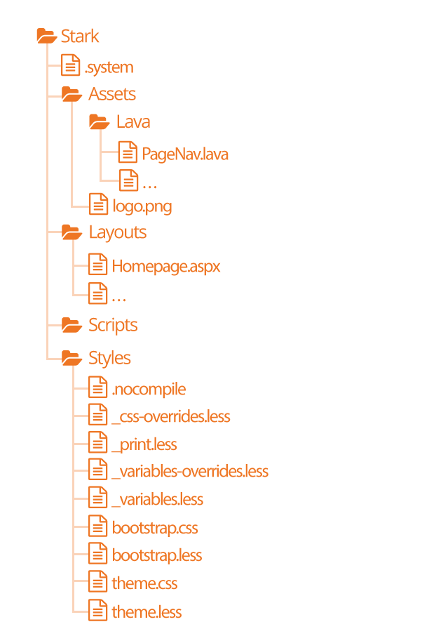
-
The .system file
tells Rock that this theme is a system theme. This prevents it from being deleted in the
Themes list.
-
The Assets
folder is used for all of the images, icons and other support
files needed by your theme. This folder also contains a
Lava
child folder for all of the Lava files needed for your theme.
-
The Layouts
folder contains all of the layouts your theme supports. For external
sites, your theme should define implementations for all of the
standard layouts covered in the
Looking Deeper At Layouts chapter.
-
The Scripts
directory will be used for any custom scripts your theme requires. Be sure to
only place unique scripts here that are not contained in the global scripts folder.
-
Finally, the Styles
folder contains all of the files needed to generate your CSS. Specifics
of these files are discussed in depth below.
Using Images in Themes
When using images in your theme design, they will typically be implemented as an IMG tag or a CSS background.
Use of an IMG tag, with accompanying ALT attribute text, is optimal if the image is part of the page content
or has semantic meaning. This will allow search engines as well as screen readers to interpret the image.
Stark
No, this is not our Ironman theme, but this theme will become your go-to
for custom theme development. Stark gets its name from the fact that it is
basic and minimally styled. In fact, it comes with the least amount of styling
possible. We created it as a starting point for you to create new works of
art. Think of it as your blank canvas.
To start a new theme, you should start by copy/pasting the Stark theme and
then renaming it. Then start restyling the theme using the .less files.
Warning
Because the Stark theme will be updated with future versions of Rock you won't want to make changes to this theme. Instead copy
and paste the Stark theme to create your own theme.
How Rock Uses Less
There are two sets of .less files. Those in the core Styles
folder and the theme .less files. The purpose of the core styles is to
provide the basic structure and look/feel to the various Rock blocks. The
theme's .less files add the final polish to the blocks and override any
of the CSS attributes you desire. Let's take a quick look at each Less
file that makes up a theme.
-
.nocompile: This file tells Rock's Less compile tools to ignore this theme. This file should only be used in
cases where a custom theme designer wishes to manually compile the theme's Less files (rare).
-
_css-overrides: This file contains the Theme Styler's CSS overrides. It should not be manually edited.
-
_print.less: This Less style file helps set specific print
styles that make Rock pages look better when printed. The contents of
this file are imported (appended) into the theme.less file. For the
most part, you should not need to modify these styles unless there is
a specific print styling you would like to add.
-
_variable-overrides: This file contains the Theme Styler's variable overrides. It should not be manually edited.
-
_variables.less: This is a very powerful file. It contains a
rather large list of style settings that you can change. Simply
changing a couple of colors can make your theme match the brand
colors of your organization. We highly recommend that you make a
copy of the Stark theme and start playing with the variables in this
file. You’ll be surprised how easy it is to make some dramatic changes.
-
bootstrap.less: This is the core Bootstrap Less file. You
should not change this file. If you need to modify a style setting
in Bootstrap, you should either identify the variable that Bootstrap
uses to control that style in the _variables.less file or write a
specific override in your theme.less file.
-
theme.less: This is the file that contains all of your theme's
custom styling. If you can’t style it with a variable change in the
_variables.less file, it should be added here.
Once you make changes to your Less files, you’ll need to compile them to
.css files for the browsers to use. There are a number of Less compilers
you can use for this.
Themes Are More Than Looks
Keep in mind as you develop your theme that you need to be concerned with more than just how your theme looks
in the visitor's browser. You should also be testing to ensure your theme works well with Rock's in-page editing
features. Zone and block editor features should work well with your theme to allow web administrators access
to edit the pages.
To help you with this Rock will add classes to the <body> tag when the zone and block editors are enabled. These
classes are 'zone-highlight' and 'block-highlight' respectively. With these classes you can adjust your layouts when
these editors are at work.
Rock will also add the class 'modal-open' to the <body> tag when a modal is open. This allows you to do special styling
when this event occurs.
Lava
Every theme should include some implementations of the standard Lava
files in the theme’s ./Assets/Lava folder. Each of these files is
covered below.
-
AdList.lava: This is used to render HTML for the various lists of ads on pages.
-
AdDetails.lava: This is used to render HTML for the details of a specific ad.
-
AdRotator.lava: This provides the markup for the large ad rotator on the homepage.
-
BlogItemList.lava: Renders markup for a list of content channel blog entries.
-
BlogItemDetail.lava: Renders markup for a content channel blog entry.
-
PageListAsBlocks.lava: This Lava is for rendering a list
of pages as blocks like the ones on the various
Admin Tools pages.
-
PageListAsTabs.lava: This renders markup for showing a
list of pages as a Bootstrap tab or pill navigation.
-
PageNav.lava: Used for a page's main navigation.
-
PageSubNav.lava: Renders markup for a page's sub-navigation.
-
RSSFeed.lava: Renders markup for a content channel RSS Feed.
-
RSSFeedItem.lava: Renders markup for an item in a content channel RSS Feed.
Testing Your Theme
As you're working on your theme you might be wondering how you can view
it without everyone seeing what you’re working on. Well prepare to have
your mind blown. Because you're a Rock Genius, you know that when a page
loads it gets the active theme by looking at the site's theme setting.
Pretty simple. You can, however, override this setting by adding the
query parameter theme='themename'. For instance, if your page is available at:
http://www.rocksolidchurchdemo.com/page/1
you can have that page display your new theme by typing in:
http://www.rocksolidchurchdemo.com/page/1?theme=MyStarkTheme
The best part is that only you will see it. Everyone else will see the
current theme defined on the site. Pretty James Bond, huh?
Important Note About Rock's Less Compiler
As a theme developer it's your responsibility to ensure your theme compiles correctly with Rock's Less compiler. Most client-based compilers
use the same JavaScript based Less compiler provided by the Less reference organization (http://lesscss.org/).
Because Rock needs to compile the Less on the server it uses a C# implementation called dotLess. DotLess
does a good job, but it is a little less forgiving with things like circular variable referencing. Also, since the compiling is done on the server,
it's more difficult to present Less errors.
Please take time to ensure that your Less is compiling correctly before moving it to the server or publishing it to the Rock Shop.
As an example to the warning above, if you're using certain CSS filters, you may find that you need to escape them.
For instance, if you add the CSS below:
.item {
    filter: blur(8px) !important;
}
You may find that your compiled CSS is blank. To fix this you'll need to escape the filter by
appending a ~ and wrapping the filter in quotes like:
.item {
    filter: ~"blur(8px) !important";
}
Theming for the Styler
As you have already seen, Rock's Theme Styler is a powerful tool for allowing others to edit your theme. It's easy for you to
enable others to change your theme by making a few small changes to your _variables.less file. Below is a side-by-side comparison
of the _variables.less file for the internal Rock theme and the UI created from it in the Rock Styler.
_variables.less File for the Rock Theme
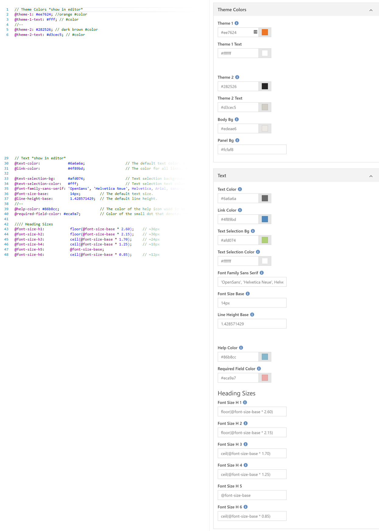
Let's look at a few lines to see how the _variables.less file is magically transformed into this nice editor.
- Line 1: Adding a '//' followed by text will create a new variable grouping. To turn
this grouping into a panel in the styler you'll also need to append *show in editor*. This allows you to
also create groups that are not editable.
- Line 2: Line two and we're already adding our first variable. The label for the variable will be
the variable name (minus the @ character). All dashes in the variable names will become spaces. The values in the comments
will be used for the help text. Finally, if the comment ends with #color, Rock will render it as a color field. The color
field is smart enough to render as a plain ol' textbox if it contains less functions like darken.
- Line 4: Placing the characters '//--' will insert line breaks in the editor. This allows you to easily sub-group your variables.
- Lines 7-28 These lines were omitted to simplify the illustration.
- Line 29: Note that there is no end marker for variable groupings. When you're done with one, simply start a new one.
Lava On Layouts
As you create your themes and layouts you might start to see a pattern of having to create HTML blocks to provide content that won't change often.
For example, you might add an HTML block at the top of every page to place an image from a page attribute, or some sort of welcome message. Luckily,
there is a way of adding content using Lava right on your layout. (You've always been able to do these types of things in C#, but honestly, who
wants to resort to C#?!)
When creating your layouts, you can add Lava right in your .aspx files. To do this use the
Rock:Lava tag. Below is a
quick example of what you can achieve.
Sample Lava Template on a Layout File
<Rock:Lava ID="lavaHeader" runat="server">
    {{ CurrentPage | Attribute:'HeaderImage' }}

    {% if CurrentPerson %}
        Hello {{ CurrentPerson.FullName }}
    {% endif %}

    {% cache key:'external-header-grouplist' duration:'3600' %}
        {% sql %}
            SELECT [Id], [Name] FROM [Group]
            WHERE [GroupTypeId] = 25 AND [IsActive] = 1
        {% endsql %}


        {% for group in results %}
            {{ group.Name }}
        {% endfor %}
    {% endcache %}
</Rock:Lava>
The example above is a bit of a kitchen sink script showing all sorts of functionality. Let's look at some of the features packed in there to see
what's possible.
-
Page Attributes: One of the best uses of Layout Lava is interacting with page attributes. It's a great idea to add a page attribute for things
like page header images. You can then place them right on your layout. Bonus points if you provide a default image in your attribute settings so if a page doesn't
provide an image a default one is used instead.
-
Custom Messages Remember, this is Lava. You have access to common objects like the CurrentPerson.
Use this for your fame and fortune.
-
Lava Commands We assume that anyone who is allowed to edit a file on your server has administrative rights (because they do, if you can edit a file on the web server you
can pretty much do what you want if you know C#) so we've enabled all of the Lava commands when using Lava templates on the layout. This simple example lists all active small groups using
the SQL command.
-
Think Speed You want your website to be fast right? Think about how you can use the Lava cache tag to remember content that comes from the database. In this
case we cache the group list for one hour (3600 seconds). Be careful though. You don't want to cache personalized messages, or if you do use the two-pass option in the Lava cache
command.
Things You Should Not Do
Rock is about freedom and empowerment. There are only a couple of things you
should not do under any circumstances, for your own good.
-
Update Global Styles: You do not want to update any of the .less
files contained in the ~/Styles/ folder. We guarantee that these files
will be overwritten by each update. If you would like to override a
specific styling you will want to do that in the CSS/Less files of your
custom themes.
-
Change the Rock Theme: The Rock theme will also be updated in new
releases. This theme serves the internal site and should not be altered.
-
Change the Stark Theme: The Stark theme will also be updated in new
releases. If you would like to make changes to this theme, please copy and paste it
to create a new theme.
-
Create a New Internal Site Theme: If you would like to alter the
look of the internal site, you could create a new internal theme. We
highly recommend that you refrain from doing so. As we add new
functionality, we will be extending the internal theme to work specifically
with these new features. It's likely that your custom internal theme will
not have the correct styling to properly display these new pages and blocks.
Remember this theme is only viewed by your internal staff and some
volunteers. We recommend putting all your effort into your external
themes which are viewable by a much wider audience.
-
Add Scripts to the Global Scripts Folder: You should not add
any custom JavaScript files to the Scripts
folder located at the root of the file system. Instead use either the
scripts folder under a specific custom theme or add a script folder in the
Plugins folder.
-
Use the External Site as Your Site: You might be tempted to jump in and start using the
external site that comes with Rock as your external (public-facing) site. Keep in mind that we add pages and
blocks to this site as we create new features in Rock, and those changes could conflict with
changes you’ve made. Think of the out-of-the-box external site as a “best practice” site to
reference when you’re creating your own site.
To build your own site, you’ll need to
create a new site and start adding pages to it. If you want your
site to start off like the one that ships with Rock, you can copy the External Homepage and child
pages, then point them to the new site. This is similar to the process described for
copying the Landing Page. As we add new pages and
blocks to Rock, you may need to manually copy those pages or blocks to your new site to see the
updates. Updates to existing blocks will generally not require any action unless, for instance,
new required block settings fields are added.
We have a few other suggestions for things to avoid in our
Admin Hero Guide.
Rock Directory Structure
So now that you know the parts and pieces of Rock, let's learn where each lives.
Rock Folders
Rock Directory Structure
-
App_Browsers/ – You should not need to worry about this directory.
It's a special directory that allows ASP.Net to identify specific
browsers and determine their capabilities.
-
App_Code/ – This directory contains un-compiled code for Rock.
You do not want to alter or add files in this directory.
-
App_Data/ – This directory allows you to store data without
having to worry that a client could browse directly to it. For
instance, Rock writes a log of severe error messages to this
directory (specifically ~/App_Data/Logs/RockExceptions.csv). But,
because the webserver blocks requests to access these files directly,
you do not need to worry about someone being able to access them.
You'll also notice that Rock keeps a cache of binary files in
~App_Data/Cache/. For the most part you don't need to know about this,
but it’s good to know how things work under the hood.
-
Assets/ – This is the global assets folder where Rock stores
images, icons, fonts, etc. that are a part of the core install. You
should refrain from storing your files in this directory.
-
Bin/ – ASP.Net keeps its compiled assemblies (aka .dlls) in this
folder. If you have custom plugins with compiled assemblies, you'll
want to add them here. Keep in mind that if you add/modify/delete any
file in this directory Rock will restart which could impact people
using Rock at the time. You should only do this after hours.
-
Blocks/ – These are the core Rock blocks. As you can see, they are
organized by function. You should not modify any of these blocks nor
add your own. This location is reserved for the core blocks.
-
Content/ – This is where you'll add your custom content for your
various sites. While it's up to you to determine the best file and
folder structure, we recommend that you at least keep the content for
the various sites separate. Over time these folders can get quite
messy so it's best to come up with a good filing structure from the
beginning.
-
Plugins/ – The plugins folder is where you'll place all of your
custom blocks. The organization of the files in this folder is very
important. To help keep things straight the following pattern should
be used.
Plugin Directory Structure
-
The top-level should start with a reverse domain organization
notation. For instance, if your organization uses the domain
rocksolidchurchdemo.org your top-level folder should be
org_rocksolidchurchdemo.
-
Under your root folder you’ll have a child folder for each
plugin that you develop.
-
Under the plugin folder you’ll have folders for things like
Assets, Styles and Scripts. You’ll also put the blocks
themselves in the root folder.
-
Scripts/ – This is the core scripts folder. You should not add
scripts to this folder. Instead add your scripts to your custom theme
folders.
-
Styles/ – The styles folder is for Rock's core .less files. You
should not edit these files as they will be overwritten during updates.
If you need to modify the properties of a certain style you should
override them in your custom theme files.
-
Themes/ – This is the location of all the themes for your Rock
install. See the Themes chapter for more information
on themes.
-
Webhooks/ – Webhooks are HTTP handlers (Web 2.0 geek-speak for very basic
webpages) that receive requests from Internet services like Mandrill
and Twilio. For instance, Twilio will call a specific webhook every
time someone responds to your SMS message to notify you of the details
of the response. When you write a custom webhook you can place it in
this folder.
Couple of Important Files
While we won't cover every file in the root Rock folder, below are a
couple that you should be aware of.
-
License.aspx: Rock uses several open-source projects in its
core. Attribution for each of these projects is given here. We also
note each of their licenses so as to show that our license (Apache)
is not in conflict with theirs.
-
Web.config: This is the core settings file for any ASP.Net
application. Unless you know exactly what you're doing you should
stay away from editing this file. Keep in mind that any change to
this file will cause Rock to restart.
File Manager
The file manager provides a basic interface to help you to upload and
delete files and manage directories without having to set up or share
FTP credentials. Its root folder can be configured allowing you to
enable a specific user or security role to manage a specific part of
a folder hierarchy. By default, a File Manager block can be found at
Admin Tools > CMS Configuration > File Manager.
File Manager
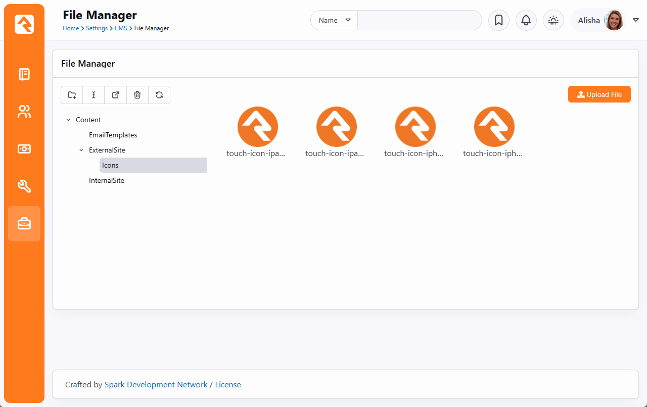
Persisted Datasets
Extensibility and performance are often in conflict. Some large datasets can be resource intensive to process,
so users might be left waiting seconds, or even minutes for results. Other datasets, like getting an attribute
of another attribute, might perform adequately, but cause issues at scale. With Persisted Datasets you can shape
data for speed and reuse demanding queries without worrying about performance.
By simply caching data as JSON, you can re-use it for later transformations (website, app, etc.) without having
to rebuild it from scratch. Persisted Datasets are cached on the database or in memory and can be called by Lava
filters to transform data for as many uses as you can think of.
How Persisted Datasets Work
Let’s take a look at what makes Persisted Datasets tick.
Output
To output a persisted dataset, you just need to use the PersistedDataset Lava filter, which
looks something like this:
{%- assign data = 'mydataset' | PersistedDataset -%}
{%- for item in data -%}
  {{ item.Title }}
{%- endfor -%}
In the above example, mydataset is the name of the Persisted Dataset
Access Key and data returns the data
contained in the dataset. You can find more information on how to use the PersistedDataset
Lava filter in the How to Use It section below.
Behind the Scenes
To create a Persisted Dataset, you’ll use a Lava-based build script to create JSON, which is then stored
in memory.
[
    {% campus where:'Id != "0"' %}
        {% for item in campusItems %}
            {
                "Id": {{ item.Id | ToJSON }},
                "Name": {{ item.Name | ToJSON }}
            }
            {% if forloop.last == false %},{% endif %}
        {% endfor %}
    {% endcampus %}
]
Because this is Lava-enabled, you have access to all the power of Lava, including SQL, Entity Commands,
Execute and Web Requests.
How to Use It
Let's see how to actually set up your first Persisted Dataset. In your Rock instance, go to
Admin Tools > CMS Configuration > Persisted Datasets
and create a new dataset. You’ll see the screen pictured below.
Add New Persisted Dataset
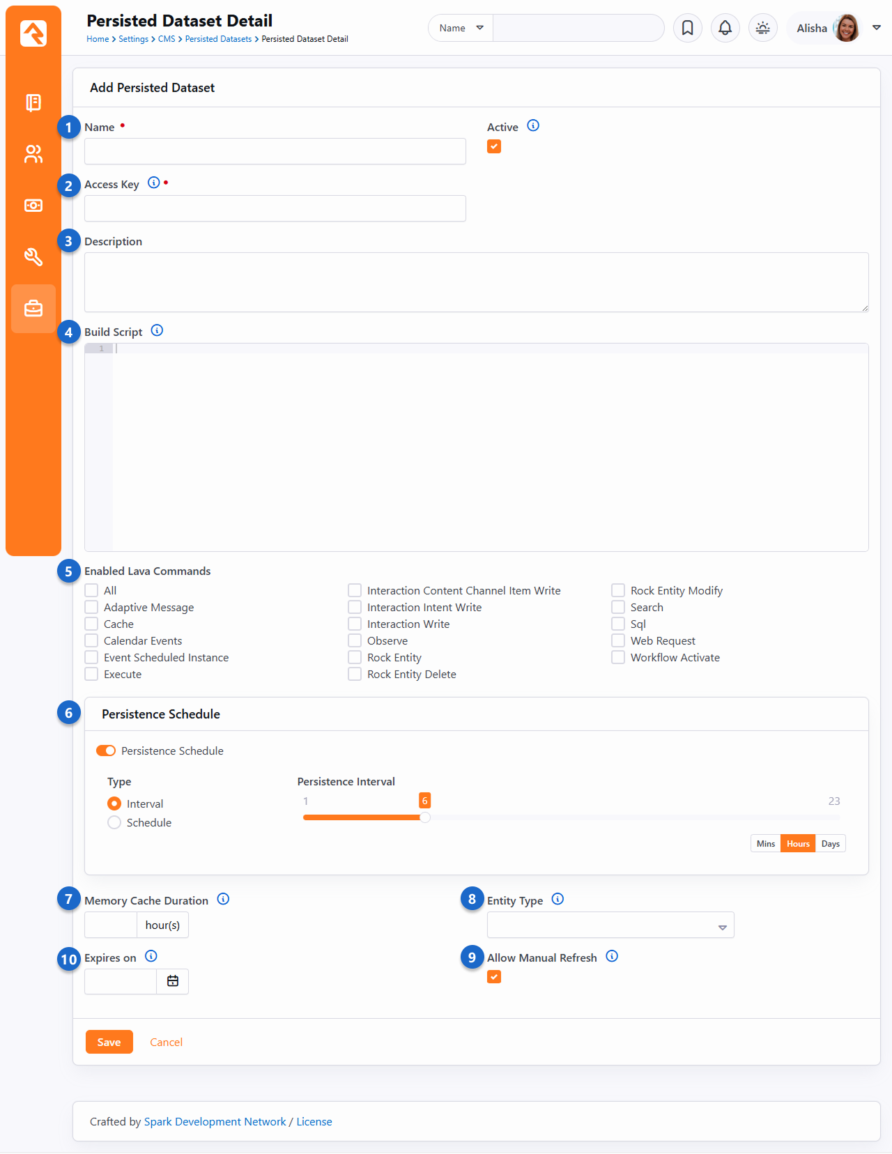
- 1 Name
- Choose a memorable name to use for organizing your Persisted Datasets.
- 2 Access Key
- The Access Key uniquely identifies the dataset. This will be the key to use when using the
PersistedDataset Lava filter.
- 3 Description
- Include a note about the information you’re storing and where it’s being used. Your future self
will thank you for providing an informative description.
- 4 Build Script
- Provide the Lava Template to use for building the JSON that will be used as the cached dataset object.
- 5 Enabled Lava Commands
- Use these settings to control what code can run inside of your build script.
- 6 Persistence Schedule
- If enabled, your dataset will update on a persisted schedule. Choose one of the following types:
-
- Interval: Saves the cached dataset at a regular cadence, such as every 12 hours or every 3 days.
- Schedule: Sets specific days and times to rebuild the dataset, like M/W/F at 3 a.m. Ideal for large data volumes.
- 7 Memory Cache Duration
- Because Persisted Datasets are generally stored in memory, the duration allows you to automatically remove a
dataset from memory after the specified number of hours. For example, if you were to set the field to “24” and
the dataset was not accessed for over 24 hours, the data would be removed from memory. This frees up memory for
other tasks and keeps Rock running fast.
This is a sliding timeline, so each time the object is read the counter will reset. You can also leave this field
blank to not cache the object in memory, which means it will be deserialized into the object on each request
(still fast).
- 8 Entity Type
- The JSON object will be associated with the Entity Type selected here.
- 9 Allow Manual Refresh
- If you need to force a dataset to use the most recent data, enable this setting and Rock will add a button to the
list view grid to manually update data.
- 10 Expires on
- The dataset will not return data and won’t be updated by the refresh job after this date.
Building Persisted Dataset Lava
The Persisted Dataset Build Script
is Lava that has been specifically formatted to output as JSON. You’ll need to format your
Build Script to create properly formatted
JSON that Rock can then deserialize. So, when you’re creating a
Build Script using Lava, keep a few things
in mind:
-
When outputting values use the
ToJSON filter, which automatically sanitizes and formats your output.
For example, "Name": {{ item.Name | ToJSON }} will output "Name": "Phoenix Campus".
-
You’ll need to add commas between values to create valid JSON.
-
Your build script is compiled once, and the Lava should not be customized per user.
Example Build Script
[
{%- assign slots = '140' | FromCache:'DefinedType' -%}
    {%- for item in slots.DefinedValues -%}
        {
            "Id": {{ item.Id | ToJSON }},
            "Slot": {{ item.Value | ToJSON }},
            "SlotDay": {{ item | Attribute:'Day' | ToJSON }},
            "SlotTime": {{ item | Attribute:'Time' | ToJSON }},
            "SlotDateTime": {{ item | Attribute:'DateTime' | ToJSON }},
            "SlotIsSchedulable": {{ item | Attribute:'IsSchedulable' | ToJSON }},
            "SlotLength": {{ item | Attribute:'Length' | ToJSON }},
            "SlotDateTime": {{ item | Attribute:'DateTime' | ToJSON }}
        }{%- unless forloop.last -%},{%- endunless -%}
    {%- endfor -%}
]
Now that you know a little bit more about how Persisted Datasets work, let’s take a look at a specific example.
A good use case is displaying the output of timeslots for a conference. From the example pictured below, there
are a few details we want to point out.
Example Persisted Dataset
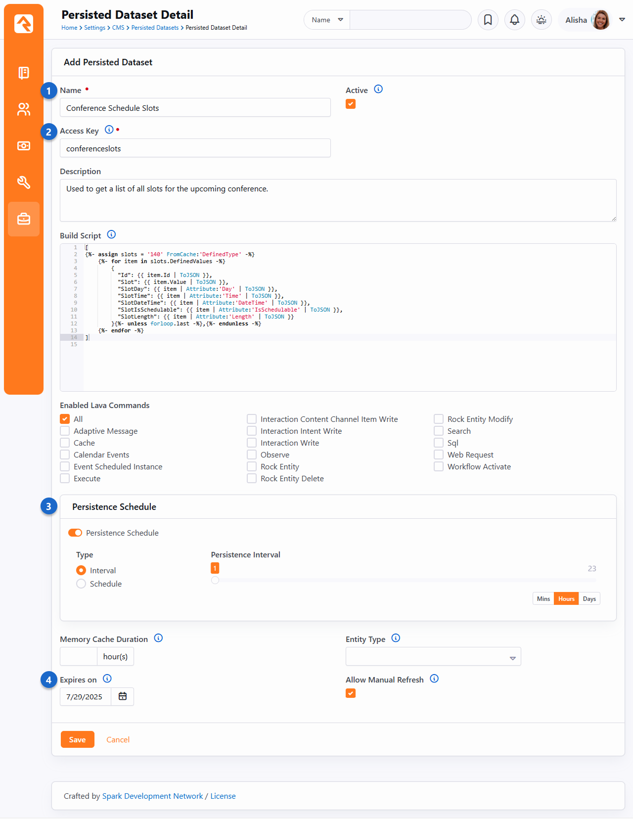
- 1 Name
- We set the Name to “Conference Schedule
Slots” so we can easily identify what this Persisted Dataset is used for.
- 2 Access Key
- Like the Name, the
Access Key “conferenceslots” makes
it easy to identify the purpose of this Persisted Dataset. The
Access Key and
Name don’t need to be identical but
should be closely related.
- 3 Refresh Interval
- This script will refresh every hour, ensuring up-to-date information around the clock.
- 4 Expires On
- The date we set here is the last date of our conference, since we won’t need this after our conference ends.
Given the example Build Script
pictured above, you could use the Lava shown below to output to your page:
{%- assign slots = 'conferenceslots' | PersistedDataset -%}
<ul>
{%- for item in slots -%}
  <li>{{ item.Slot }} ({{ item.SlotTime }} minutes) - {{ item.SlotDateTime }}</li>
{%- endfor -%}
</ul>
Caching for Rock Websites
Caching in Rock operates on the principle that once a piece of content has been created it doesn’t need to be created again.
So, a copy can be kept around in a cache. Keeping content in a cache means it can be served very quickly, without triggering
slow database queries or web requests. With caching you can provide individuals with faster page loads and a better experience
when your server is under heavy load.
Caching is a powerful tool to make your Rock site faster. However, caching can be dangerous without understanding how your
cache is being handled. All Rock caching takes the output of a template; anything programmatic inside is uncacheable.
Think of Rock caches as a copy of how your Lava presents itself when you access it. Tags like {%- stylesheet -%},
{%- javascript -%} or page redirects will be applied.
When using Rock caching, developers should be aware of performance on the first load, before Rock has cached content. If your content
is very slow, caching isn't a solution because content in your cache doesn’t stay there permanently. For content that causes long load times,
use Rock’s Persisted Dataset feature.
What can be cached?
Rock has several different types of caching available in different blocks. Caching can also be done through Lava or by using the
Persisted Dataset feature. Below, we'll break down what can be cached and how.
HTML Content Blocks
The HTML Content Block is one of the most ubiquitous blocks in Rock and is commonly used for displaying semi-static content on a page.
When content is not being customized for individual users, developers should use the block cache
Block Properties > Cache Duration. Even blocks without Lava content can
experience increased performance by avoiding querying the database.
Content Channel View, Content Channel Item View and Content Component Blocks
“Content” blocks display a list of results from a content channel. The block features two different types of cache, accessed
through Block Properties, called Output Cache and
Item Cache. The two caches are fundamentally different, and
mutually exclusive.
The Item Cache stores the underlying entity data requested by
the block without storing the output of the block. Rendering from this cache is slower because the Lava output is processed when the
block is requested.
The Output Cache stores the output of the entire block. Use the
Output Cache when the output from the block is not being customized
based on the current authenticated person, the current page or any other merge field value. Requests from an
Output Cache will be faster than an
Item Cache because no Lava is processed.
Lava Cache Command
The Lava cache command is one of the most flexible ways to cache in Rock because it can be used anywhere that is Lava-enabled. It can
also be used in conjunction with all other cache types. At the most basic level, a Lava cache tag has a key and
duration:
{% cache key:'decker-page-list' duration:'3600' %}
    {% person where:'LastName == "Decker"' %}
        {% for person in personItems %}
                {{ person.FullName }} <br>
        {% endfor %}
    {% endperson %}
{% endcache %}
In the example pictured above, Lava will query the database for all "Deckers" and store the results in Rock's cache with the key of
'decker-page-list' for a duration of an hour. After an hour has expired, a fresh query will be made from the database.
Keep in mind that Rock doesn't know where your Lava is running. All it knows is the key you gave it. This can work for you or against you.
If you want your cached Lava to be unique, be sure to give it a unique key (e.g., 'page-12-deckerlist'). If you'd like your cached Lava to
be reused in several places, such as on a number of different pages, use a shared key (e.g., 'decker-list'). Your key strategy is completely
up to you.
Using twopass you have the option to cache the contents and personalize the output for an individual person. Setting
twopass:'true' tells Lava to:
- Run the Lava, then cache the results.
- When pulling it from the cache, run the cached version through Lava again.
To set tags to be customized for the current individual with the twopass parameter, wrap your personalized tags with the
{% raw %} tag.
{% cache key:'decker-page-list' duration:'3600' twopass:'true' %}
    Hi {% raw %} {{ CurrentPerson.NickName }}! {% endraw %}


    {% person where:'LastName == "Decker"' %}
        {% for person in personItems %}
                 <br>
        {% endfor %}
    {% endperson %}
{% endcache %}
Note that the current person will be correct (because it survives the first pass because it's in a raw command) and the results of
the database call will be fully cached.
Toggle Web Cache
While you want things to be cached as much as possible, sometimes caching can present you with challenges.
For instance, if you're developing a new site, you'll want to configure the blocks with caching, but the
cached items can get cumbersome if you're making changes and need to see how things look right away.
As pictured below, you can enable or disable the web cache for certain blocks by accessing the admin toolbar
and clicking the icon. This allows administrators to temporarily disable the
cache for certain blocks, via a cookie. As of the time of this writing, this only impacts caching for the
following blocks:
- HTML Content
- Content Channel View
- Content Channel Item View
- Internal Communication View
Toggle Web Cache
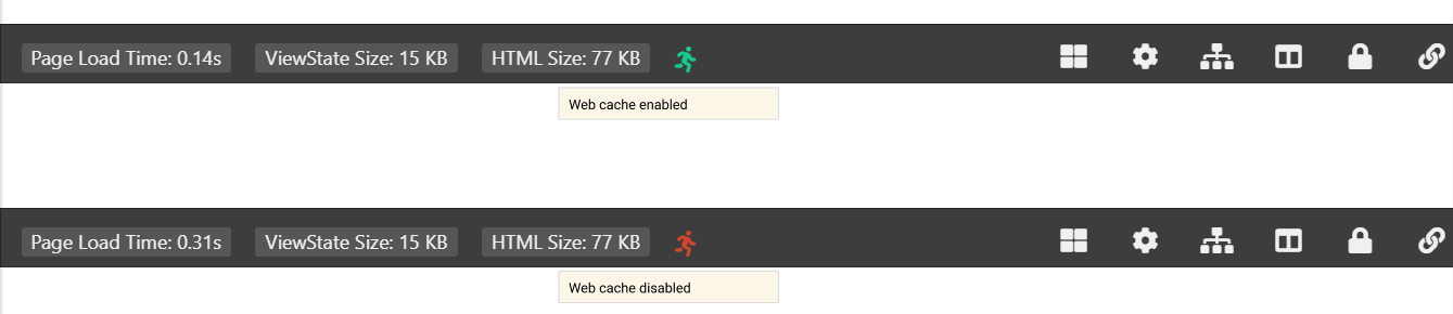
A Different Kind of Cache - Persisted Datasets
Traditional caching in Rock is limited to specific blocks, or to a particular format when using the Lava cache tag. Persisted Datasets are an always-ready
cache that allow you to shape data for speed and use across many different blocks, and with different types of markup. Persisted Datasets are cached on the
database or in memory using a job, so they’re quick every time.
Persisted Datasets should be used when a large dataset is resource intensive to process, leaving people waiting seconds, or even minutes, for results. They
can also be used when certain queries, like getting an attribute of another attribute, would cause issues at scale.
Persisted Dataset Example
{% assign data = 'mydataset' | PersistedDataset %}
{%- for item in data -%}
  {{ item.Title }}
{%- endfor -%}
If you want more details, we have a whole chapter on Persisted Datasets.
Content Library
Rock's Content Library feature fosters a sense of community among churches by facilitating seamless
content sharing, addressing resource limitations, and enabling congregants to access enriching
materials beyond traditional services. This collaborative repository strengthens ministries and your
digital strategy by providing easily accessible content that supports teachings and spiritual growth
throughout the week.
Let’s look at an overview of how the process works.
Content Library Diagram
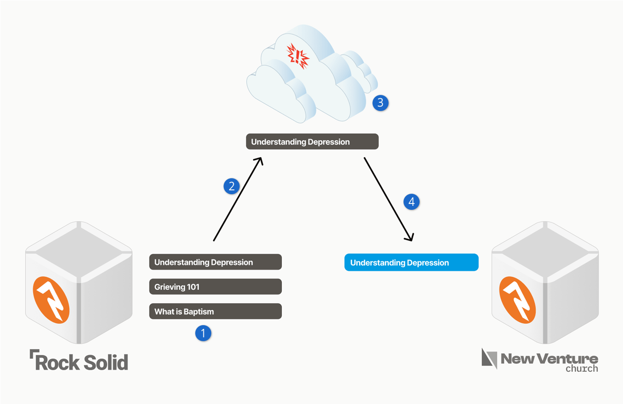
- 1 Content Creation
- A church crafts relevant content about topics like depression, grieving, or baptism.
- 2 Selective Sharing
- The church that created the content can choose what to send to the Content Library.
- 3 Spark-Powered Storage
- Content is safely stored in a Spark-hosted cloud environment.
- 4 Church Access
- Other churches easily access and download content to their Rock instance.
Next, we’ll look at how you can access content that other churches have added to the library.
Library Viewer
The Library Viewer is an intuitive gateway to a wide array of articles and resources. Seamlessly
search by topic, date, and popularity, downloading content into your Rock instance with ease.
Whether enhancing connections or tackling challenges, the library's transformative wisdom enriches
minds and hearts, all while aligning seamlessly with your digital strategy.
You’ll use a Content Channel to access the Library Viewer, as described below.
Once in the Library Viewer you’ll see a list of content items along the left. You can click on
any of these to see the associated content. You’ll also notice a “Download Article” button,
which will download the content as a new Content Channel Item into the Content Channel from
which you accessed the library.
Content Library Viewer
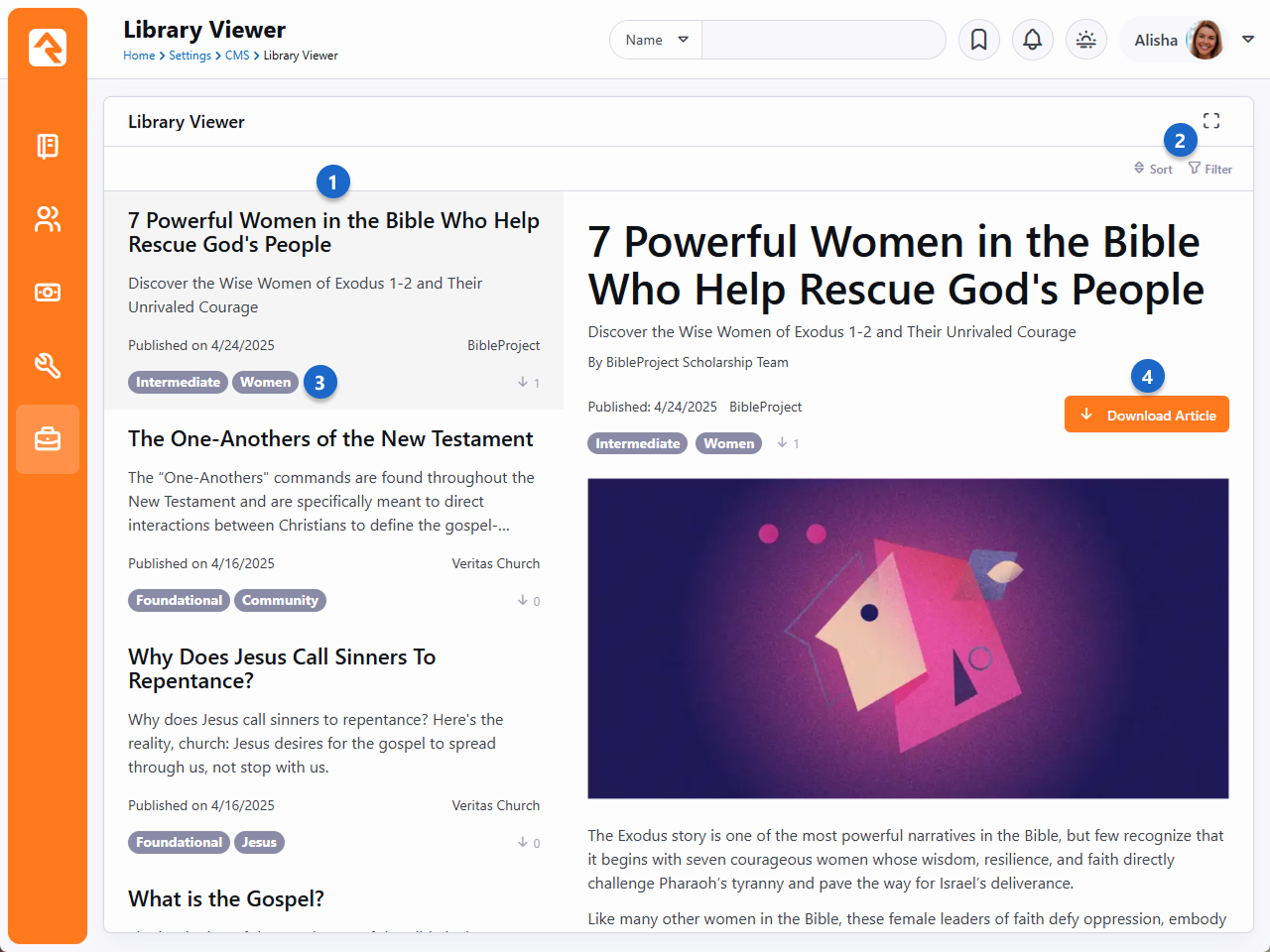
- 1 Content Item List
- This is the list of articles or other resources available for download.
- 2 Sort/Filter
- You can change the order in which the content items are listed. You can also use a
variety of filters to only show certain content.
- 3 Experience Level/Topic
- These tags are set for each Content Channel Item, which we’ll cover below.
- 4 Download Article
- With a single click you download the content from the library to your Rock instance. It
will be added as a Content Channel Item within the Content Channel that was used to access
the page.
If you’ve already downloaded the item, the “Download Article” button will change to say
“Re-download and Refresh” which will update (overwrite) the item from your previous download.
If you made any changes to the content after you downloaded it, those changes will be lost.
You may also notice a green icon that appears both within the item itself and in the list
of items along the left. This is simply a visual indicator that the item has been downloaded.
Content Library Viewer with Icon
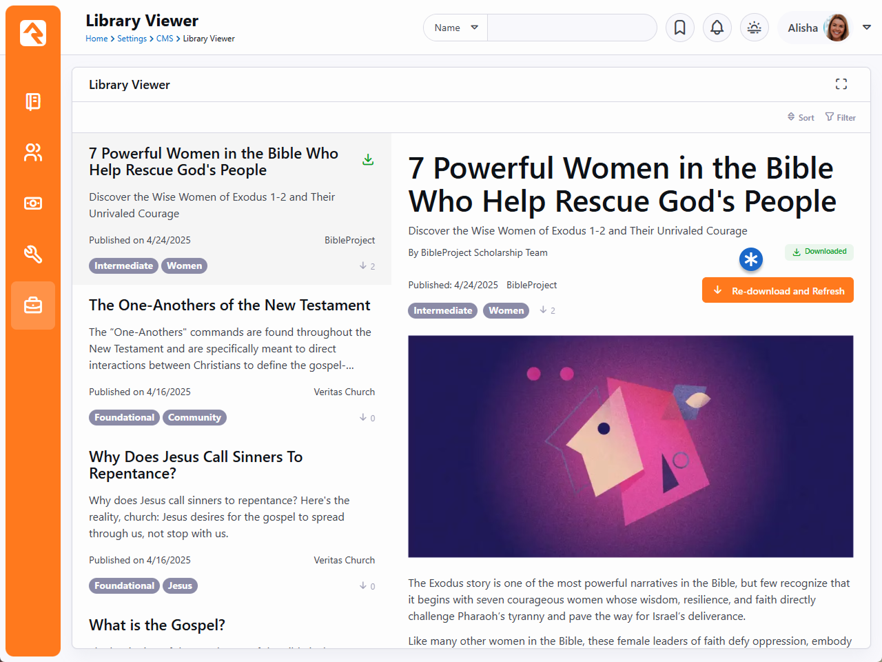
You’ll sometimes see other icons associated with the item, as listed below:
Content Library Icons
Trending
Popular
New
Download
To download from the Library Viewer, you must access it using the Download from Library
button on the Content Channel as pictured below. This tells the Library Viewer which
Content Channel to use when downloading content.
Content Channel
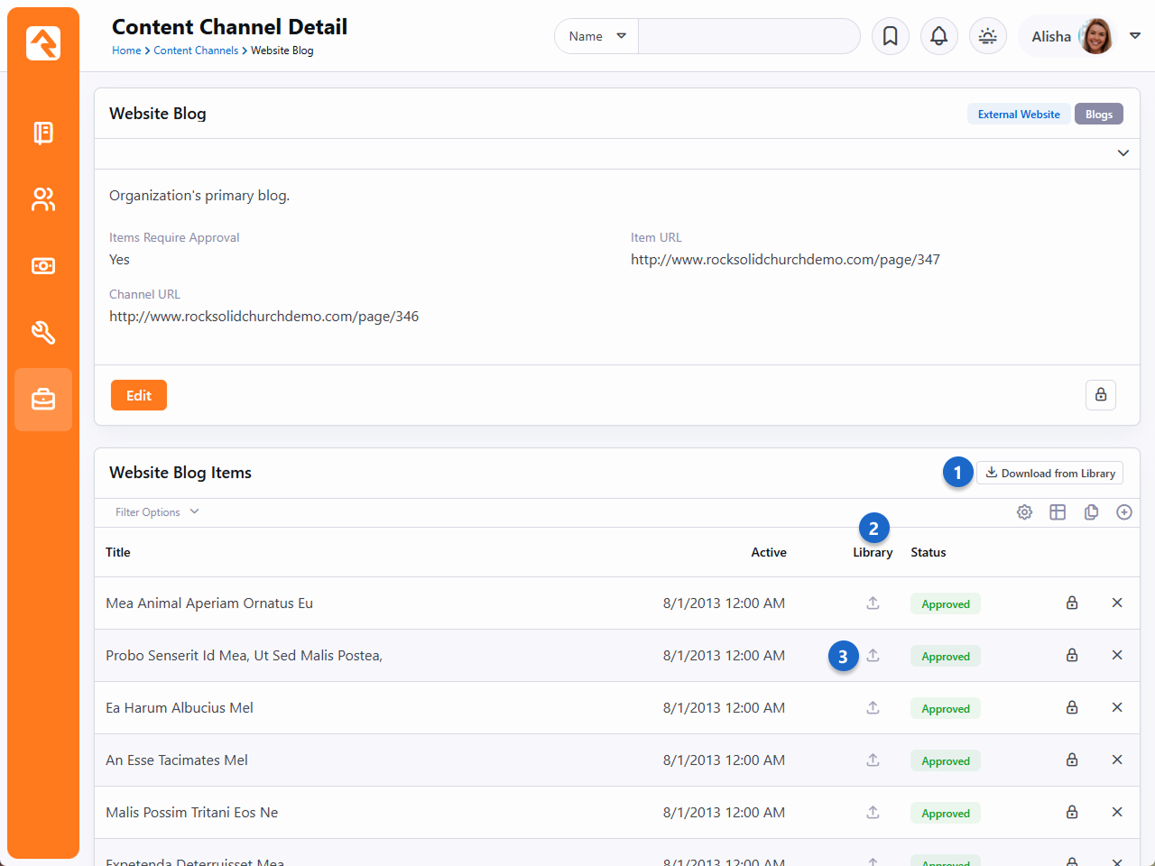
- 1 Download from Library
- Click this button to access the Library Viewer and download content. See
below for additional details.
- 2 Library Icons
- A green icon indicates downloaded items. Click to refresh with the latest
version (your changes will be overwritten). The blue icon marks items uploaded
to the library. Click to resend with your updates.
- 3 Upload to Library
- Each Content Channel Item within the channel can be uploaded to the
library by clicking the gray icon.
Setup
The Content Library features are enabled on specific Content Channels
(Admin Tools > CMS Configuration > Content Channels)
and apply to all the items within the channel. You can then choose individual
items to share or download.
Content Channel Setup
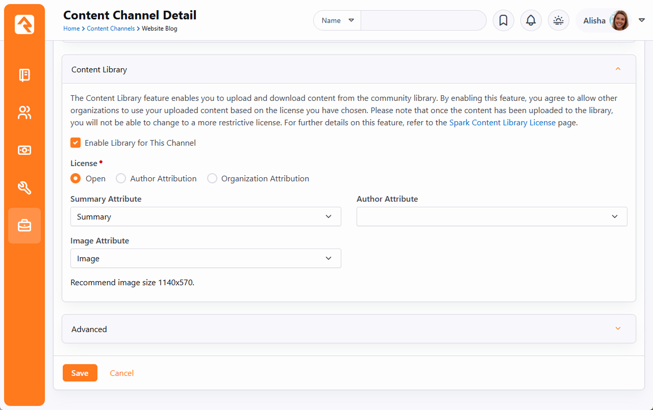
- 1 Enable Library for This Channel
- Activate Content Library features on specific Content Channels, aligning with
your organization’s digital strategy goals.
- 2 License
- The license determines whether you need to reference the author or
organization who created the content, and whether you can edit downloaded
content. See below for details.
- 3 Attributes
- Ideally, you’ll have all these items to help connect people with content
relevant to them.
As mentioned above, there are three License options available to you:
- Open: Enjoy ultimate flexibility—use articles as needed, without
attribution. Customize downloaded content to suit your organization.
- Author Attribution: Use articles as-is, with no changes.
Acknowledge the original author's contribution when showcasing the article.
- Organization Attribution: Use articles unaltered. Attribute both
the author (if specified) and the organization that added it to the library when
displaying the article.
With an Open License you won’t want to give attribution to the author, because as soon as you
change any of the content it’s no longer their work. If you change the License, any items you’ve
previously uploaded to the library will retain their original License. So, changing the License
only impacts new uploads going forward.
Lastly, let’s look at the options available for individual Content Channel Items.
Content Channel Item Setup
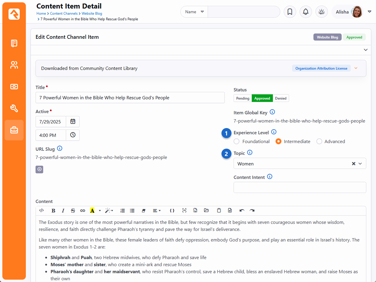
- 1 Experience Level
- Classify content as Foundational, Intermediate, or Advanced for easy filtering in the
Library Viewer. While not mandatory for all items, a selection is required for content to
be uploaded to the library.
- 2 Topic
- a. Assign a relevant topic to each content channel item. Topics are organized under
categories ("domains"), such as "Personal Growth" or "Explore Faith." Like Experience Level,
a Topic is required for uploading an item to the library. The list of topics cannot be
changed.
Rock's Content Library helps propel your ministry to new heights through seamless integration
into your digital strategy. As we look ahead, the horizon promises even more content
possibilities beyond articles. So, stay engaged and explore this evolving landscape of
ministry enrichment.
Interactive Experiences
Interactive Experiences are your key to creating engaging and dynamic church services. With this feature, you can foster real-time connections through
interactive questions in your church’s Rock Mobile app. You can choose between anonymous or personalized responses, enable your pastor to connect with
the congregation in real time, and add a new level of engagement to your services. Let’s look at the general process before we get into specifics.
Interactive Experience Devices
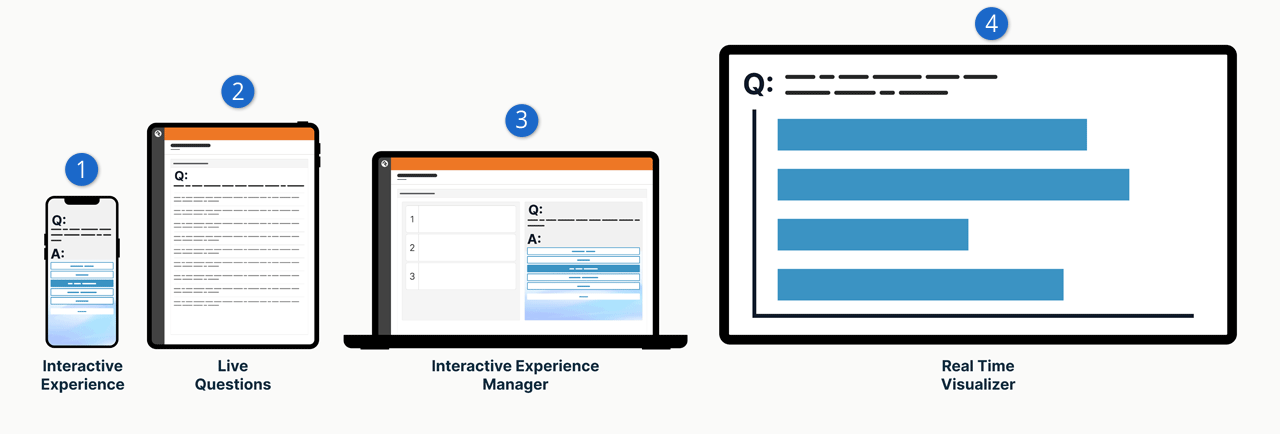
- 1 Interactive Experience
- This is a visitor’s phone using your Rock Mobile app. Right now there’s a question listed, and the person can provide an answer on their
device. This is the main component of the interactive experience.
- 2 Live Questions
- As the questions are answered, the answers appear in Rock in real time. This might be a pastor’s iPad on the stage, so they can monitor
the answers coming in.
- 3 Interactive Experience Manager
- An administrator controls when questions appear and how long to keep the question open for responses.
- 4 Real Time Visualizer
- This displays the question and a list of answers intended for the big screen on stage. The answers can optionally be moderated and
reviewed for approval. In that case, only approved answers will appear here.
Pictured below is an example of a poll question. That’s one type of
Action that your
Experience can have.
Another type of Action is asking a short answer question.
Action on Device
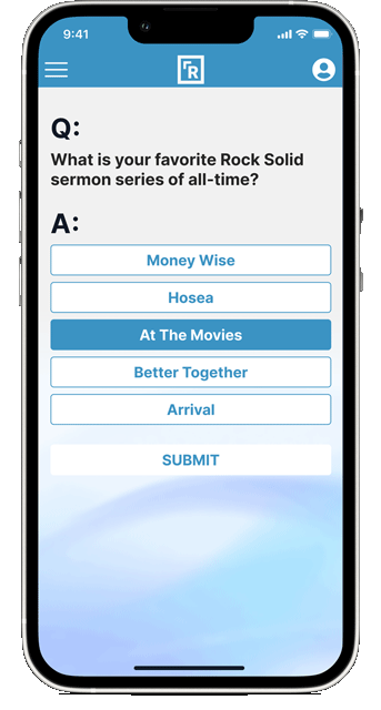
Aside from Actions, there are other customizable screens that the person can see. For before the service you can create a custom Welcome screen
with your own image and colors.
Welcome Screen
But what about in the middle of the service, between Actions? This feature provides a customizable screen for that too. And then at the end of
the experience, you guessed it, you can customize what people will see.
Before we dive into the setup, let’s look at a few other features that come along with Interactive Experiences.
Experience Manager
You can access the different Interactive Experience pages in Rock by going to
Tools > Interactive Experiences.
First, we’ll look at the Experience Manager.
Experience Manager - Live Event
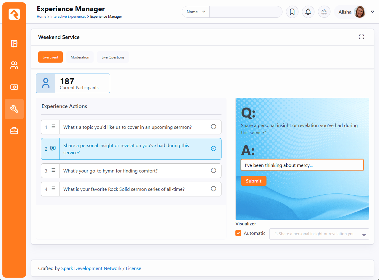
The Experience Manager is typically what you’ll use to, that’s right, manage the experiences. Pictured above, under the Live Event tab,
you can see a live count of how many people are participating, and you get to control, in real time, the Actions that will show up on
people’s mobile devices. It even includes a preview window so you can see what they see.
Under the Moderation tab you can review responses to questions, particularly short answer questions, and can approve or reject them
based on their content.
Experience Manager - Moderation
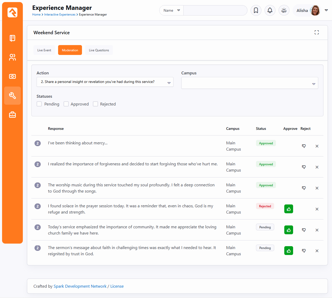
The last stop in our tour of the Experience Manager is the Live Questions tab. This is where you can see a list of responses to the
selection action. This list is filterable by campus. Only responses that have been approved (for those requiring approval) will appear here.
Experience Manager - Live Questions
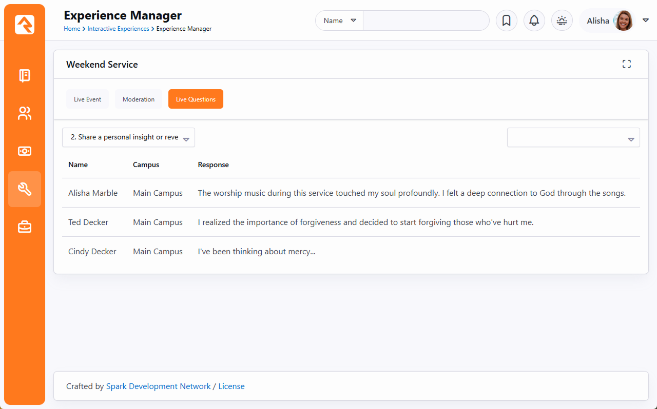
Experience Questions
This area is meant for the pastor on stage, to view the results of the actions (e.g., poll answers) live and in real time as
people are responding through your church’s app.
Experience Questions
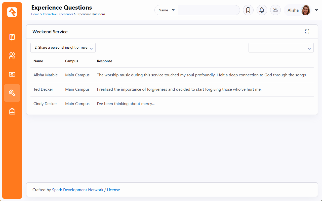
As pictured above, the pastor can select which question to view. And there’s an optional Campus filter, to ensure they’re viewing
the correct set of replies.
Experience Visualizer
The answers to your questions can be read in a list like we’ve seen so far. But the Experience Visualizer lets you see the responses graphically.
Visualizer Graph
You can also see the responses presented as a word cloud. The larger the word, the more responses it got.
Visualizer Word Cloud
Experience Administration
Experience Administration is where you’ll go to create and maintain your experiences, actions and what gets displayed on the app.
Let’s walk through setting up a new experience. We’ll start by adding a new row to the Experience Administration page
under Tools > Interactive Experiences.
Add New Experience
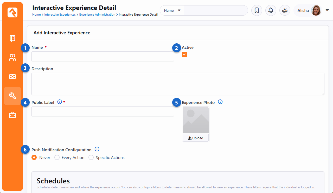
- 1 Name
- This is going to be what the experience is called. You might have an experience named
Weekend Services.
- 2 Active
- You might Inactivate an experience if it's not needed for now but will be used in the
future. This way you don't have to delete experiences you're not using.
- 3 Description
- Adding a good description helps provide clarity and purpose for the experience and
when it's to be used.
- 4 Public Label
- The name you choose here will be visible to people using your app. For instance, on the person’s device they can choose
which Interactive Experience they want to join, when more than one is available.
- 5 Experience Photo
- You might reference the Experience Photo on your external website when displaying information about the experience.
This isn’t required.
- 6 Push Notification Configuration
- When you select an Action from the Experience Manager, you can choose to send a push notification to people who
have your mobile app, alerting them of the action. If you choose a push notification option, you'll be
asked to provide a Lava-enabled Title and Detail. These are the actual contents of the push notification the person receives on
their mobile device.
Next, we’ll look at the schedule configuration. As it says on the page, Schedules determine when and where the experience occurs.
Add New Experience
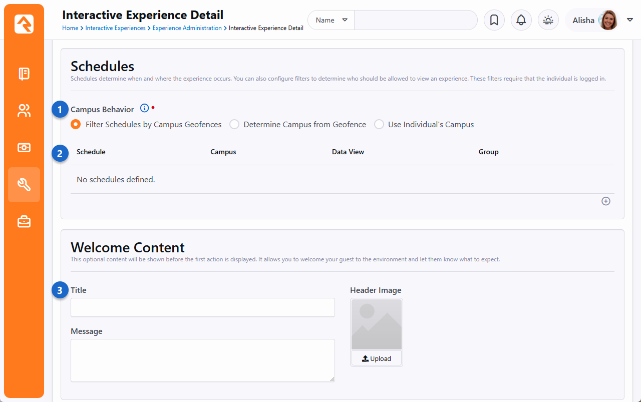
- 1 Campus Behavior
- This controls how the campus is determined. Because you may have different campuses with different actions. The options include:
- Filter Schedules by Campus Geofences: Geofences are used to display schedules based on your current location,
matching you with the closest campus. Your interactions will also be associated with this campus. Your campus configuration
will need to include a geofence for this to work.
- Determine Campus from Geofence: Your campus for interactions will be determined by the geofence of your current location.
Your campus configuration will need to include a geofence for this to work.
- Use Individual's Campus: Your chosen campus in Rock will be used for interactions, without considering geofences.
So, you can optionally use geofences to determine things like if the person is at home or on campus. And don’t forget you
can also check out the help icon in Rock for additional information.
- 2 Schedule
- This is where you set the date, time, and recurrences for your experience. But that’s not all. For each schedule you can determine
who should be able to see the experience based on a data view or group membership. You might use group membership to use Interactive
Experiences for team training.
- 3 Welcome Content
- The title, message and header image you select here will appear in your mobile app just before the experience kicks off.
Use this to welcome people to the Interactive Experience experience!
As we move down the page, you'll find additional settings for what people will see in your app during the experience.
Add New Experience
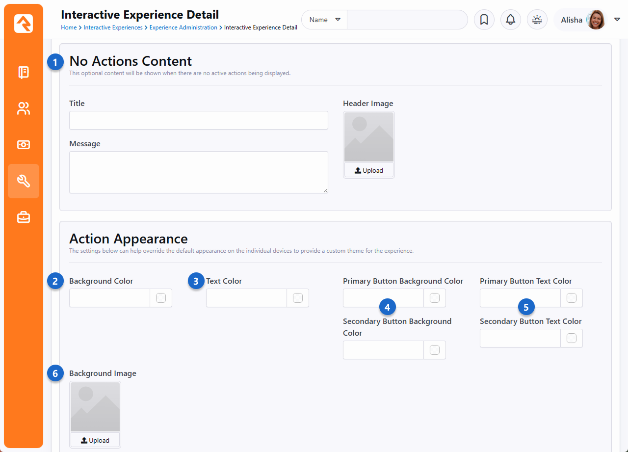
- 1 No Actions Content
- This is what people will see in between actions. For instance, when you choose to stop collecting responses from a question,
this is what will be shown before the next question appears. That would all be handled through the Experience Manager.
- 2 Background Color
- If you don’t have a background image, this color will appear as the background.
- 3 Text Color
- When you ask for a short answer or poll response, this will be the color of the question/prompt text.
- 4 Primary/Secondary Button Background Color
- Whenever a button appears (e.g., the Submit button) these are the colors that will be used as the background.
- 5 Primary/Secondary Button Text Color
- This is just like the above setting, except it applies to the text (e.g., “Submit”) of the button.
- 6 Background Image
- The poll and short answer questions will sit on top of the picture you upload here. Be sure to choose a picture/color
combination that works for you and is easy on the eyes.
Below is an example of what the No Actions Content might look like.
Stay Tuned
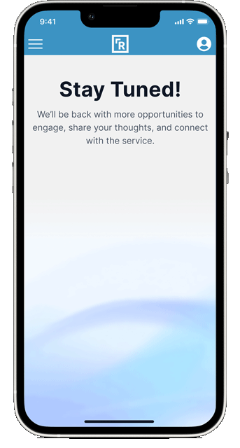
As we continue down the configuration list, we get to customize what the person sees when the experience has ended.
You'll also see options to provide a custom theme for the experience.
Add New Experience
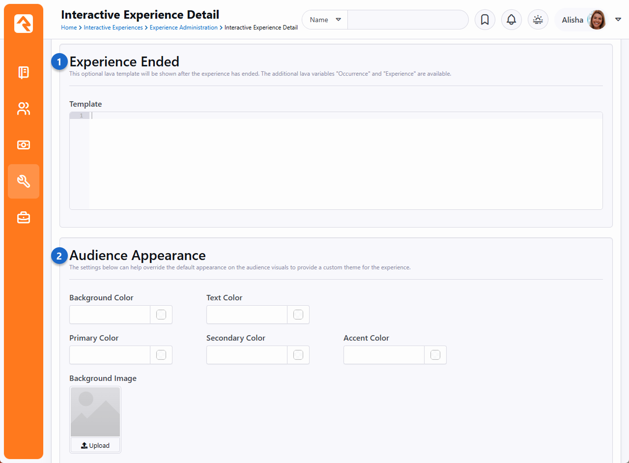
- 1 Experience Ended
- All good things must come to an end, and Experiences are no exception. The Lava-enabled content you provide here will
be shown to the person after the experience has ended.
- 2 Audience Appearance
- You can choose a separate set of colors (and an optional image) to apply to the experience in general.
For example, if you used an image in the Welcome or No Actions Content, then those images will be placed
on top of your experience’s background image or color.
Next, let’s dive into the action configuration, which you would access from the same page, as pictured in the
last screenshot below. What you’ll see will vary depending on the Type of action you’re working with.
We’ll use an example from the Poll action type.
Add New Experience
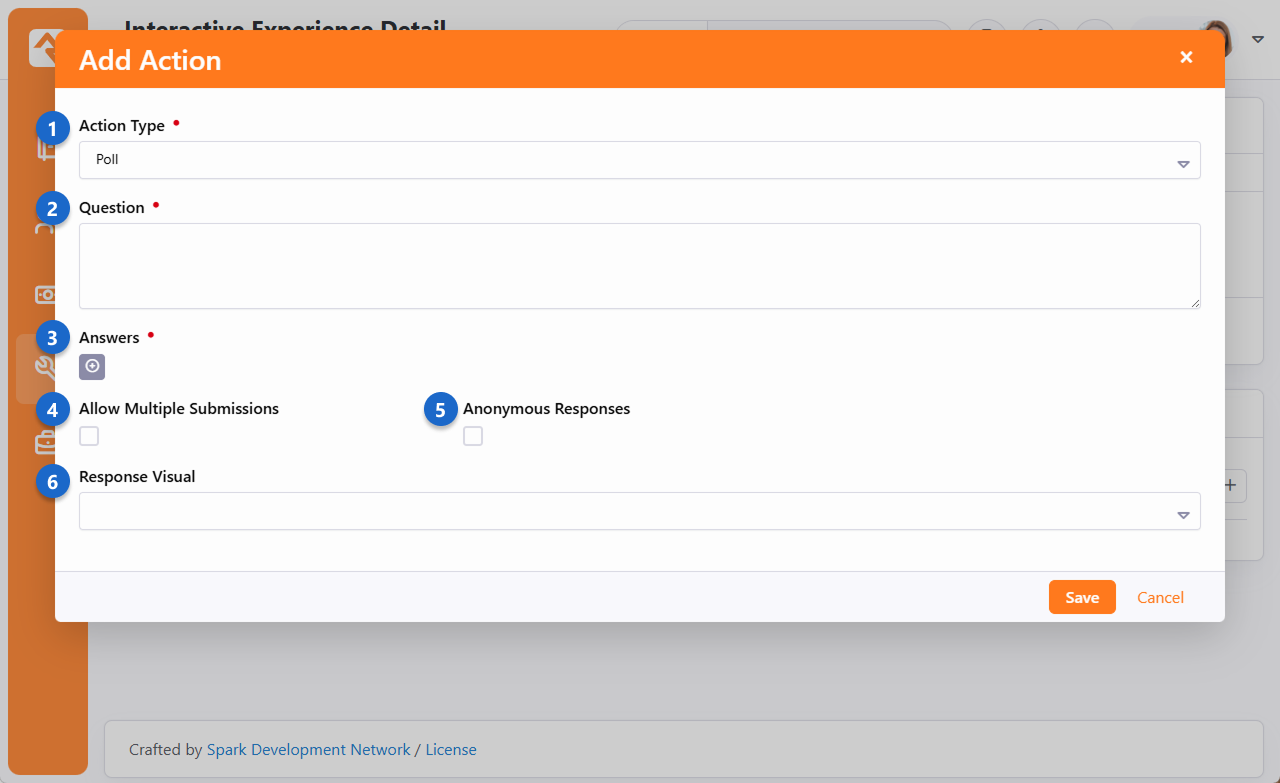
- 1 Action Type
- Currently there are 3 Action Types to choose from:
- Embed Webpage – To set up, just provide the URL you want to embed. It's a straightforward process, yet quite powerful.
Embedding a webpage, like one with a Rock Workflow Entry block, greatly enhances the experience. But it could also be files,
like an image or a PDF. Imagine the possibilities! The only requirement is you need to have a web page to point it to.
- Poll – We’ve already seen an example of a poll, now you can see how they’re set up. The screenshot above is for a Poll action.
- Short Answer – We also saw one of these in an earlier screenshot. The configuration is similar, except you also have the
option to review and approve/reject the responses before they get published.
- 2 Question
- This is the question that people will see and respond to on their mobile devices during the experience.
- 3 Answers
- This section is where you list the available options a person can choose to respond with.
- 4 Allow Multiple Submissions
- This simply indicates whether the same person can answer the same question more than once.
- 5 Anonymous Responses
- If you recall from earlier when we were looking at Live Questions and Experience Questions, you may have noticed that people’s names were listed.
You can choose to hide the names on those pages by enabling this option.
- 6 Response Visual
- The options here include “Bar Chart” and “Word Cloud” which we’ve seen examples of previously. Whichever one you pick, you’ll have additional
configuration options that are specific to the visual you chose. For instance, you can have the bar chart be horizontal or vertical.
After you’ve got your actions configured, you’re ready to go live with this experience!
With everything set up, your Experience Administration page will look similar to the
below screenshot.
Experience Administration
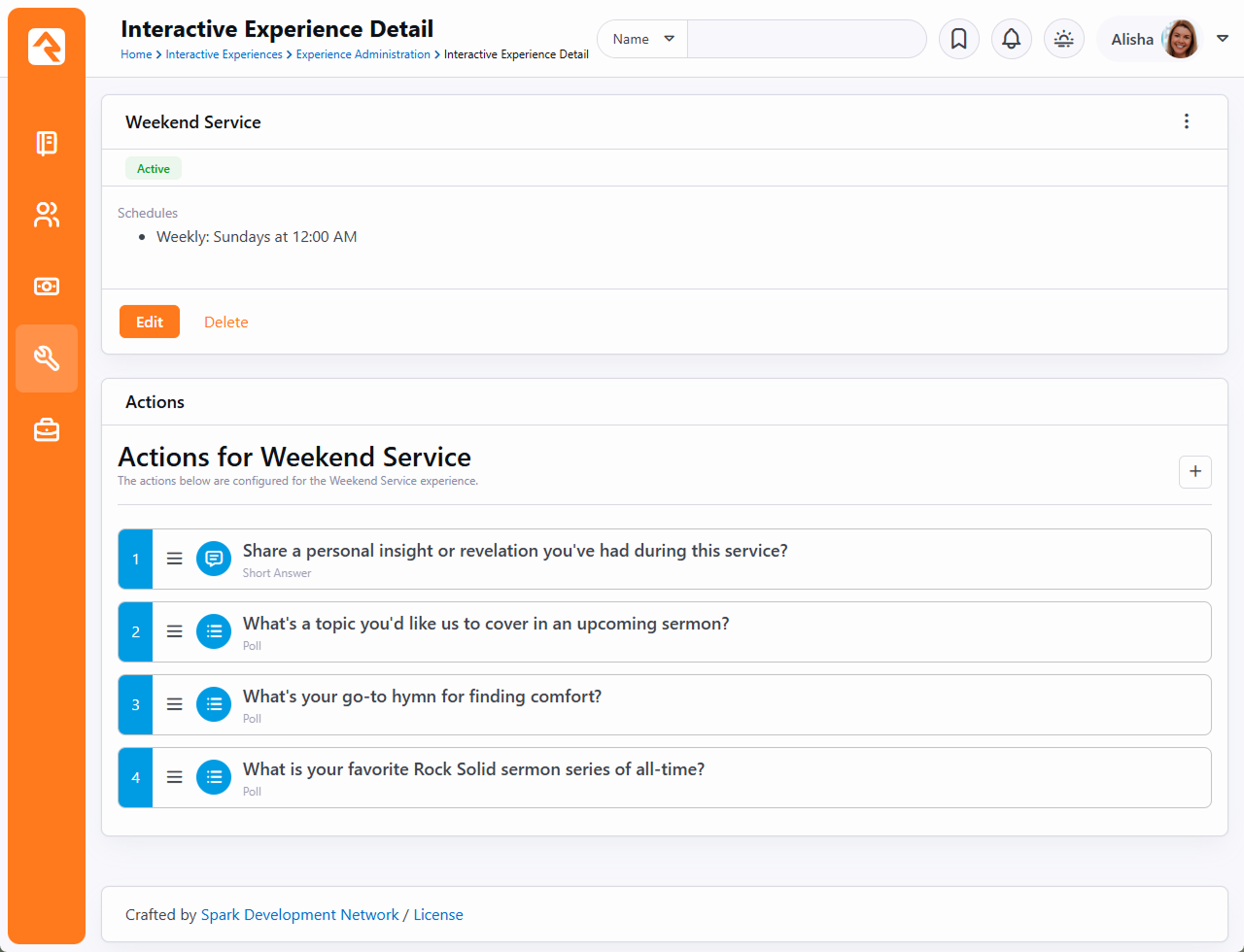
We can edit the configuration for this experience by clicking the Edit button pictured above. Below that you can edit the Actions
or add new ones.